

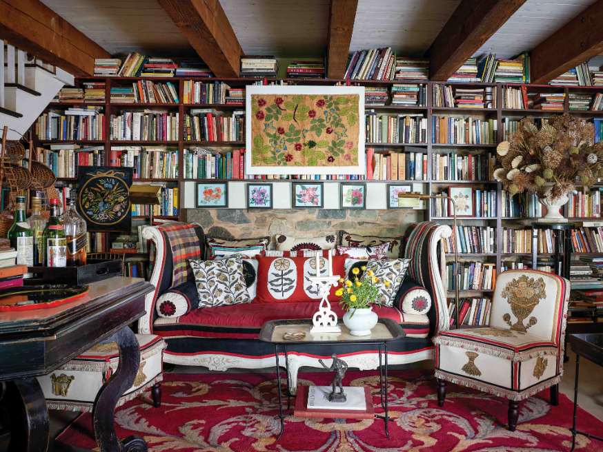


When the team at FS&CO—parent company to Schumacher, Patterson Flynn, Backdrop, and our very own FREDERIC Media—began planning a new global headquarters in downtown Manhattan’s historic Devlin building, it was agreed that the space should embody the 134-year-old company’s sophisticated joie de vivre. Blending historic references with an eye for the now, the SoHo office—designed by Dara Caponigro, FS&CO’s chief creative officer and FREDERIC editor in chief, and Stephanie Cano, Schumacher’s director of space planning—is a study in delicate harmony and dramatic counterpoint.
Read on for Caponigro’s tips for creating a statement-making work space where every carefully chosen element is engineered to inspire.
-
A trio of pastels by Caroline Beauzon, hung above a Cappellini credenza in a coordinating shade of green, welcomes visitors on the main floor. Weekly deliveries of Emily Thompson floral arrangements add verdant energy.
-
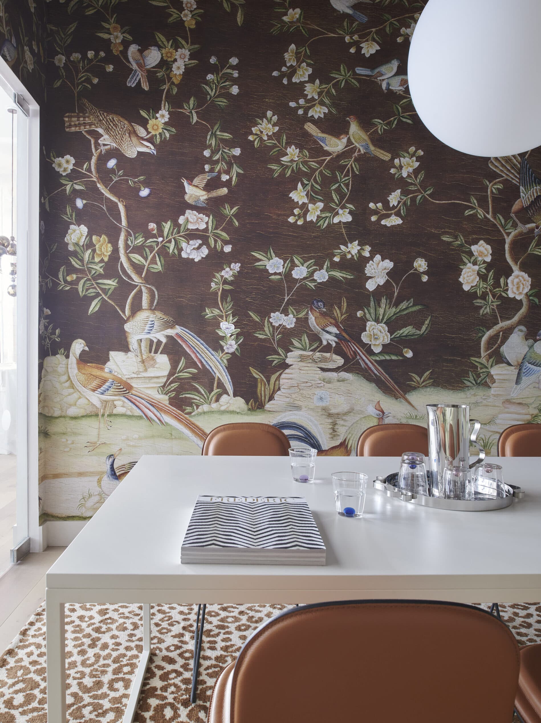
A meeting room features Dutch Tree of Life wallpaper panels by Iksel Decorative Arts and an Iconic Leopard Rug, both from Schumacher. Table and chairs by Jasper Morrison for Cappellini. Sferis Pendant Light by Zafferano.
Set Parameters
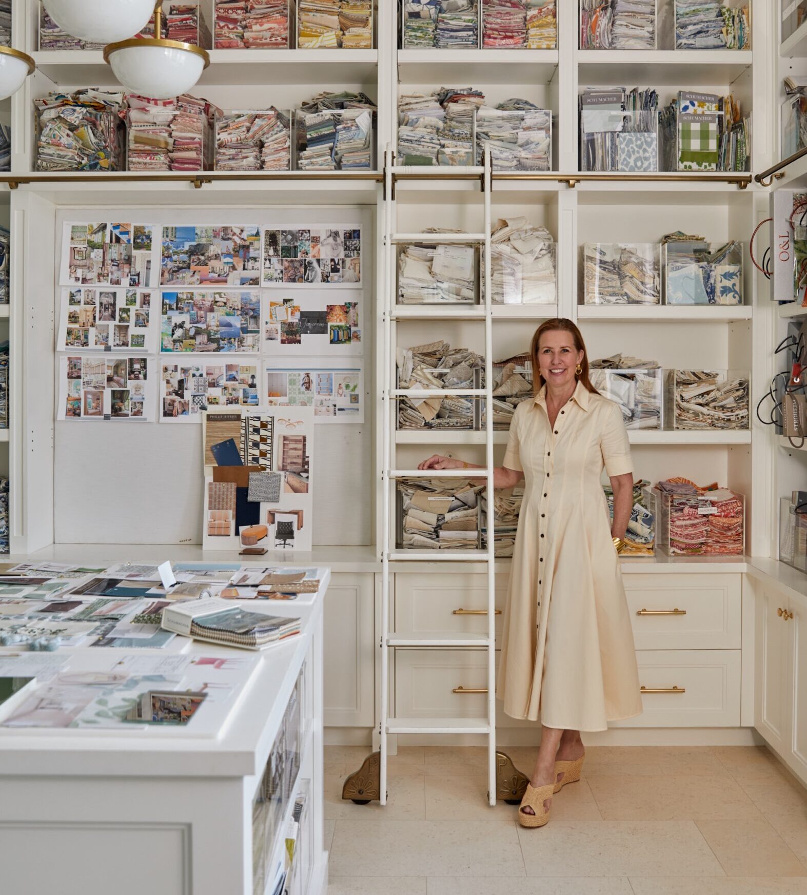
At 19,500 square feet, this was the biggest interior design project that Stephanie Cano and I had ever worked on, so we gave ourselves some limits. We chose to work with only four furniture companies: Cappellini, Cassina, Herman Miller, and Schumacher. Even though that still left us with plenty of choices, paring them back really helped. And because FS&CO is a design company with some illustrious high-profile brands, we pulled from them, too: Backdrop for eco-friendly paint, Patterson Flynn for some of their exquisite textiles and rugs, and, of course, Schumacher for fabric and wallpapers.
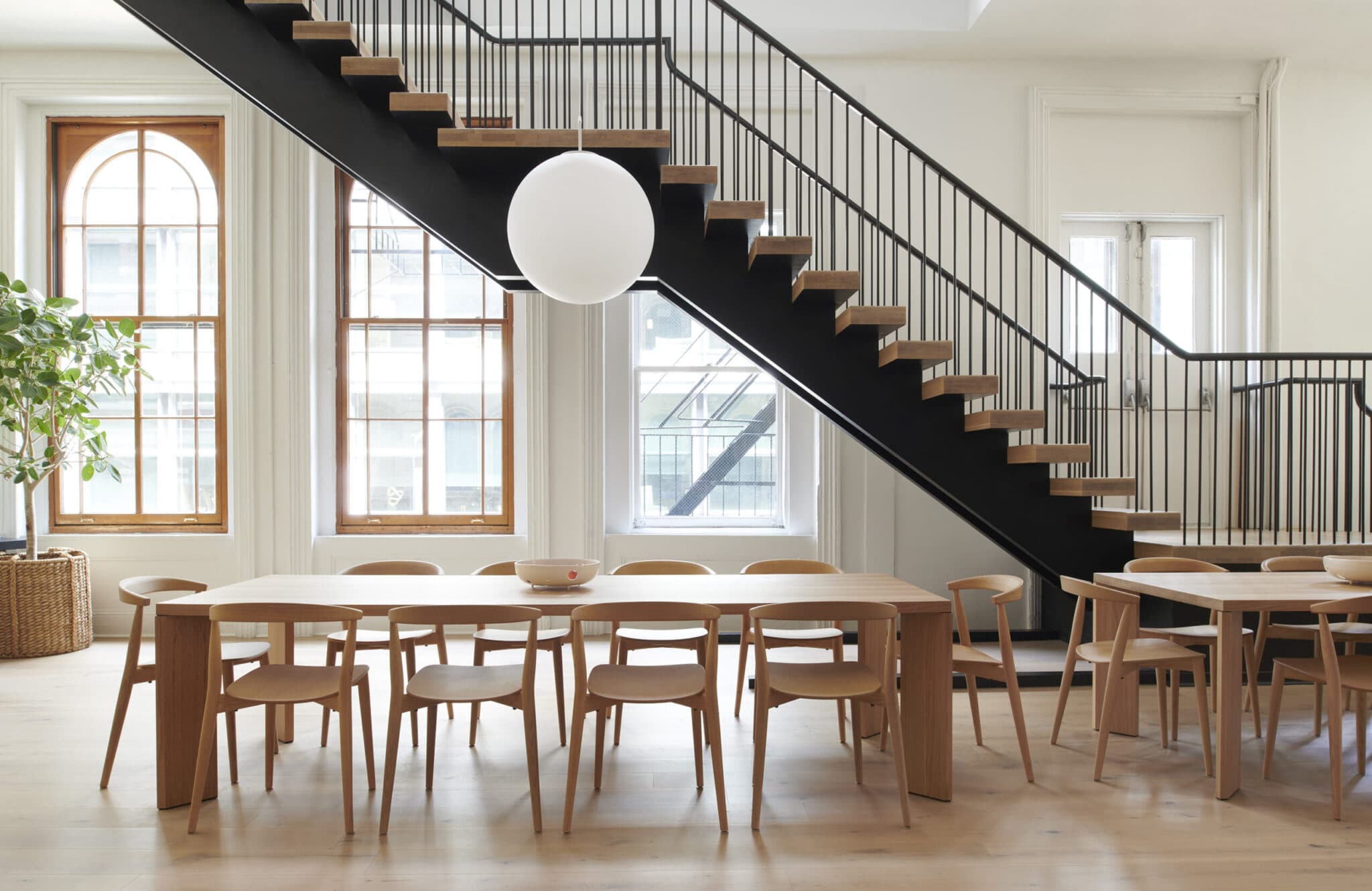
A Sferis pendant by Zafferano hangs in the community space on the main floor. The tables are by Cassina, and the chairs are Cappellini.
Choose a Neutral Floor Color
We wanted floors that didn’t skew too yellow or red so it would go with any paint color or wallpaper we decided to use initially or in the future. On the fourth floor, we kept the existing red oak flooring and treated it with Bona NordicSeal to neutralize the color, making it more versatile.
Get Creative with Wallpaper
In some rooms, we used instant mood-making scenic wallpapers that wow but also are cocooning and comforting. In other rooms, we papered the ceilings only. In one striped meeting room, we went for broke and changed the direction of the striped wallpaper repeatedly for a pop-art effect.
-
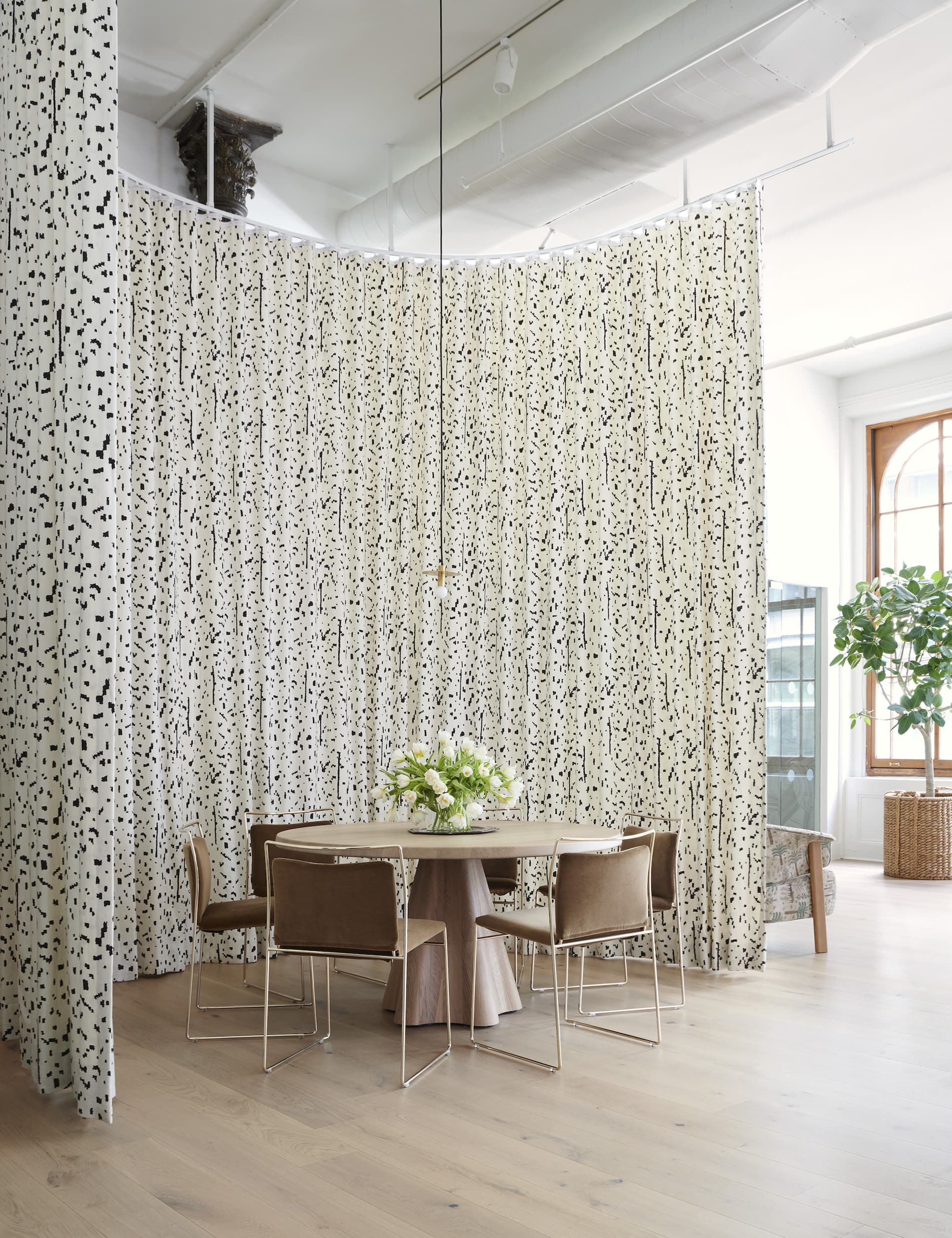
Caponigro used tall curtains in Bespotted fabric by Miles Redd for Schumacher to carve out an intimate meeting space within the large main room. Stella table by Schumacher; chairs by Cassina.
-
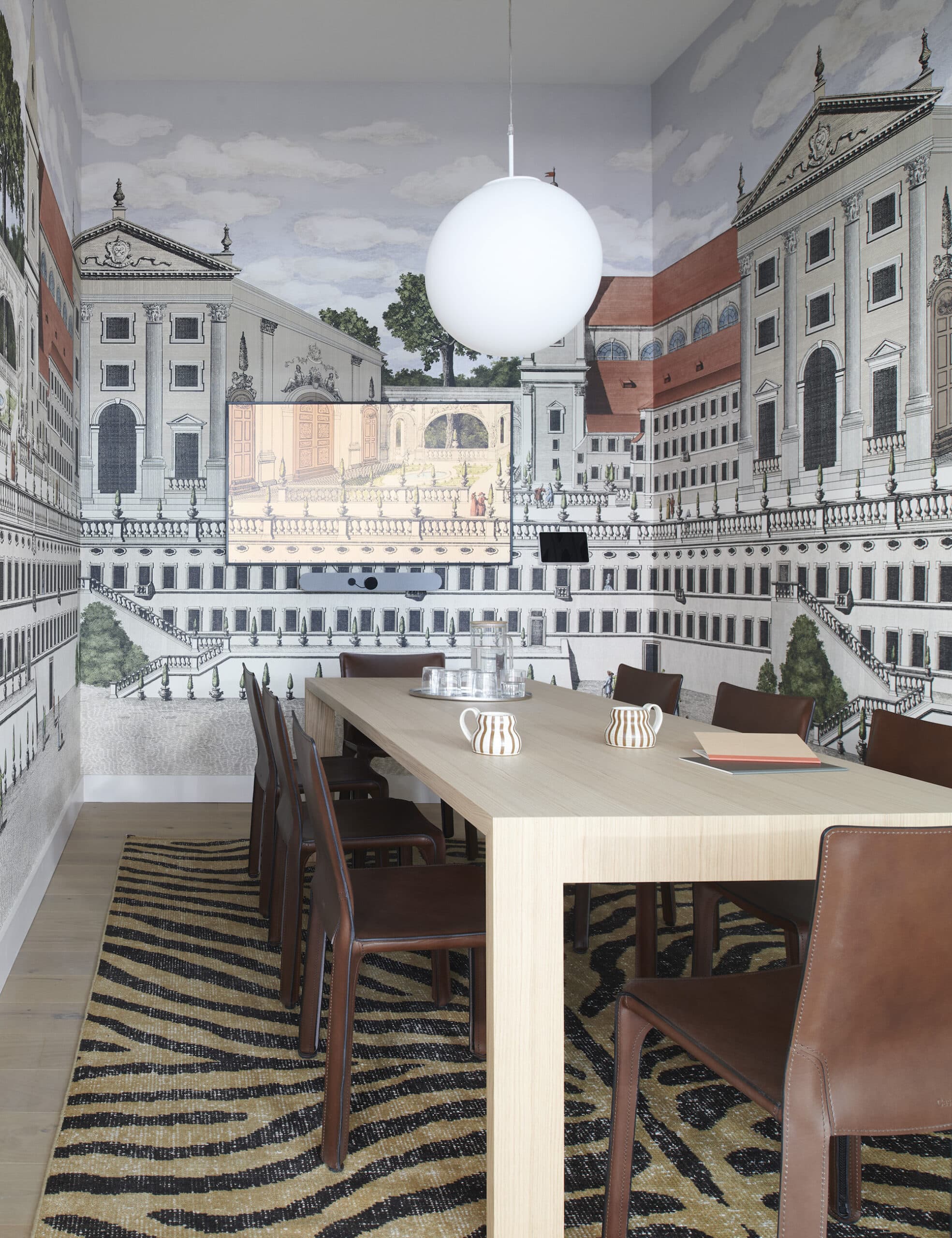
Piazza Firenze Wallpaper Panels by Johnson Hartig/Libertine for Schumacher, a Zebre Hand-Knotted Rug by Schumacher, and leather chairs by Mario Bellini for Cassina turn a small conference room into an eclectic jewelbox.
Keep It Timeless but Interesting
The envelope of the new space is quite classic, so we let the architectural details—tall ceilings, cast iron columns, and arched windows—speak for themselves, trying to obstruct them as little as possible. We created interest through materials: a floor-to-ceiling curtain enclosing an eating area, undulating warm white Portugese tile, beautiful white oak floors, and lots and lots of wallpaper. Wallpaper panels were particularly impactful in the meeting rooms, creating different moods in each—a chinoiserie garden in one, a Palladian cityscape in another.
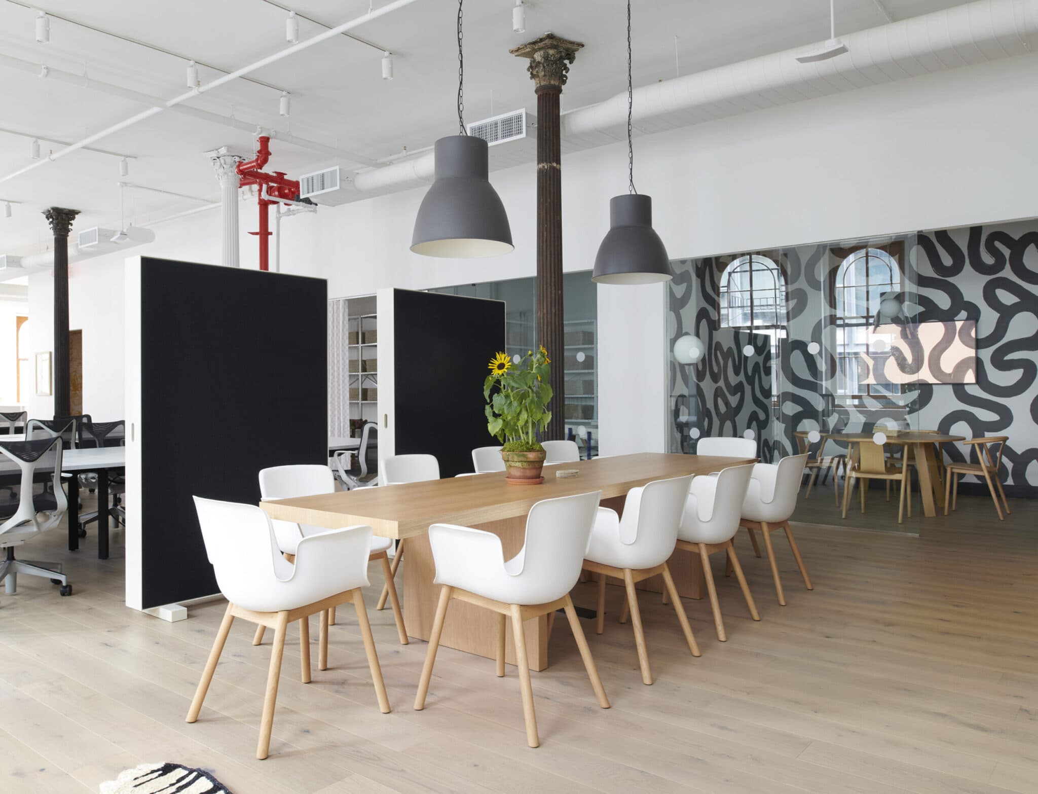
A high-low mix of Ikea pendant lights with a Cappellini table and chairs on the office’s third floor; the conference room is wallpapered in Trace by Hadiya Williams for Schumacher.
Balance Variety with Cohesion
The three floors are united by a mostly neutral palette (we used the same Backdrop paint colors more or less throughout), but each has its own accents. The wallpaper in the elevator landing sets the mood for each. The main floor is the most handsome, sophisticated, and grand, with a palette of rich browns, chalky taupes, and whites, as well as almost black and verdant greens.
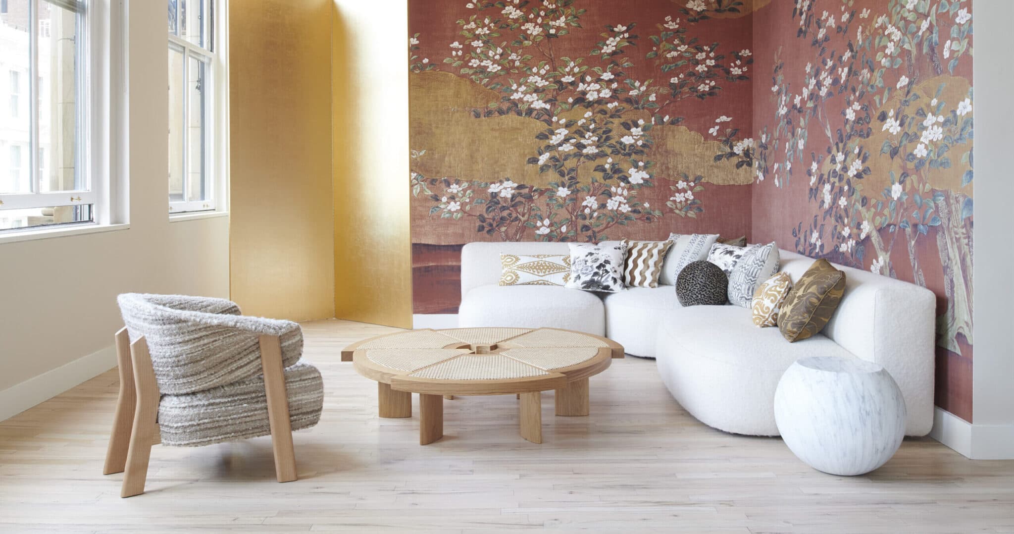
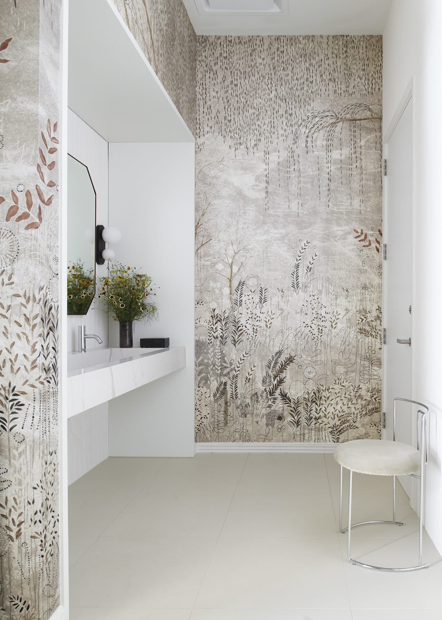
The third floor, where the creative teams sit, has a punchier vibe: It’s a study in mostly black and white with some primary colors carefully thrown in. The hardware changes on this floor from chrome to black; there’s a sleek, glossy kitchenette, a mailroom in cobalt blue with black accents, and a pretty sensational meeting room with a dynamic graphic pattern. The elevators to the fourth floor open to a delicate chinoiserie. It is probably the most feminine of the spaces, also incorporating a historic toile and a pretty floral chintz, but it’s by no means saccharine. Cool, arty lighting from Denmark and France, and some shapely, modern furniture keeps things from getting too sweet.
-
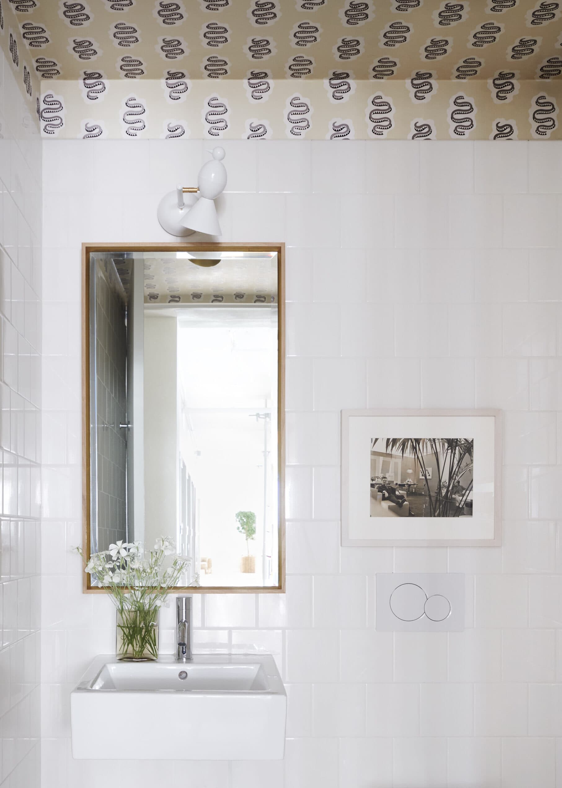
No surface went unnoticed: In a fourth-floor bathroom, Elsa wallpaper in Sandstone by Schumacher and an Alouette wall light by Atelier Areti draw the eye upward. The framed photograph is by David Hicks.
-
Bisou Wallpaper Panels by Colette Cosentino for Schumacher and a Gaja Chair by Kazuhide Takahama for Cassina make for a zen vibe in the bathroom.
Don’t Ignore Utilitarian Spaces
We wanted to make sure that even rooms like the mailroom and printer rooms felt special, adding wallpaper, interesting paint colors, and rugs wherever it made sense. Those spaces have become some of my favorite little surprises throughout the office.
Choose a Theme for Art
Buying art was a bit overwhelming. We decided to narrow our focus to interiors, which helped make the decisions easier. We scoured eBay, Chairish, and antiques markets in France for still-lifes, vintage interior photography, and abstract paintings of chairs; we also included original pieces from Schumacher collaborators and framed some of our favorite documents from the company’s archive.
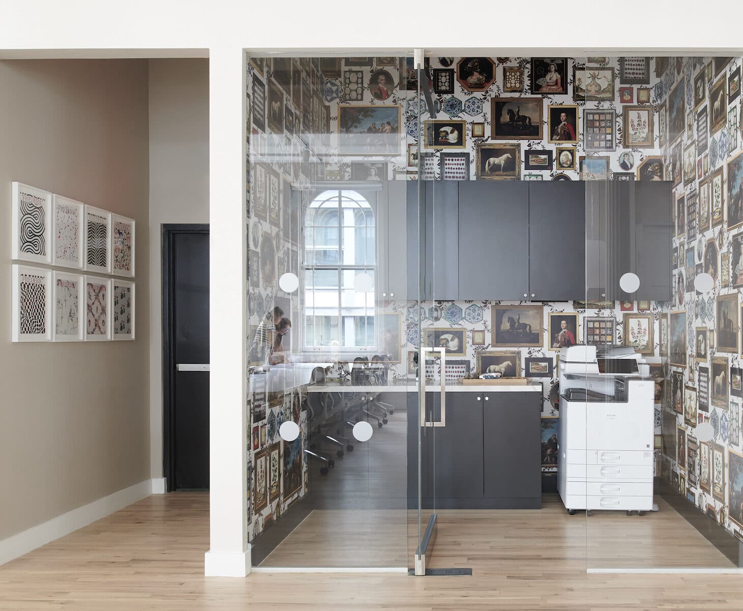
A trip to the printer turns into a more fanciful voyage thanks to Le Grand Tour wallpaper by Johnson Hartig/Libertine for Schumacher. A framed octet of FREDERIC covers becomes art on the opposite wall.
Embrace the Power of Plants
Our CEO requested that we get plants and trees, which really make the space feel more alive. We’ve also sprung for weekly flower arrangements by Emily Thompson. Walking into the office on a Monday morning is always a treat—you just never know what stroke of genius will greet you.
Pay Attention to Details
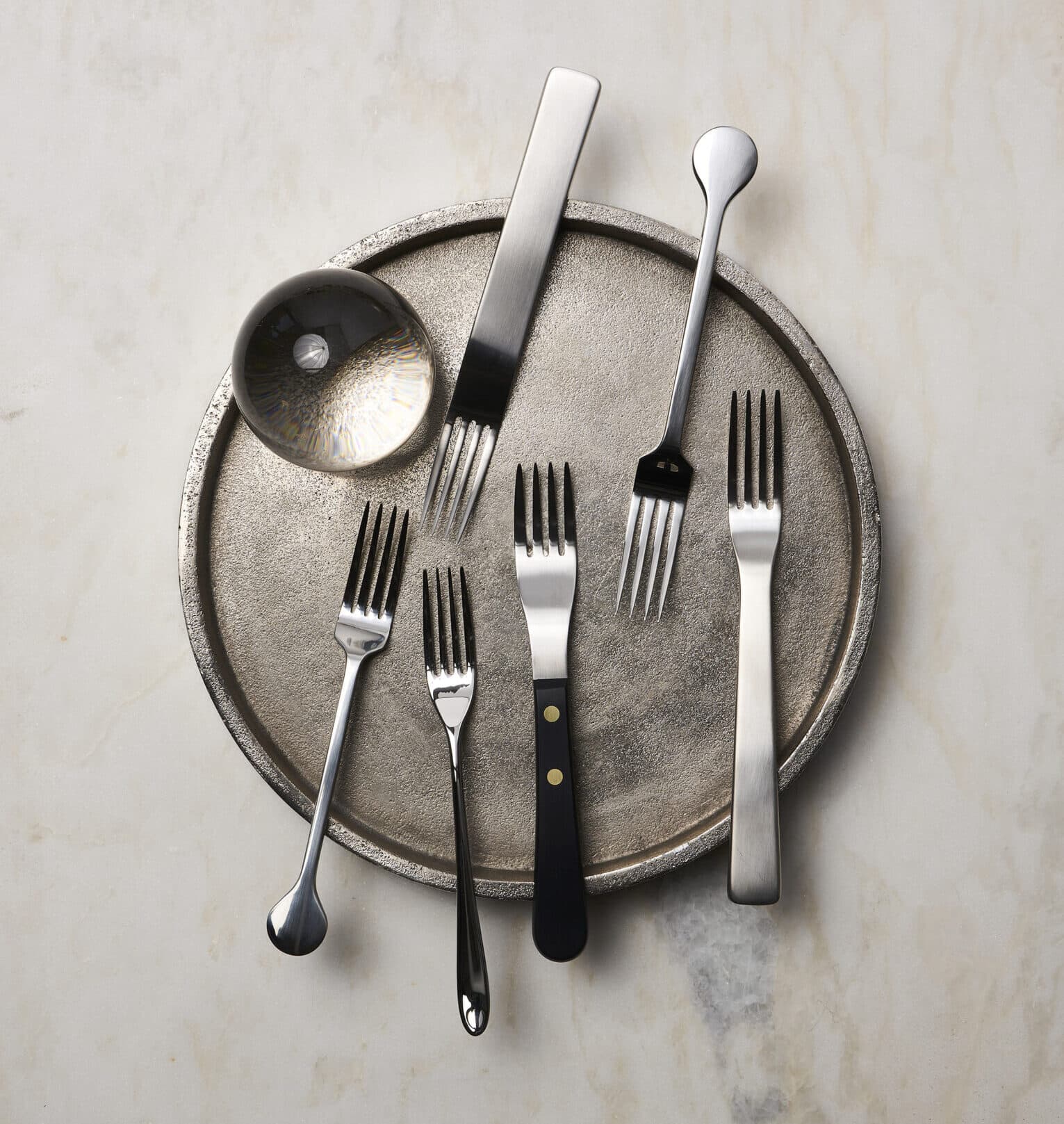
Though it seems like it might not make much of a difference, when we replaced the existing light switches and outlets with new ones—Legrand Radiant outlets in matte black and Amerelle Elan brushed nickel wallplates—the space became instantly more posh. We also spent hours deliberating on dishes, flatware, tape dispensers, and staplers. I can wholeheartedly say there isn’t an ugly thing in the entire office. It helps elevate the experience of being there.
-
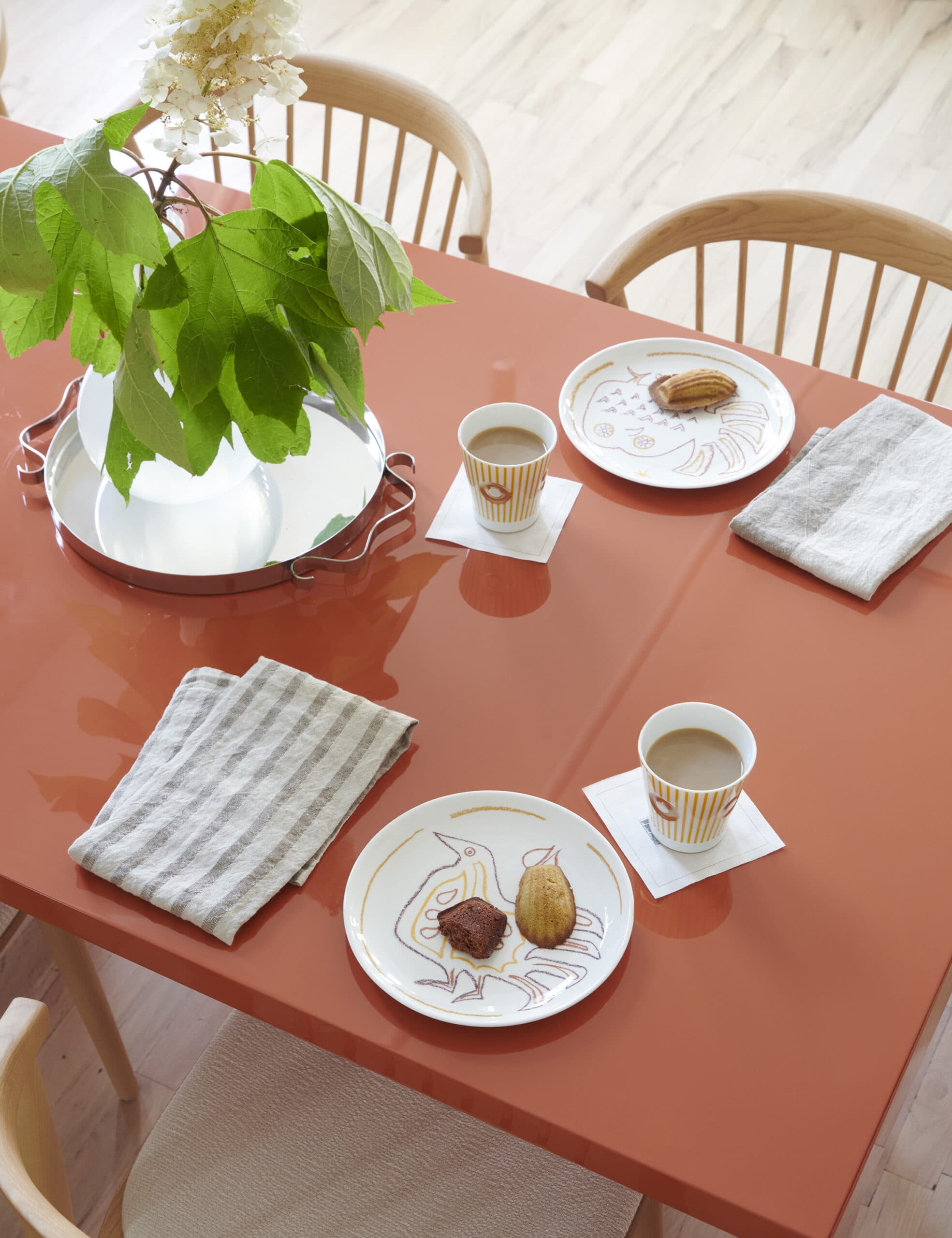
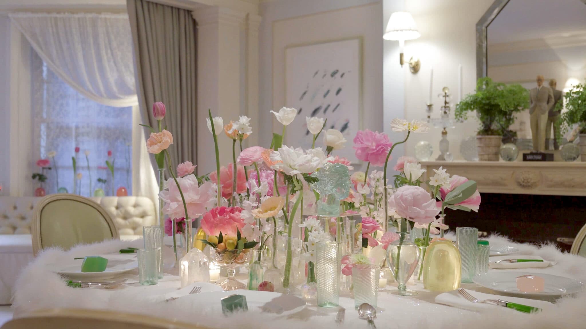
Marinette Salad Plates and Delphos Goblets from Bernadaud and a Sophie Lou Jacobsen tray add verve to coffee meetings (and coordinate with the orange Cappellini table).
-
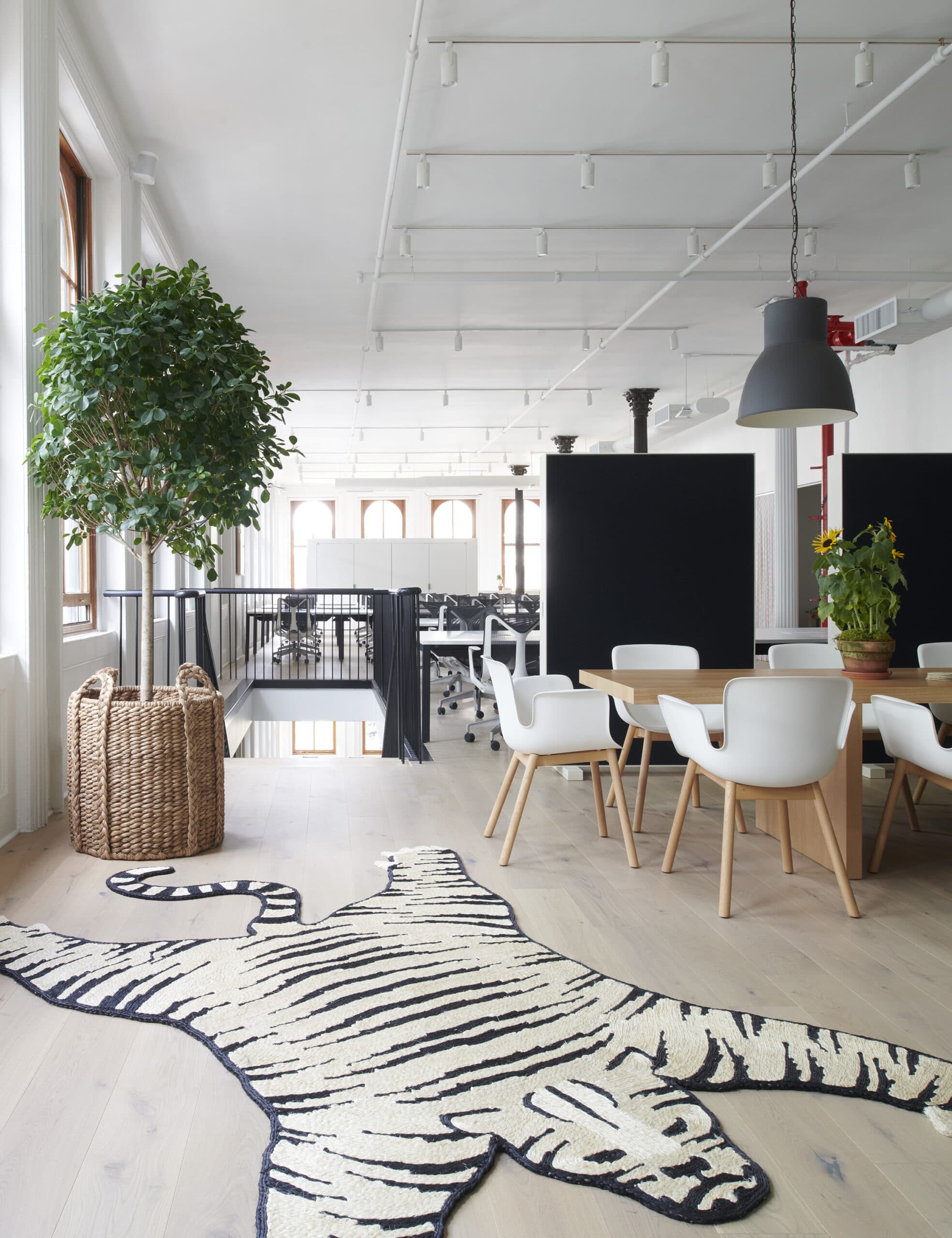
A Tigre Rug by Charlap Hyman & Herrero for Patterson Flynn sets a playful note on the third floor landing.
Have Fun!
We’re a sophisticated company but we’re not stuffy, and we wanted to make sure that spirit of playfulness came across. We installed a riff on a tiger skin rug made from abaca, a surprising lacquer orange conference table, and lots of whimsical lighting, including some sconces with playful birds. We even took the residential decorating trick of using coordinating fabric and wallpaper, covering some meeting rooms in head-to-toe pattern.
-
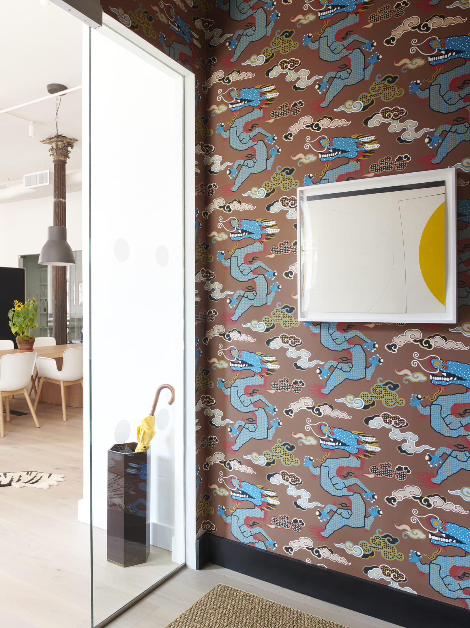
Each elevator landing has its own signature wallpaper. On the third floor, it’s Magical Ming Dragon by Johnson Hartig/Libertine for Schumacher.
-
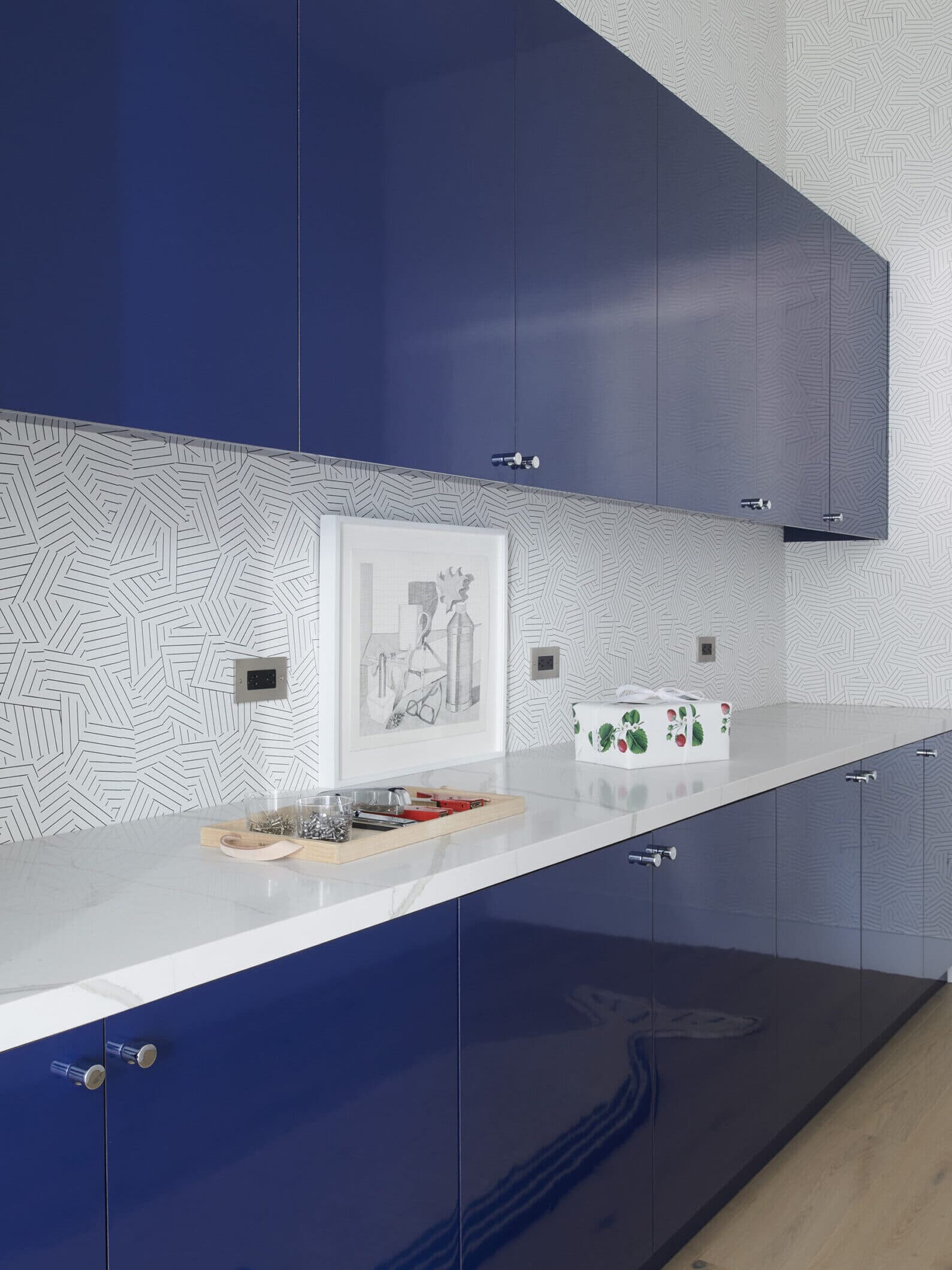
Even the mailroom has personality, with blue lacquered cabinets and Deconstructed Stripe by Miles Redd for Schumacher wallpaper.