


Instantly elongating and effortlessly elegant, stripes have been a wardrobe staple since time immemorial. Painting them on walls (or ceilings or millwork or even floors) can create a similar effect, drawing eyes to all the right places—and hiding a few flaws along the way.
-
BEYOND THE PALE
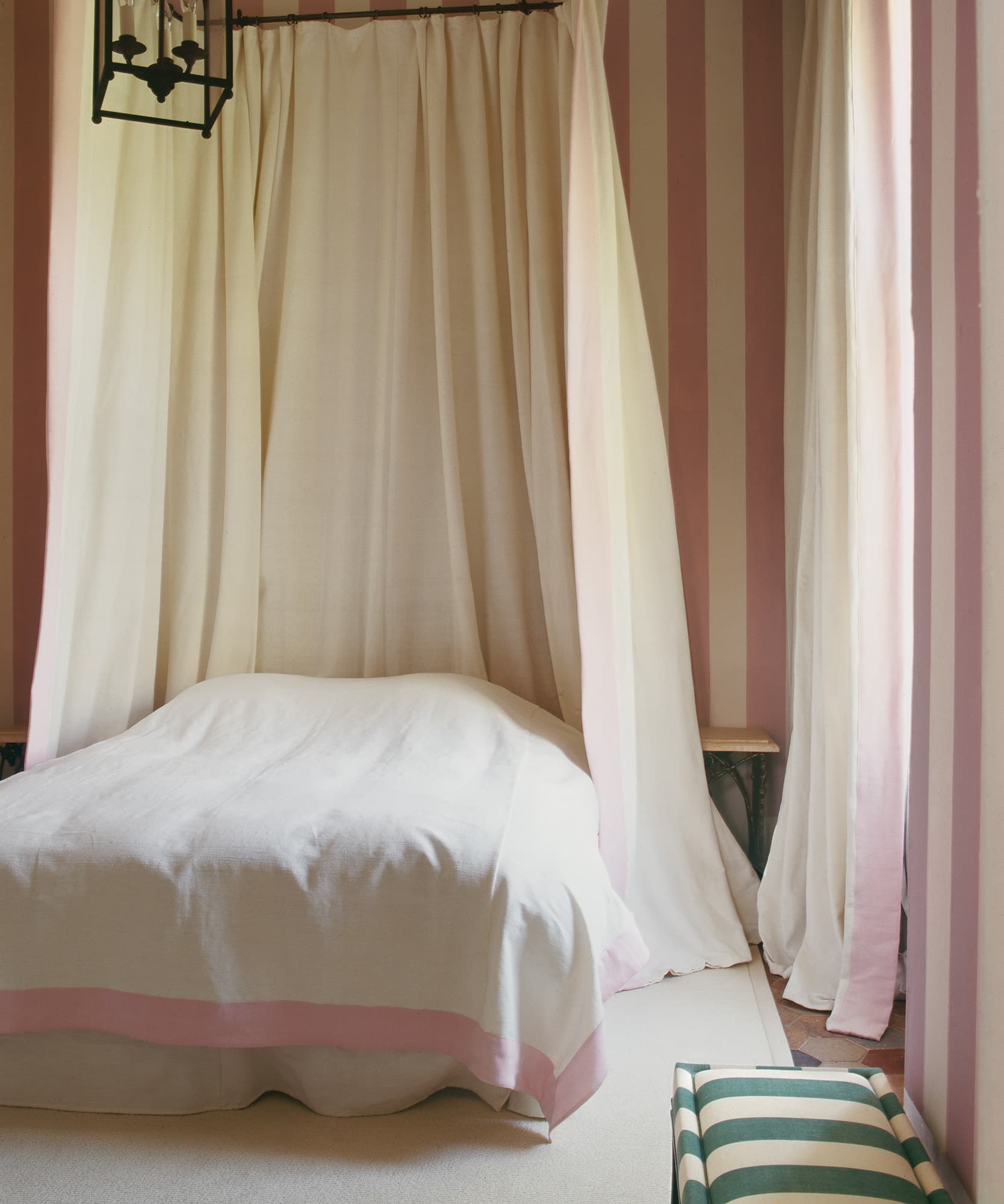
Graphic stripes needn’t overwhelm: Frédéric Méchiche chose soft pink and cream to create an airy bedroom that feels anything but brash for a chateau near Chantilly. A pink-bordered duvet brings it all into harmony.
René Stoeltie -
MAKE A STATEMENT
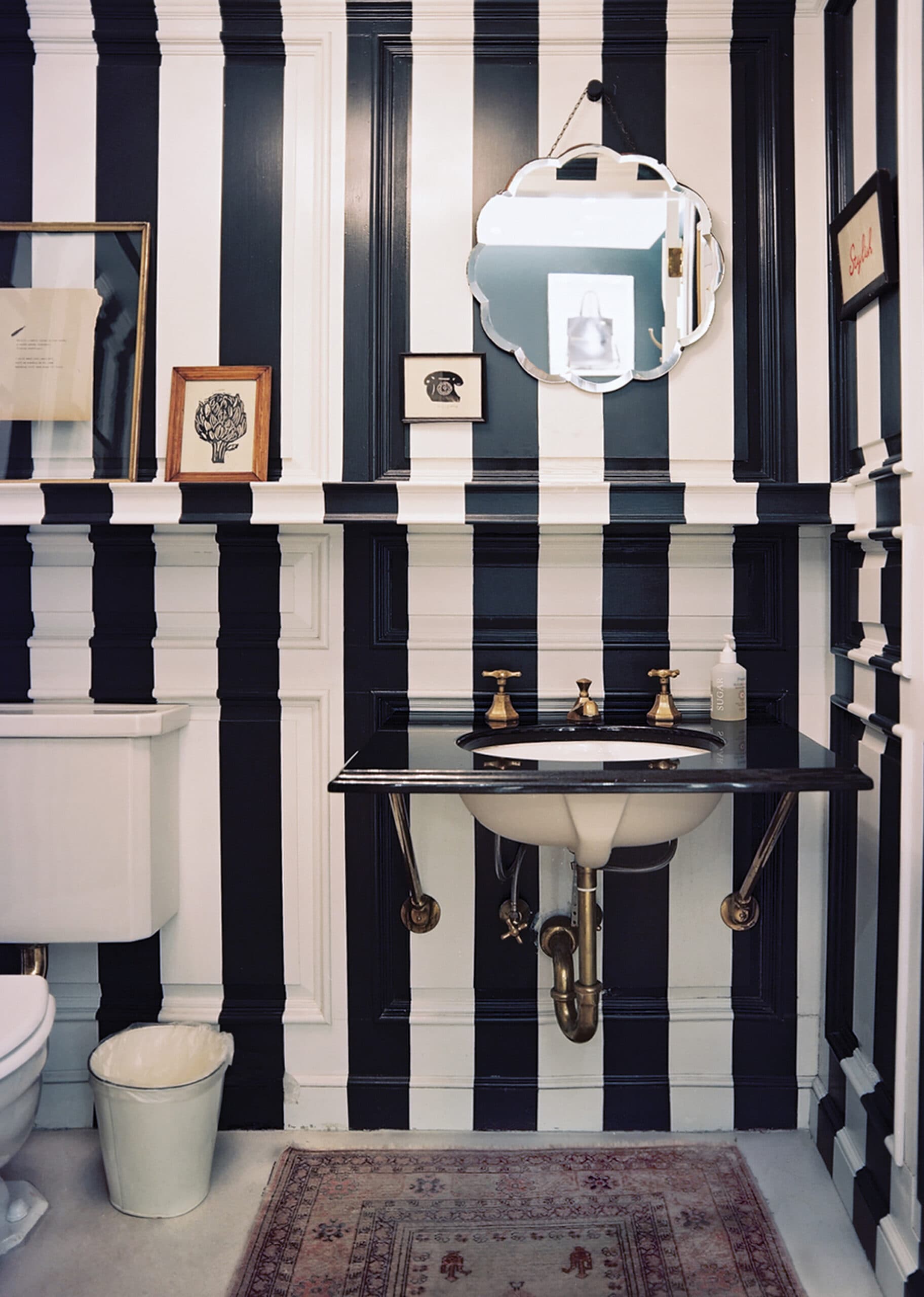
At the J.Crew Collection store on Madison Avenue, the brand’s former creative director Jenna Lyons took a no-holds-barred approach, painting powder room walls from top to bottom in black and white—and camouflaging fussy millwork in the process.
Patrick Cline -
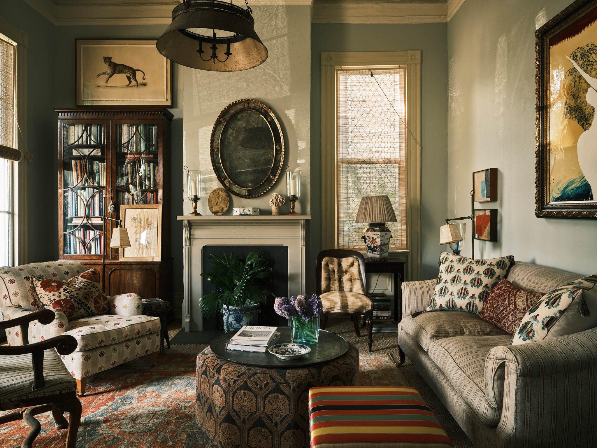
LOOKING UP
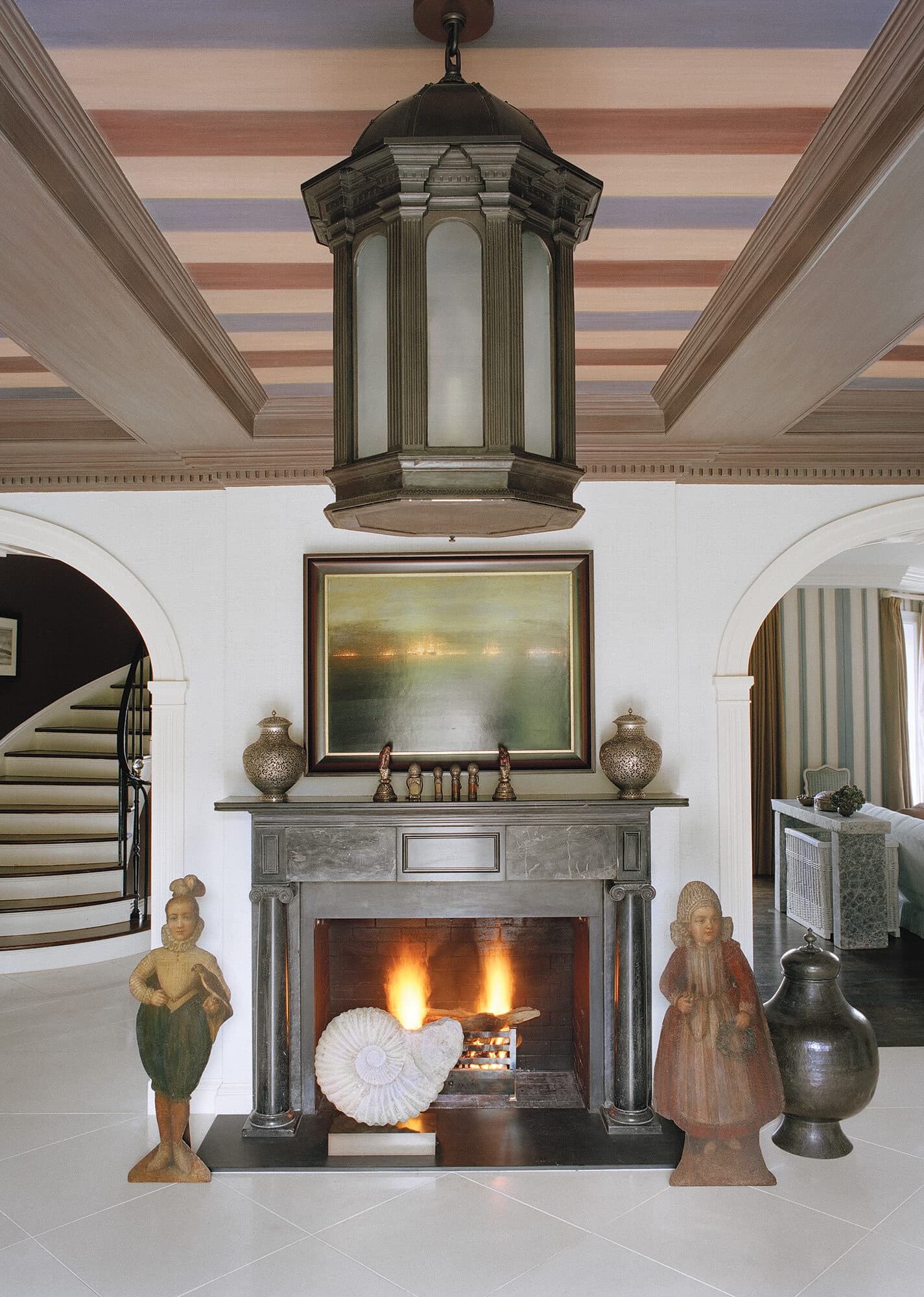
Stephen Sills used a striped ceiling in earthy tones to warm up a white-walled room and emphasize the rustic woodwork within. A brass lantern and eclectic art lend a dash of global flavor.
François Halard / Trunk Archive -
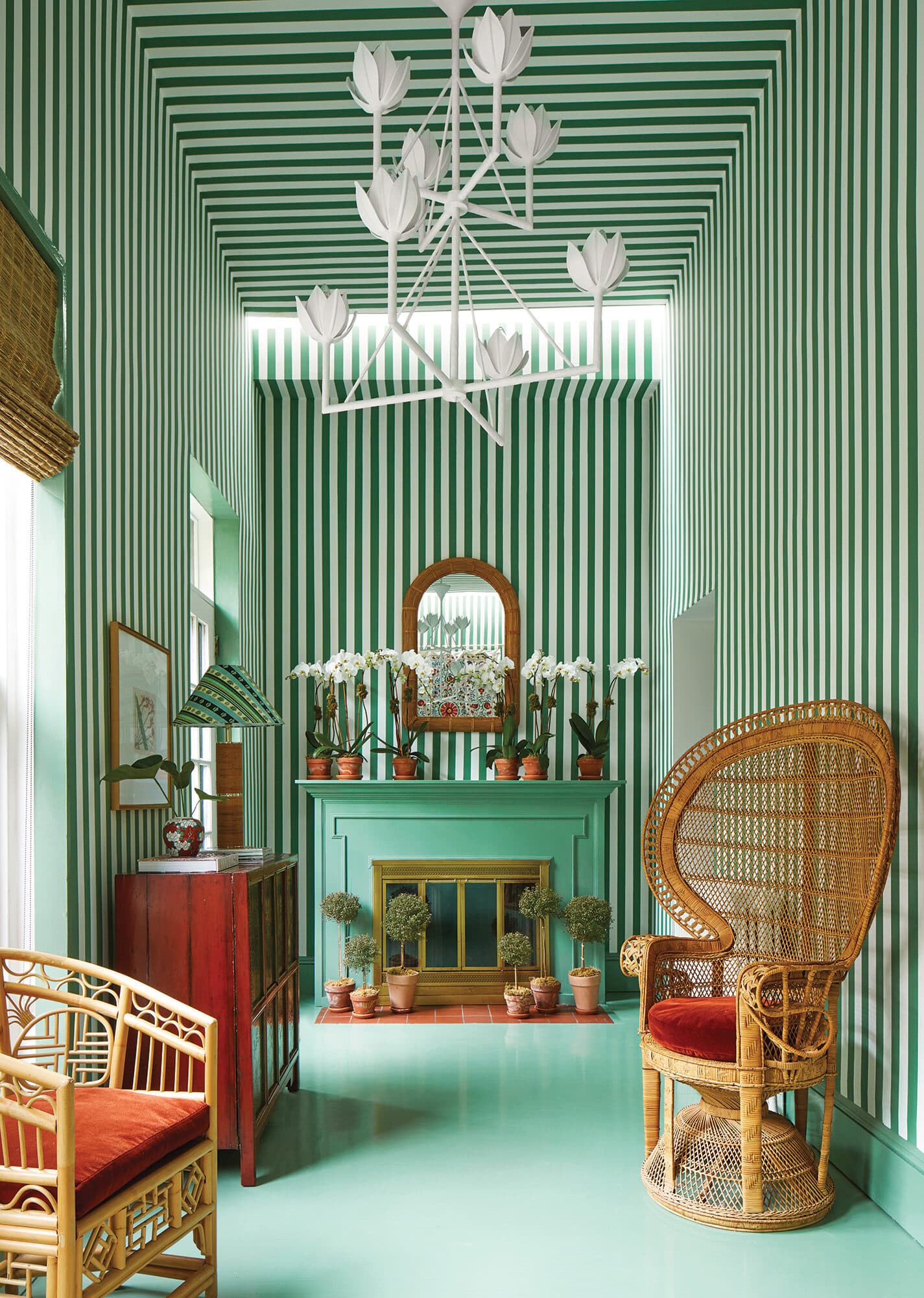
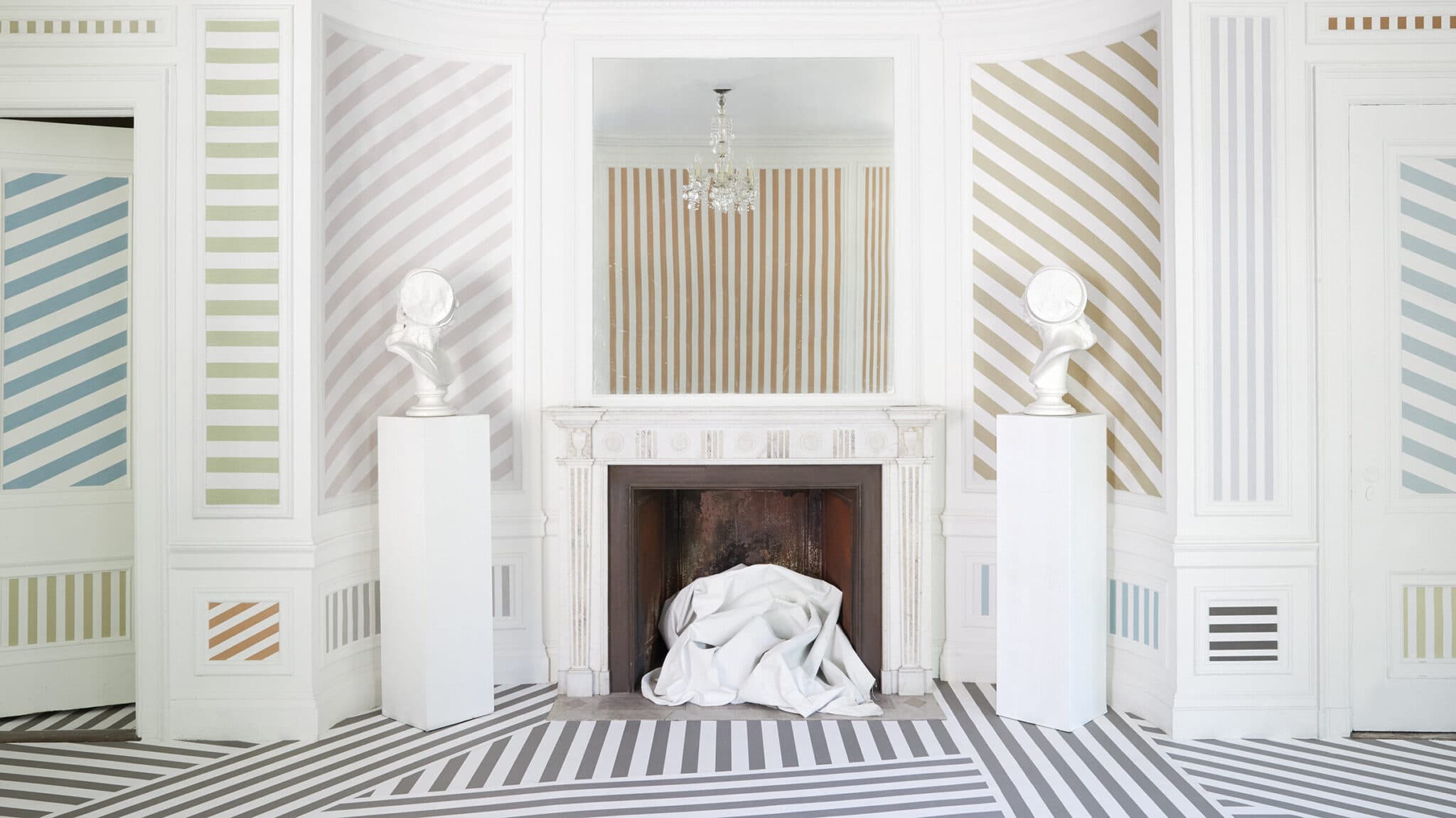
GOING MONOCHROME
We’re more than a little envious of this gorgeously green space by Nicholas Obeid. Stripes on the walls and ceiling could make for a dizzying effect, but the tightly controlled palette keeps everything neatly in line.
Gieves Anderson / Trunk Archive -
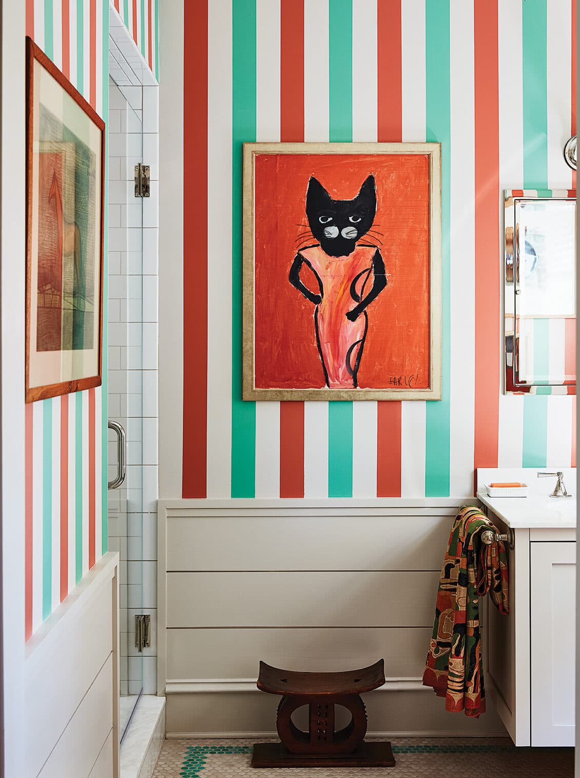
OPPOSITES ATTRACT
Need proof that even the most unexpected color combinations can look right when in the form of classic stripes? Sheila Bridges used white space to make spicy red and brilliant turquoise feel like the most natural pairing.
Frank Frances -
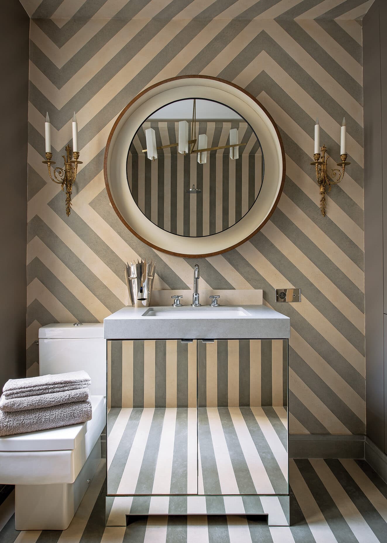
NEUTRAL STATE
With stripes veering off in all directions (and further refracted by the mirrored vanity), the op-art effect of this Jean-Louis Deniot–designed bath is tempered by the muted gray and cream shades that make up the motif.
Xavier Bejot -
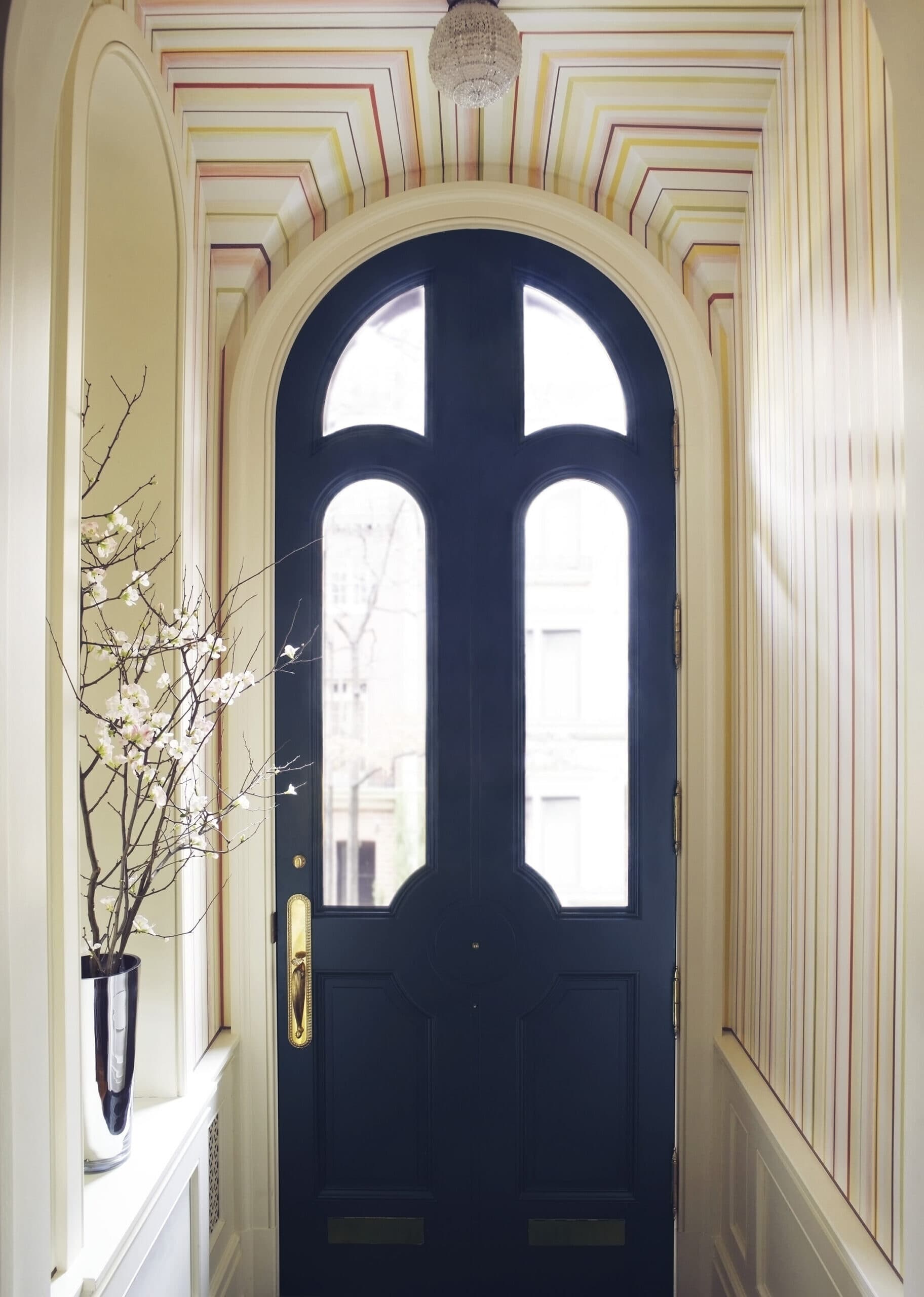
COLOR THEORY
Look closely at the sorbet-hued stripes surrounding the arched doorway of this Manhattan brownstone: They’re playfully asymmetric, bringing levity to the Jeffrey Bilhuber–designed space.
Pieter Estersohn -
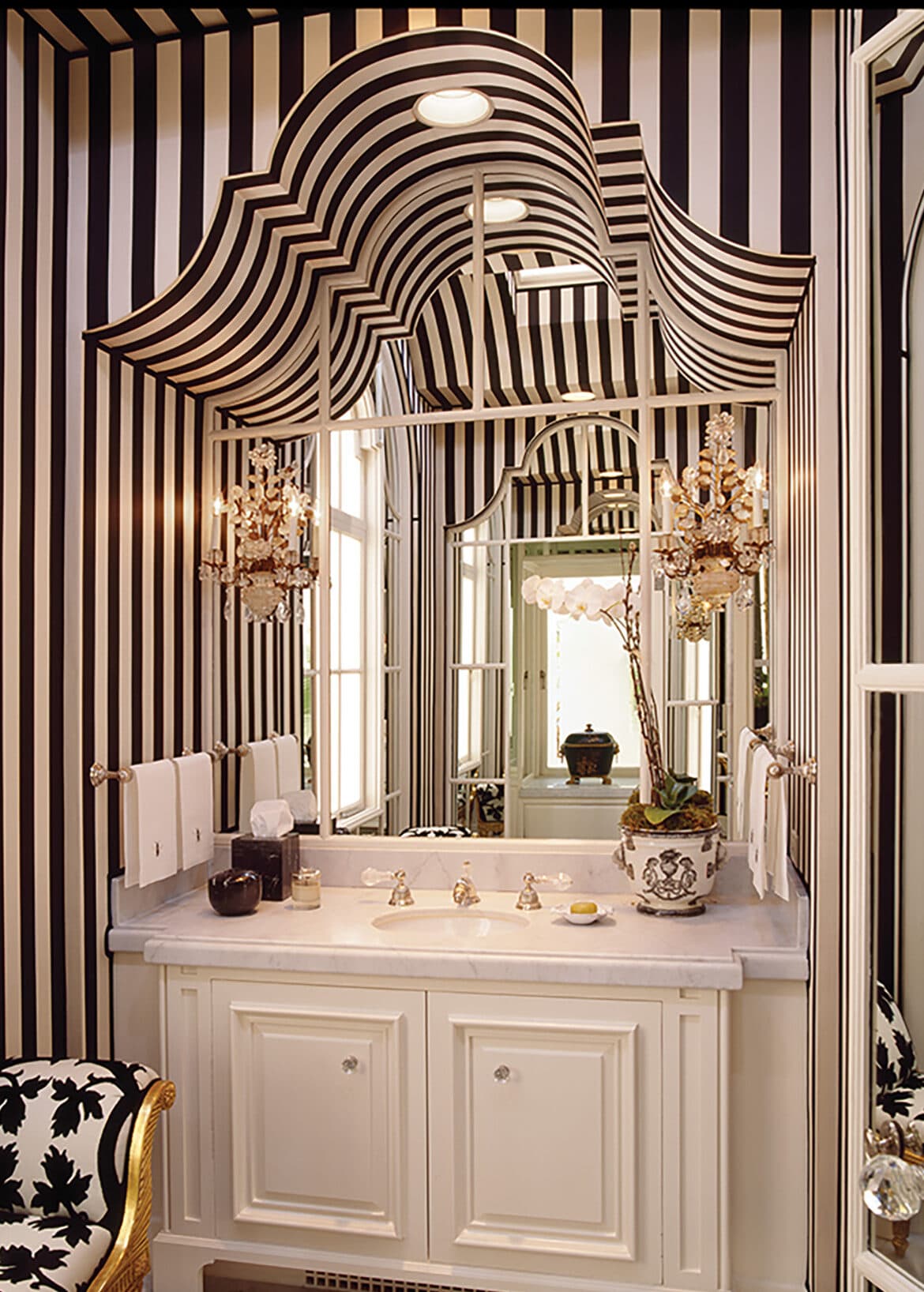
MAJOR THEATRE
Elsie de Wolfe meets My Fair Lady in this dramatic powder room by Suzanne Tucker, where black-and-white stripes highlight the graceful curves of the vanity niche and antique French sconces add a twinkling glamour.
Ken Gutmaker / OTTO
BEYOND THE PALE
Graphic stripes needn’t overwhelm: Frédéric Méchiche chose soft pink and cream to create an airy bedroom that feels anything but brash for a chateau near Chantilly. A pink-bordered duvet brings it all into harmony.
René StoeltieMAKE A STATEMENT
At the J.Crew Collection store on Madison Avenue, the brand’s former creative director Jenna Lyons took a no-holds-barred approach, painting powder room walls from top to bottom in black and white—and camouflaging fussy millwork in the process.
Patrick ClineLOOKING UP
Stephen Sills used a striped ceiling in earthy tones to warm up a white-walled room and emphasize the rustic woodwork within. A brass lantern and eclectic art lend a dash of global flavor.
François Halard / Trunk ArchiveGOING MONOCHROME
We’re more than a little envious of this gorgeously green space by Nicholas Obeid. Stripes on the walls and ceiling could make for a dizzying effect, but the tightly controlled palette keeps everything neatly in line.
Gieves Anderson / Trunk ArchiveOPPOSITES ATTRACT
Need proof that even the most unexpected color combinations can look right when in the form of classic stripes? Sheila Bridges used white space to make spicy red and brilliant turquoise feel like the most natural pairing.
Frank FrancesNEUTRAL STATE
With stripes veering off in all directions (and further refracted by the mirrored vanity), the op-art effect of this Jean-Louis Deniot–designed bath is tempered by the muted gray and cream shades that make up the motif.
Xavier BejotCOLOR THEORY
Look closely at the sorbet-hued stripes surrounding the arched doorway of this Manhattan brownstone: They’re playfully asymmetric, bringing levity to the Jeffrey Bilhuber–designed space.
Pieter EstersohnMAJOR THEATRE
Elsie de Wolfe meets My Fair Lady in this dramatic powder room by Suzanne Tucker, where black-and-white stripes highlight the graceful curves of the vanity niche and antique French sconces add a twinkling glamour.
Ken Gutmaker / OTTOGetting It Straight
While stripes might seem simple—paint your wall in the lighter color, measure, mark, tape, apply the darker hue—the straightforward pattern can be tricky to master. We asked decorative artist Agustin Hurtado of Chango Brooklyn (a.k.a. the painter that Miles Redd and Nick Olsen keep on speed dial) to share his tips.
1. Prepare Your Canvas
The smoother the wall, the better the outcome. “If there’s any texture, it’s going to be hard to make the stripes look straight,” says Hurtado. He prefers a Level 5 drywall finish, which involves a skim coat for extra leveling.
2. Start From the Center
Despite appearances, most walls aren’t completely straight, says Hurtado. To account for any variance, he begins marking stripes from the center of a wall and works outward, fudging the distances as needed to make the final result look consistent.
3. Keep Edges Crisp
“There’s nothing worse than realizing that your paint has leaked under the tape,” cautions Hurtado. To avoid this, he recommends burnishing and then lightly sanding down the edges of the tape; the small amount of dust that gets trapped underneath will create a barrier, preventing any new paint from seeping in.
4. Don’t Spray It
A spray application might be ideal for certain jobs, but when it comes to stripes, stick to brushes. “Paint doesn’t absorb into the wall as well when it’s sprayed, so when you remove the tape, the paint can peel right off,” Hurtado explains.
5. Mix Up the Finishes
To create extra depth, especially when working with hues that are more similar in tone, consider alternating two different paint sheens. “We’ve also done stripes on Venetian plaster and then polished only one color,” Hurtado says. “It looks incredibly elegant.”
Get the Look
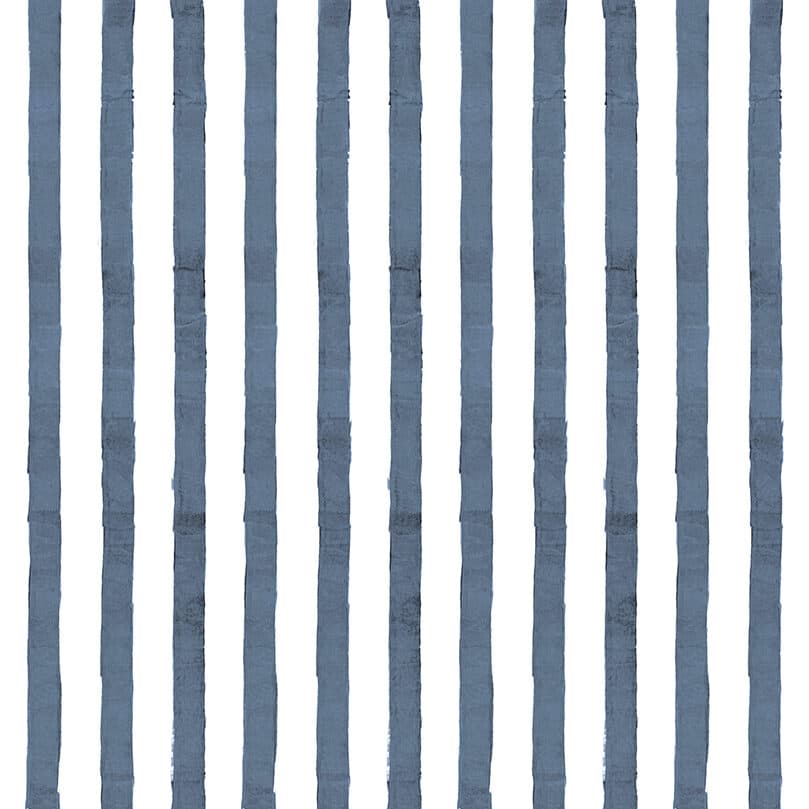
In a rush? Take a shortcut by swapping your paintbrush for a few rolls of these striped wallpapers.
-
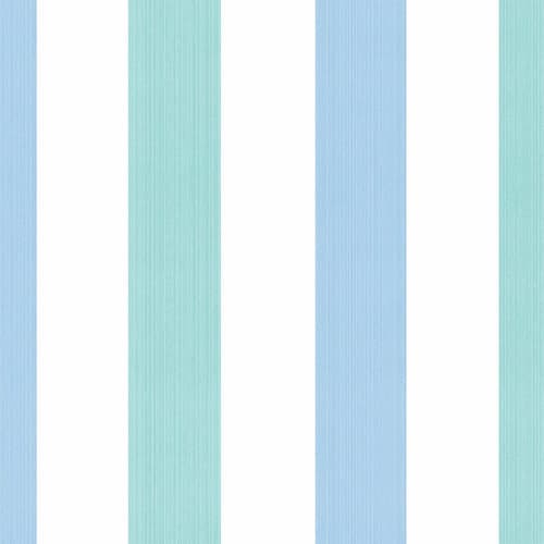
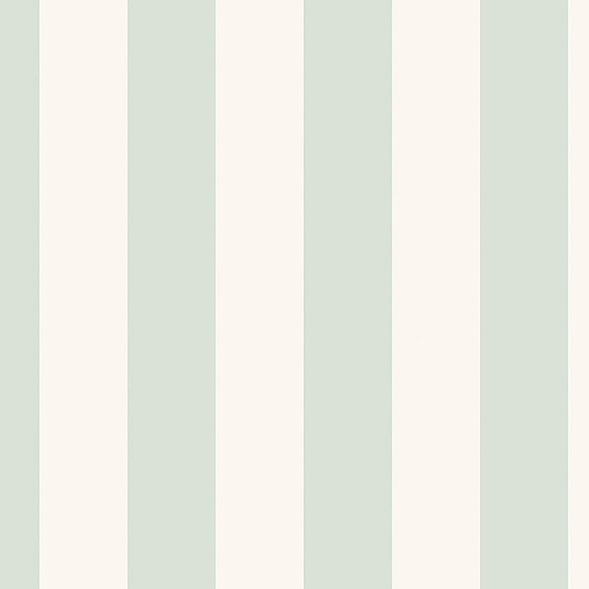
Hyde Park Stripe by Waterhouse Wallhangings
To the trade, waterhouse wallhangings.com
-

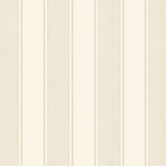
Baxter Stripe by Schumacher
$324 per roll, chairish.com
-
Ombrellino Stripe by C & C Milano
To the trade, cec-milano.uk
-
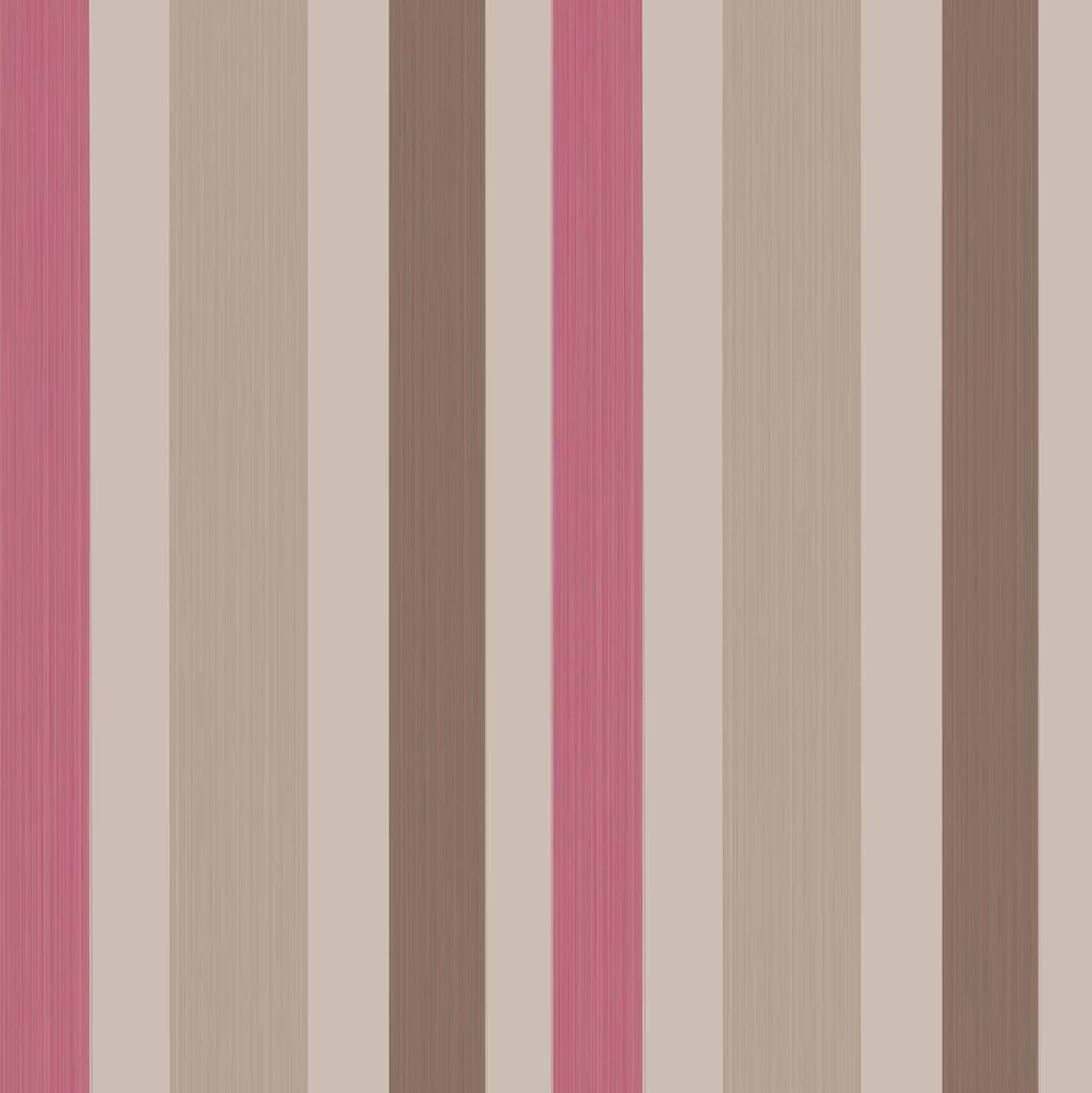
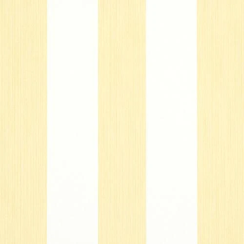
Chromatic Stripe by Farrow & Ball
$225 per roll, farrow-ball.com
-
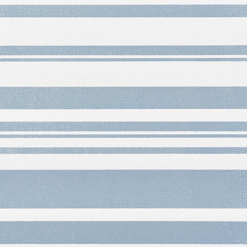
Falsterbo Stripe by Boråstapeter
$165 per roll, decoratorsbest.com
-
Horizon Paperweave Panels by Schumacher
$1,008 for two panels, chairish.com
-

Classic Stripe by Sheila Bridges
$300 per roll, sheilabridges.com
-
Campbell Stripe by Peter Fasano
To the trade, peterfasano.com
-
Edwin Stripe Wide by Schumacher
$420 per roll, perigold.com