

Our new favorite addition to the neutral color palette, rich green is all the buzz—for good reason! This chameleon-like hue can completely alter the mood of a room, from dark and moody evergreen to playful and vibrant lime. We caught up with some of our favorite design connoisseurs to get the scoop on the green paints they return to again and again.
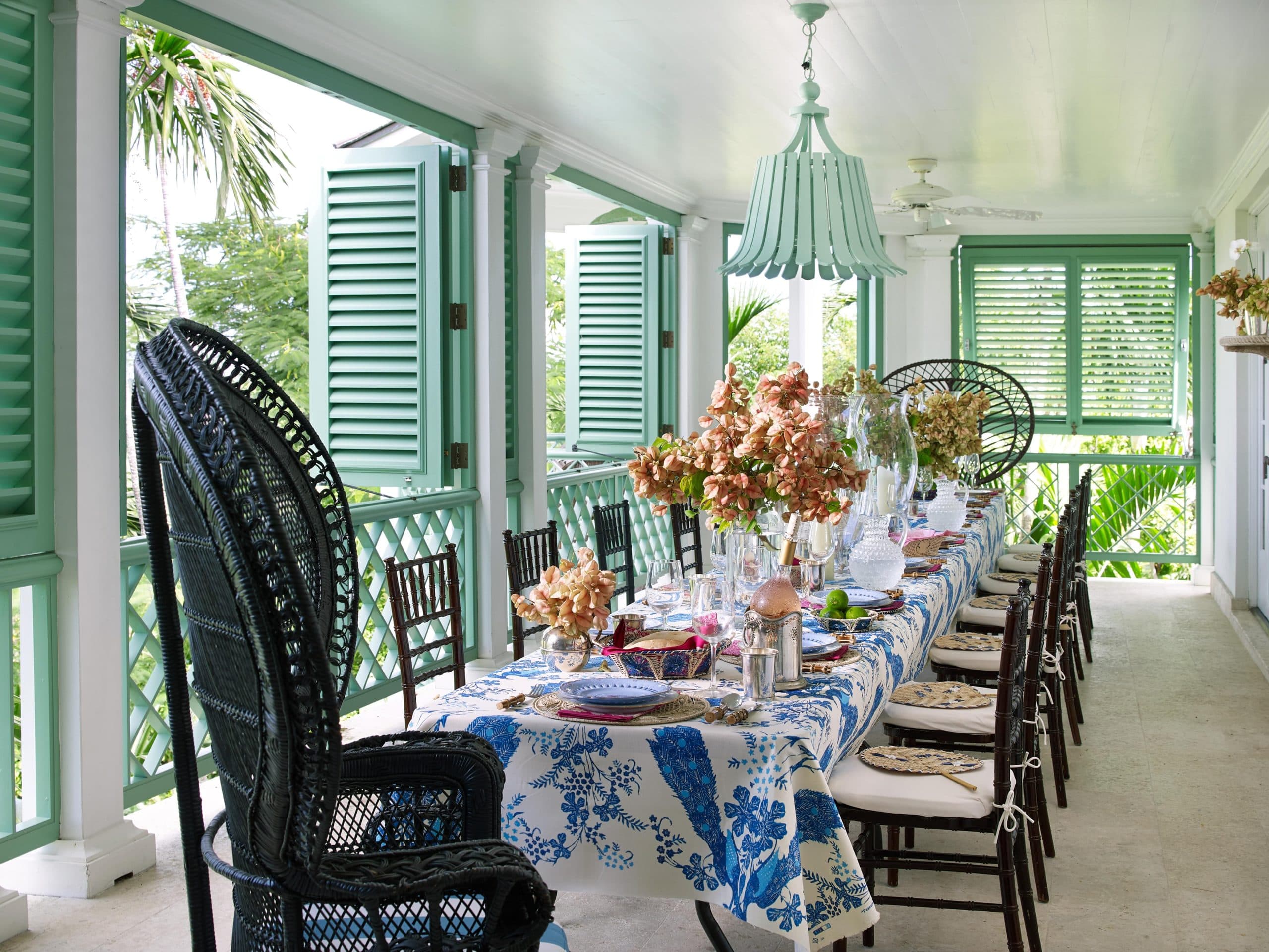
Featured in Lindroth’s book, Island Hopping (Vendome), the railing and shutters of this dining space are painted in Benjamin Moore’s Southfield Green.
Tria GiovanSouthfield Green by Benjamin Moore
“I’ve long been a fan of Oliver Messsel and his signature green, which he used on trim and shutters throughout his classical projects in Barbados and Mustique. It can best be replicated through Benjamin Moore’s Southfield Green, which is also wonderful on tired wicker furniture—gives everything a refreshing touch!” –Amanda Lindroth
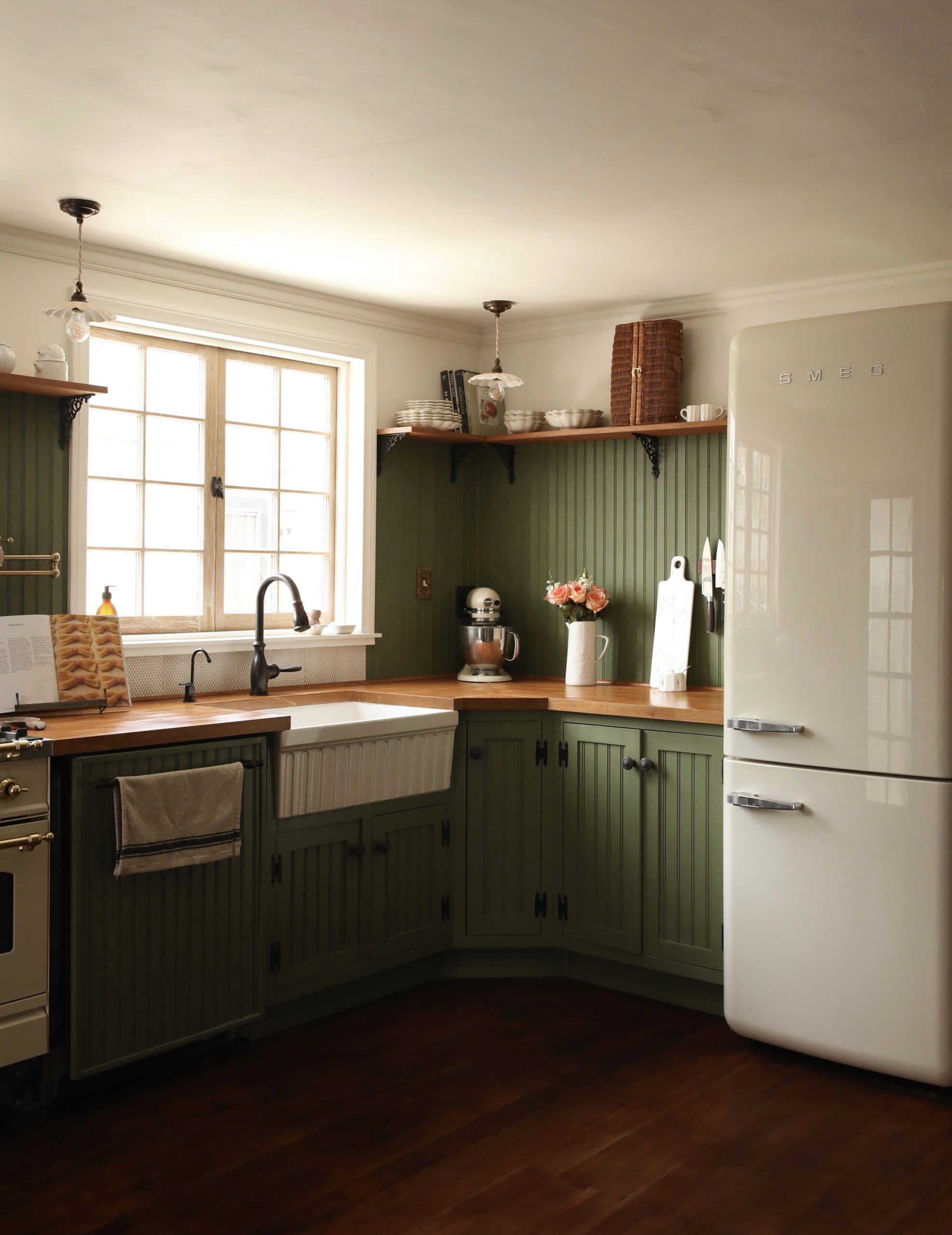
Halverson employed Backdrop’s Lawn Party to add comfort to her kitchen.
Eric NeujahrLawn Party by Backdrop
“I was hunting for the perfect green shade for our kitchen—the moment I swatched Lawn Party, I knew I’d found the right hue that feels perfectly cozy and calming whenever I look at it.” – Courtney Halverson
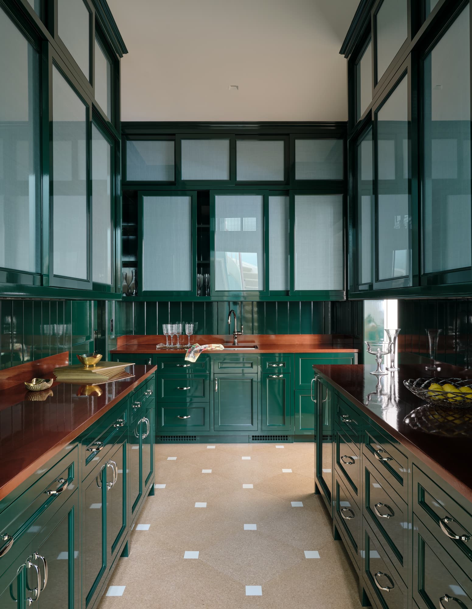
Chrome Green HC-189 by Benjamin Moore
“They call this color ‘Chrome Green’ but I really see it as a Magnolia Green. It’s cool in the hot light of summer and warm in the chill of winter – very few colors can do that.” – Miles Redd
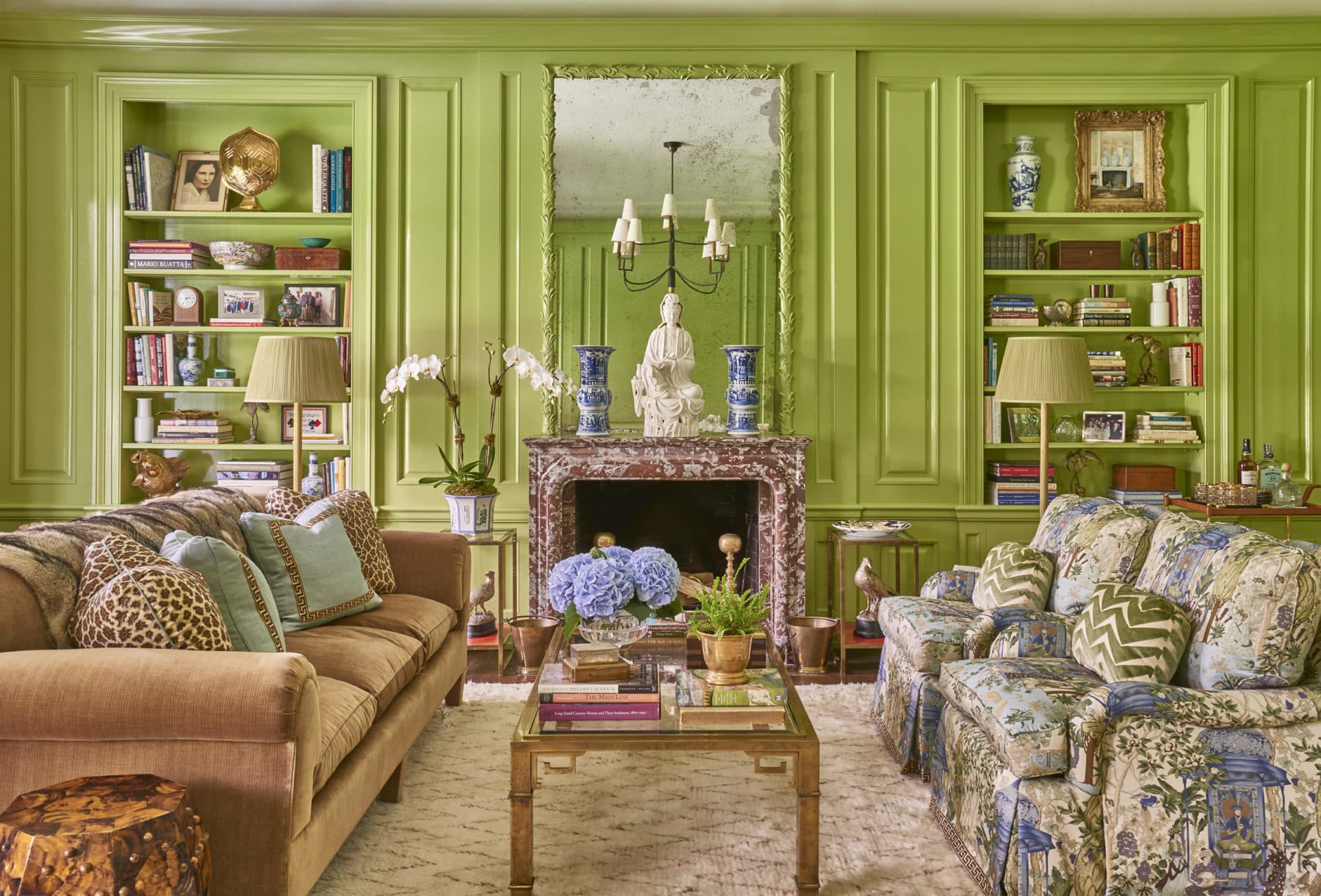
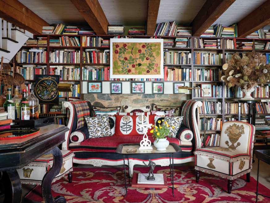
Braff added some gloss with Benjamin Moore’s Vienna Green on the paneling of her Locust Valley library.
Savage GibsonVienna Green by Benjamin Moore
“The green paint makes the room without feeling heavy or cartoony. Paired with a Moroccan style carpet, delphinium blue accented fabrics, ebonized furniture and brass accents, the lacquered green library is one of my favorite rooms.” – Meg Braff
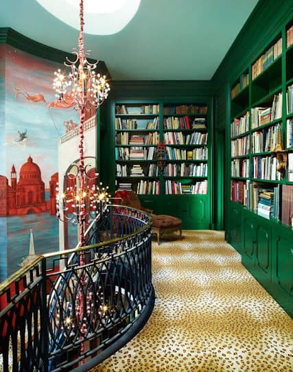
Deep Jungle No. 595 by Benjamin Moore
“I like vibrant colors—though will use pastels when requested by clients—I always chose clear jewel tones. Faded, washed out, or toned down shades don’t interest me unless they’ve faded naturally over centuries of wear and exposure. Green is my fetish color…and I consider it to be a neutral color too.” – Hutton Wilkinson
Neal gave this door’s interior a playful twist, drenching it in Basset Hall Green by Benjamin Moore.
Cate Black PhotographyBassett Hall Green CW 480 by Benjamin Moore
“I love what the color green represents—growth, renewal and harmony. I wanted this door immersed in it!” – Sherrell Neal
Boothby dipped the walls and trim of this room in Vert de Terre by Farrow & Ball.
Read McKendreeVert de Terre No. 234 by Farrow & Ball
“It has enough gray undertones that it makes for a perfect sage green without any pastel feel to it and seems to go with everything. It can be both youthful and sophisticated!” – Chauncey Boothby