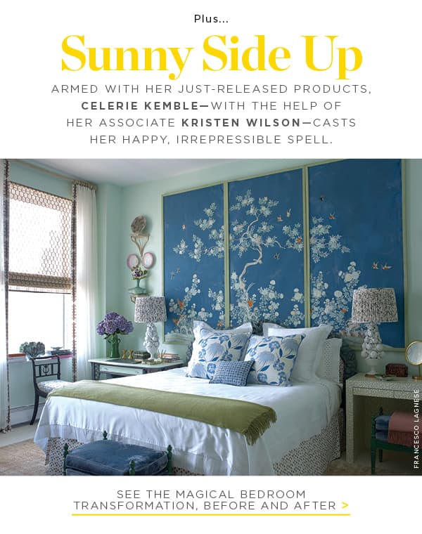

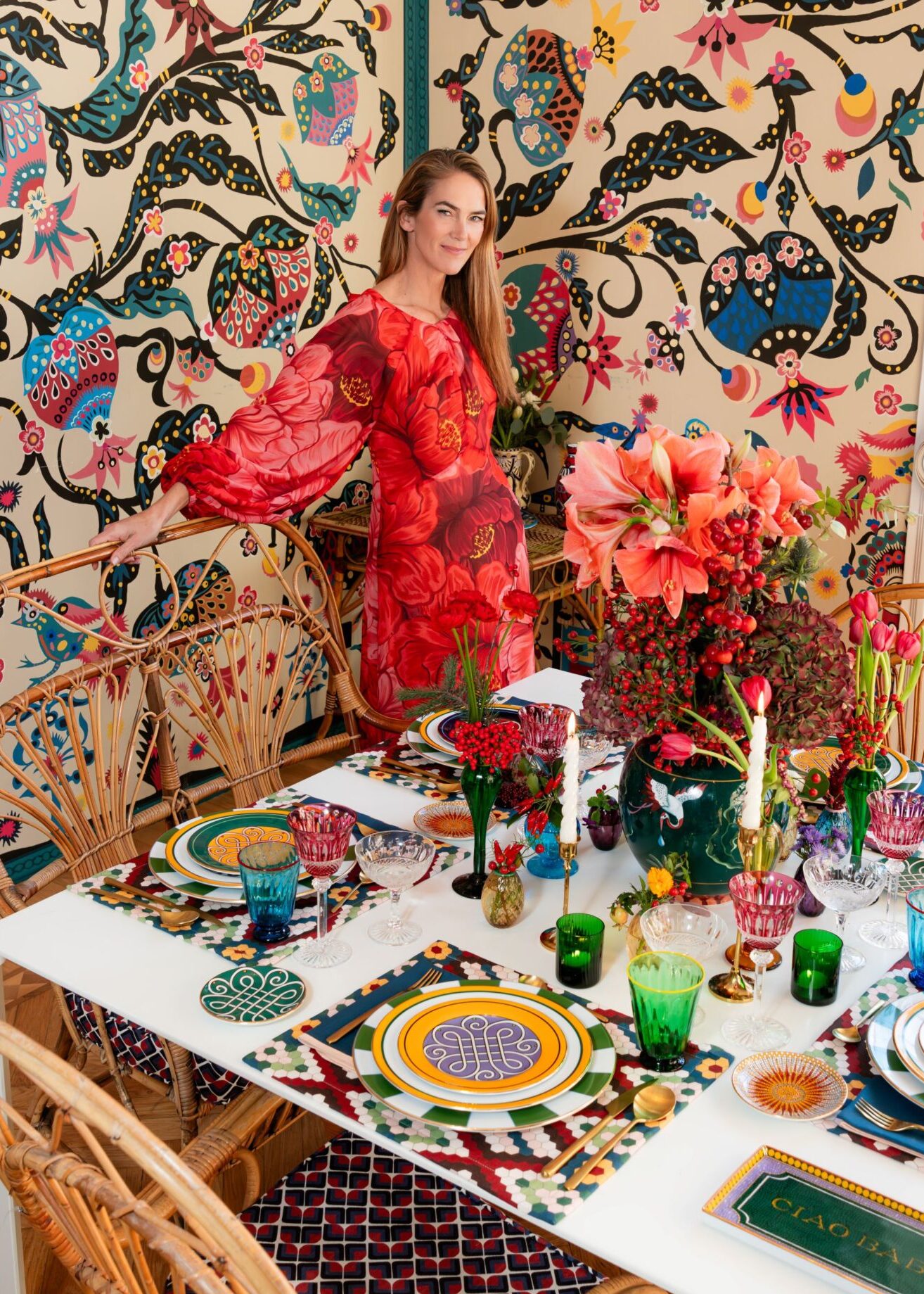

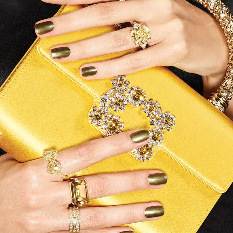


Using her own experience as a decorator, Celerie Kemble has created a toolkit of fabrics, wallcoverings and trims in fresh patterns and happy colors that you can’t help but fall in love with. So we picked her brain for ideas on using pattern, finding inspiration—and so much more!

How would you describe your style?
Lighthearted and fresh while based in the classic vocabulary of old Palm Beach, New York—and, now, a little more Los Angeles. That may seem a geographic stretch, but it is where I spend most of my time now and pick up inspiration. I’m not sure what is more exciting to me: color or patina. Both are essential.
How do you get out of a creative slump?
In the past few years, since having kids pretty much destroyed the concept of quiet time at home, I’ve found that a long flight and some caffeine usually gets the bingo wheel of ideas turning. Being a little antsy but strapped into a seat can sometimes make the most magic happen in my imagination. The challenge is holding the idea and bringing it forward into a live project. I have tear sheets, torn-out magazine images, saved Instagram grabs and Pinterest boards on all my devices, in my purses and across my desks and night tables.

Who are your personal style icons?
My close but most super stylish friends Michael DePerno, Amanda Brooks, Bronson van Wyck and Lela Rose. Their creativity and passion are obvious in how each embodies their distinct style. They are live and evolving examples of impeccable taste but always completely themselves. They are all creators. That’s what I think of as true style.
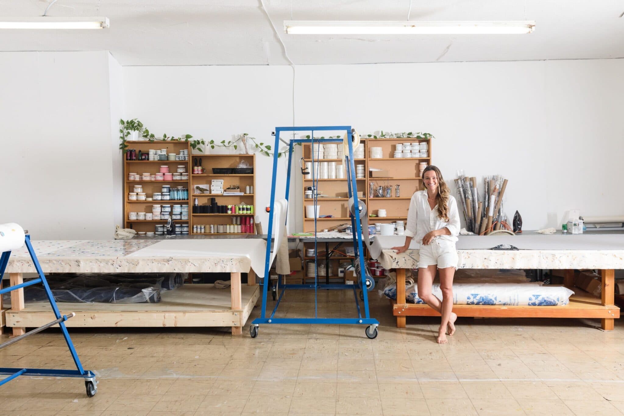
We’re so excited about your new collection with Schumacher. How does it relate to your past collections?
When I am allowed to design my own fabrics, which is different from decorating for a client, I am set free to actually build new tools for my business. I try using new textures and scale, and to address color like I’m looking for a new flavor. Though I deeply love my older patterns and colors, I get thirsty for new ones. That’s why we are adding a light chintz, almost modish floral, and new colors in fawn and pink grapefruits.

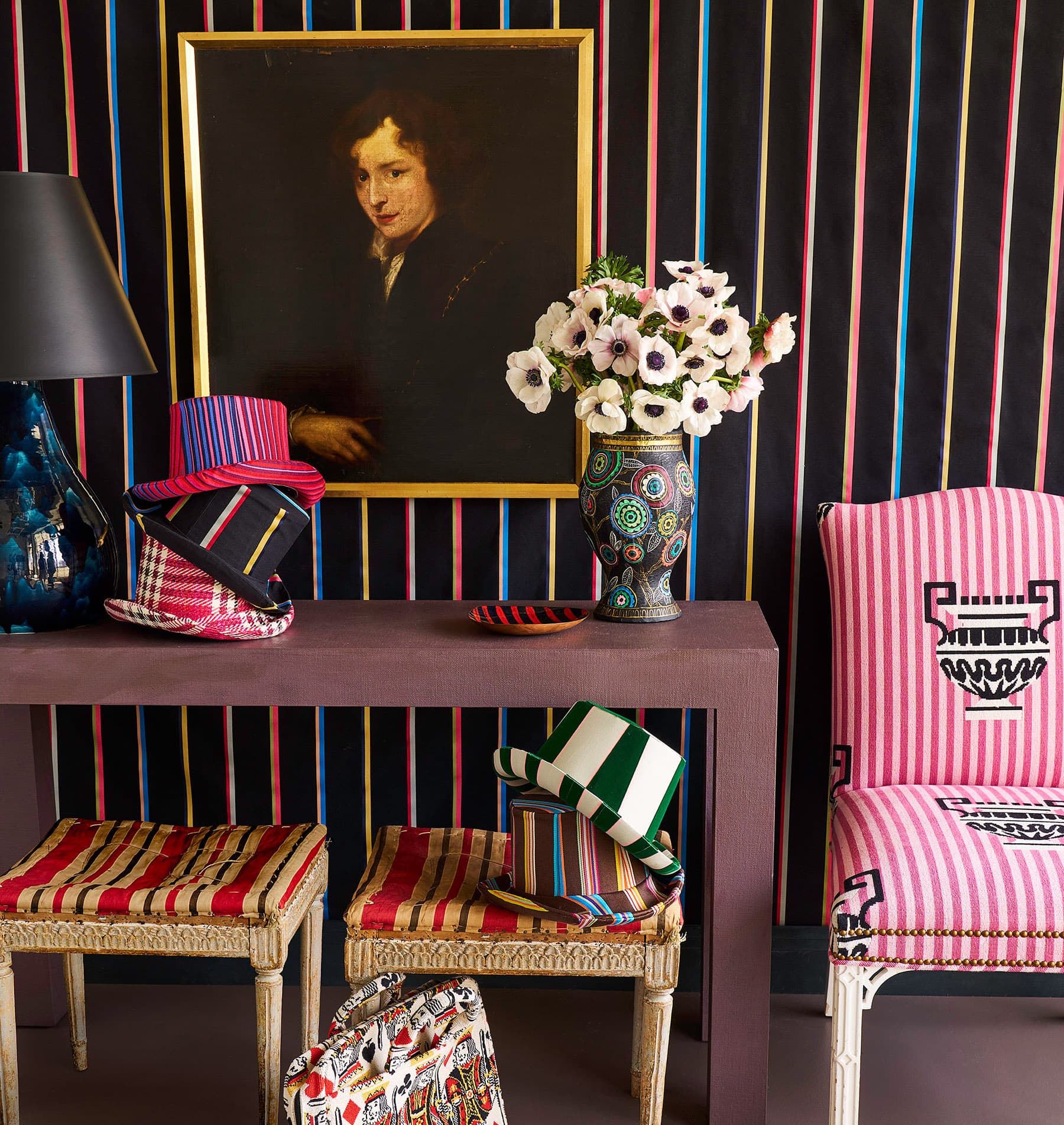
What were your major inspirations for the new collection?
I took a lot of inspiration from vintage garments (linings and scarves), old watercolor palettes, and the graphic floral upholstery fabrics from my childhood home, which were very ‘70s and ‘80s.
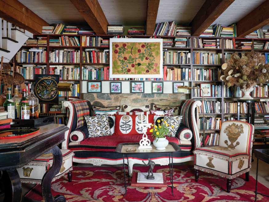
What’s your best tip for mixing patterns in a space?
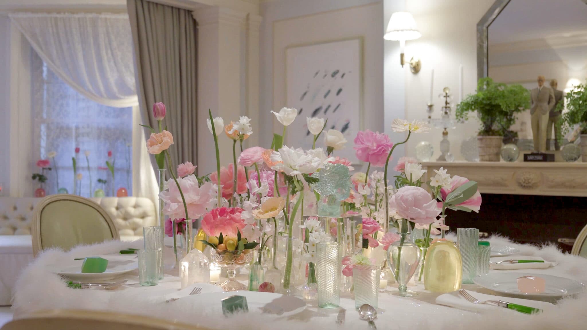
I have a slightly weird philosophy on pattern. It is based on the idea that, like in nature, the more variety is present, the more calming and seemingly right the environment can be. I’m more stressed out by a design scheme that has exact matches and perfect coordination of only one or two patterns.
I think if two of your colors connect or at least almost match, you can mix almost any patterns together and weave in additional colors as long as you don’t start repeating more than two of the same scale or shape. It never hurts to have a vintage fabric element, too!
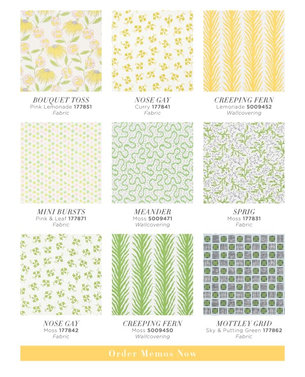
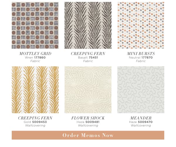
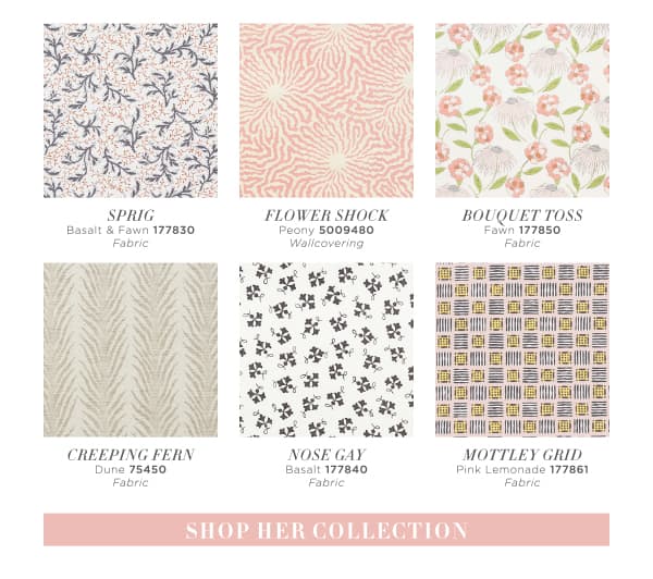
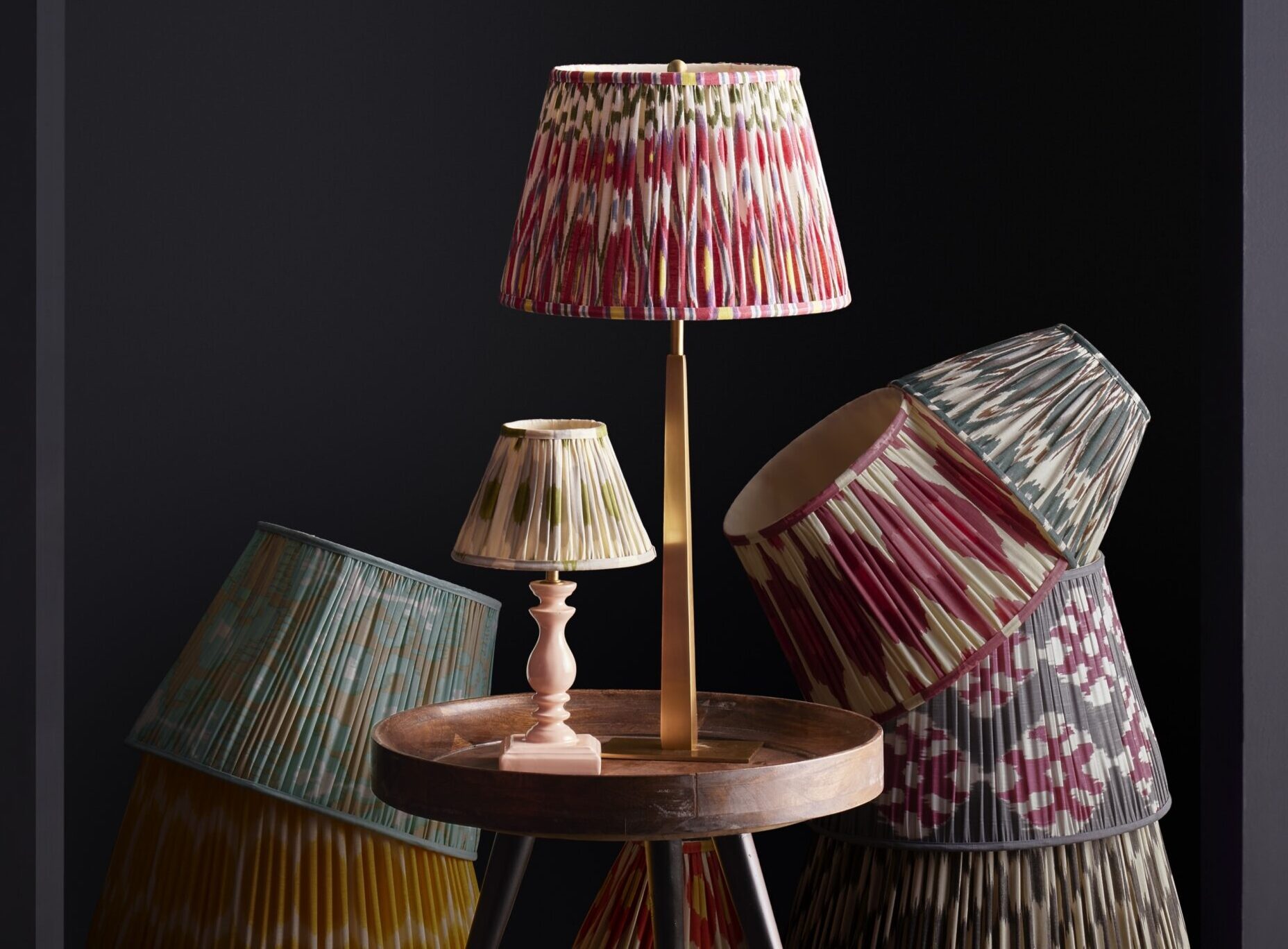
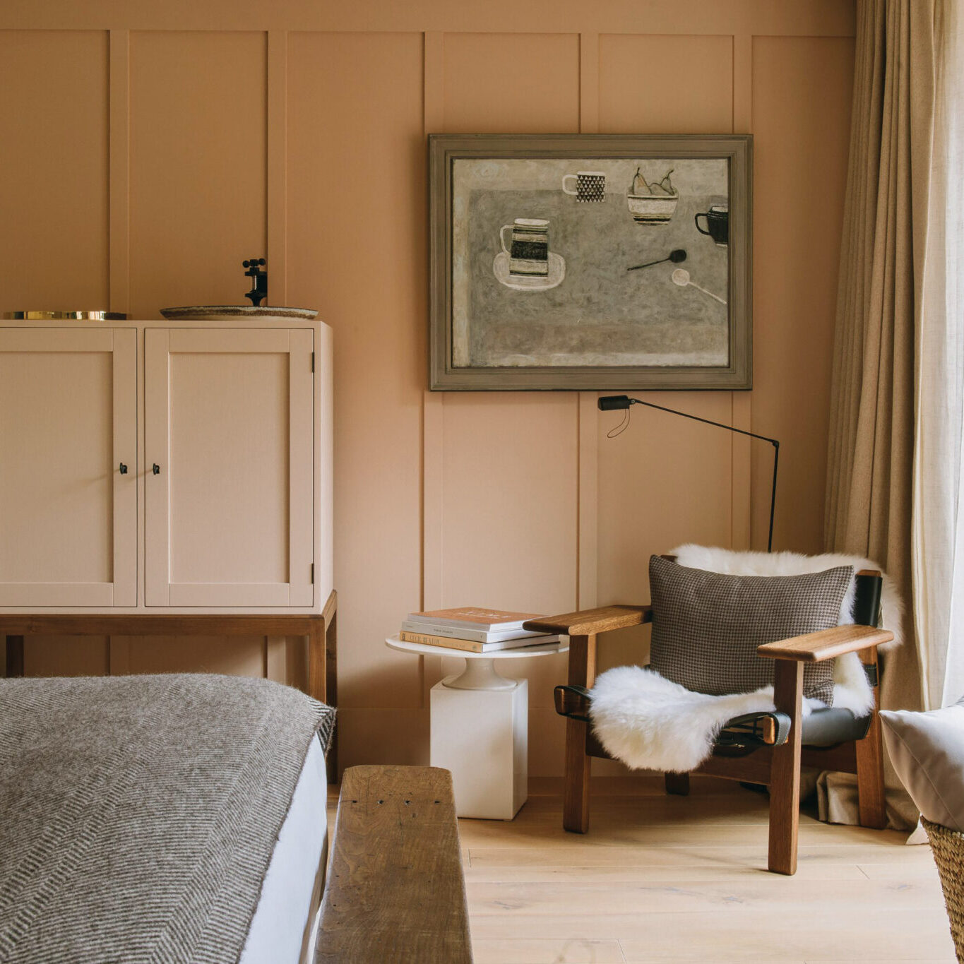
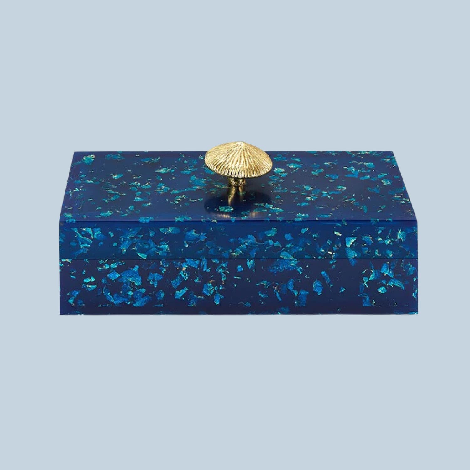
THE SCHUMACHER X CELERIE KEMBLE COLLECTION