


Interior designer Timothy Corrigan isn’t afraid of making strong but subtle—and expertly layered—statements. “The best rooms are those that reveal their secrets over time,” he tells us. “There’s always more than meets the eye.” It’s something you can’t help but notice within the pages of his new book, The New Elegance: Stylish, Comfortable Rooms for Today. Each space draws you in for a closer look. Also on display is Corrigan’s talent for mixing patterns with panache. So we had to ask: How does he do it?

A guestroom at a client’s home in London.
Wallpaper, Wallpaper, Wallpaper!
“I find patterned walls actually make the space feel much cozier and inviting—you feel embraced and safe, it’s like someone putting their arms around you. There’s something about putting pattern on the walls that reinforces that feeling of thoughtfulness and being nurtured. It’s a very subtle thing. And for this bedroom, we used the same floral fabric on the walls, the bed drapes, the curtains—it very much became all about this one charming pattern.”

Corrigan’s own living room in Los Angeles, CA.
PICK A LEADING LADY
“I like to think of a room in terms of a play or movie: there are stars and supporting players. I’m very conscious of that when picking the patterns. You can’t have too many of one type or scale or color, otherwise everything is speaking in the same voice and it can feel heavy and plodding and monotonous. I love putting a stripe with a floral or a small scale with a large scale or an angular geometric one with a softer, more lyrical pattern.”

The guestroom at a client’s Los Angeles home.
STICK TO A PALETTE
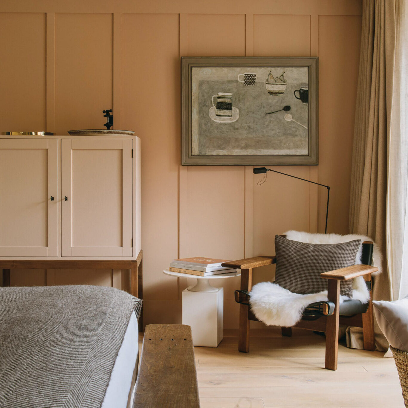
“In this room, I very much wanted to mix orange and cobalt—I was going for a strong color combination and because this is a guest room rather than a space used day-in-and-day-out I felt it could handle a real punch,” Corrigan says. “It was really the colors that drove the room rather than the patterns, and then working to find a harmonious mix within that specific palette. And interestingly enough, this is the second version of this room. When I first designed it, the walls were just plain orange and then I found this fabulous toile three years later.”

The master bedroom of a client’s London home.