


The design brief—an antiques-filled New York City foothold for a Texas family—was a think-outside-the-box notion considering that the 3,000-square-foot space was in 40 Bond Street, an apartment building with soaring ceilings by noted Swiss minimalists Herzog & de Mueron. But Megan and Austin Curry’s main residence in Dallas is already filled with sleek, of-the-moment furnishings and contemporary art; they wanted their pied-à-terre to be a departure, drawing on traditional trappings to better dovetail with their Manhattan life. “We’re out all day in the bustle of the city,” explains Megan. “When we come home, we wanted a sense of serenity and comfort.”

To augment the verdant treetop views in the library, Thompson chose curtains in a green velvet that mimics the summer foliage outside. The sofas are covered in a sky-blue linen. Biedermeier table, Loft Antiques; ceramic lamp, Objet Plus; custom ottoman and rug.
Lesley UnruhEnter Cece Barfield Thompson, a native Texan, Bunny Williams alum, and avowed outside-the-box thinker. “The idea was to create a home that was reflective of New York City itself, with different styles and periods that come together without fuss,” she says. Thompson understands a central truth about decorating, namely that the vibe of an object that’s a couple of hundred years old depends entirely on its context. Just because a chair was carved in the 18th century doesn’t mean it has to look like it still belongs there. “To keep it young, we made sure that the palette was refined and the patterns were pared down so the antiques didn’t get stuffy. We were going for sophisticated but not overdone,” she explains.
-

Tones of bone, ivory, and sand predominate in the space. “We made sure to speak to the architecture outside when selecting the colors to help bring the city in,” says the decorator.
Lesley Unruh -

On the living room walls, squares of Chinese paper from Gracie—usually used as the backdrop for painted murals—are left blank, creating a subtle backdrop for antiques and art, including a 19th-century American carved horse head and an inlaid English box, and a midcentury Marcel Breuer chair.
Lesley Unruh
A savvy editor, Thompson knows when to give objects room to breathe: “Negative space lets antiques become sculptural. If you can appreciate their form, they can feel modern.” Take the major 18th-century Italian landscape paintings in the living room, complete with chunky gilt and scrolling frames. “They’re so moody,” she says. “I wanted them to sing.” So she set them off with a backdrop of creamy squares of Chinese paper from Gracie, normally used for painted murals but in this case left blank and custom-colored in an ethereal shade of white. “If those paintings were hung on a plain white wall, they would feel like they are on loan from somewhere,” she says. “The subtle texture of the paper speaks to the texture of the paintings. They’re like tumbling blocks—masculine and rich while staying in the spirit of the architecture.”
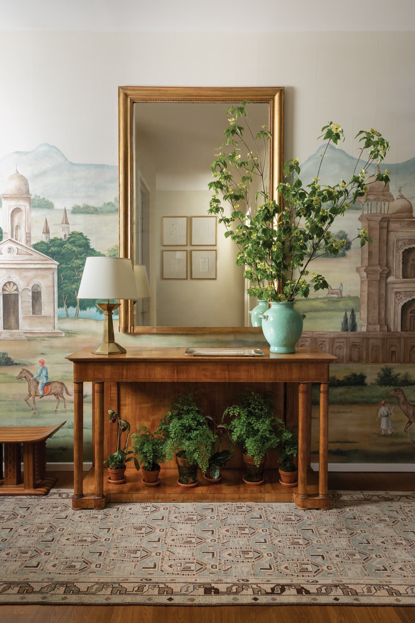
The windowless entry hall needed a strong visual feature to anchor it, so Thompson commissioned a Mughal-inspired scenic mural from Gracie, which is painted on the same Chinese paper that she used on the walls of the living room. “That continuity was important as there was no architectural stop between the spaces,” Thompson says. An antique Louis Phillipe–style gilt mirror hangs above the Biedermeier console.
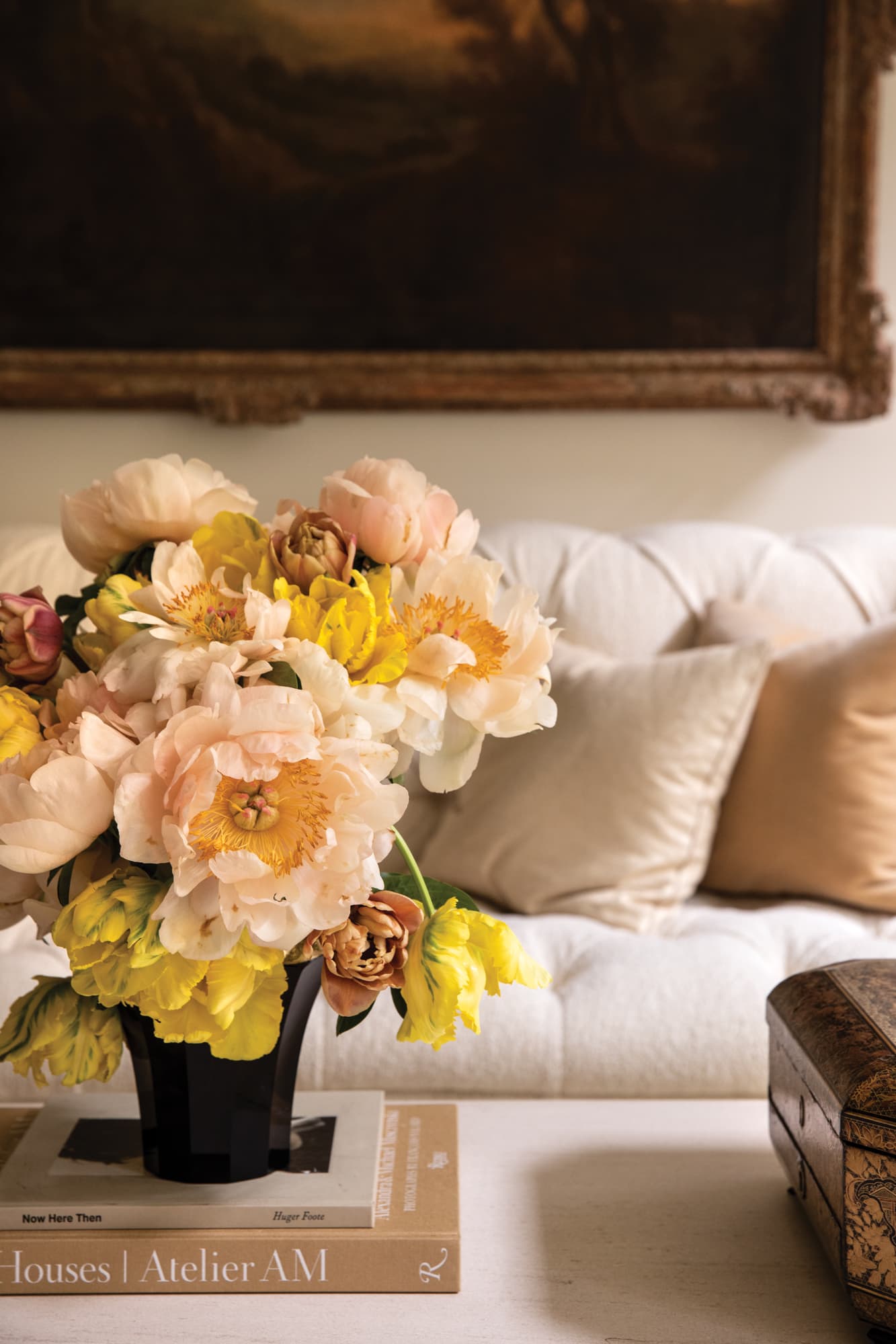
Lesley UnruhAnother key to updating antiques is calibrating how they interact with other pieces in a space. “If you put a contemporary painting over an old brown chest, the painting gives the chest new life and the chest gives the painting a sense of gravitas that it might not have had,” says Thompson. She made sure to save room for newer vintage and custom objects that would play well with items boasting more storied provenances. In the living room, midcentury modern–inspired cocktail tables give wattage to a 19th-century French stool. (“If those turned legs were next to a patterned chintz sofa or heavily carved wing chair, it would look totally different and you wouldn’t appreciate it,” she notes.) In that same vein, a tubular steel Breuer chair mingles with a Louis XVI–style armchair covered in leather, a 19th-century gueridon, and tufted custom sofas festooned with bullion fringe. “When you put one ornate thing down, you want to balance that with something simple,” adds Barfield. “It doesn’t matter whether you start with a van der Rohe chaise or an ormolu chest—you just have to know where you’re going.”
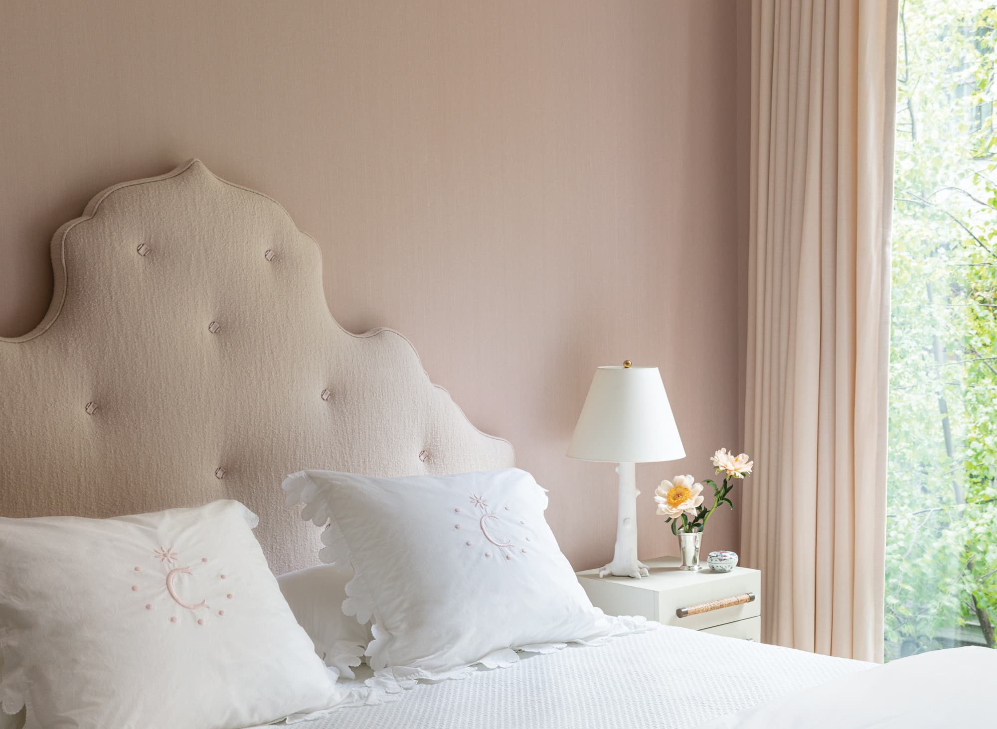
In the six-year-old daughter’s room, which also doubles as a guest room, Thompson divined a not-too-sleek, not-too-sweet shade of pink silk for the walls and paired it with a creamy custom wool headboard and matching curtains. Bedding, Matouk; Lamp, Christopher Spitzmiller.
Lesley UnruhThere are moments of calm, too, furnished with just a few spare elements. The primary bedroom is a haven, with a canopy bed wrapped in diaphanous floor-to-ceiling sheers; on the windows are soaring curtains, which puddle slightly for an extra hit of luxury and to accentuate the hand of the fabrics—rough Belgian linen, as opposed to the bed’s supple silk-and-cotton blend. “It’s all about the use of materials—texture, opacity, tone, shade, and scale are all so important,” Barfield says. “It’s pared down without being flat. White is not just white. Linen is not just linen.”
-
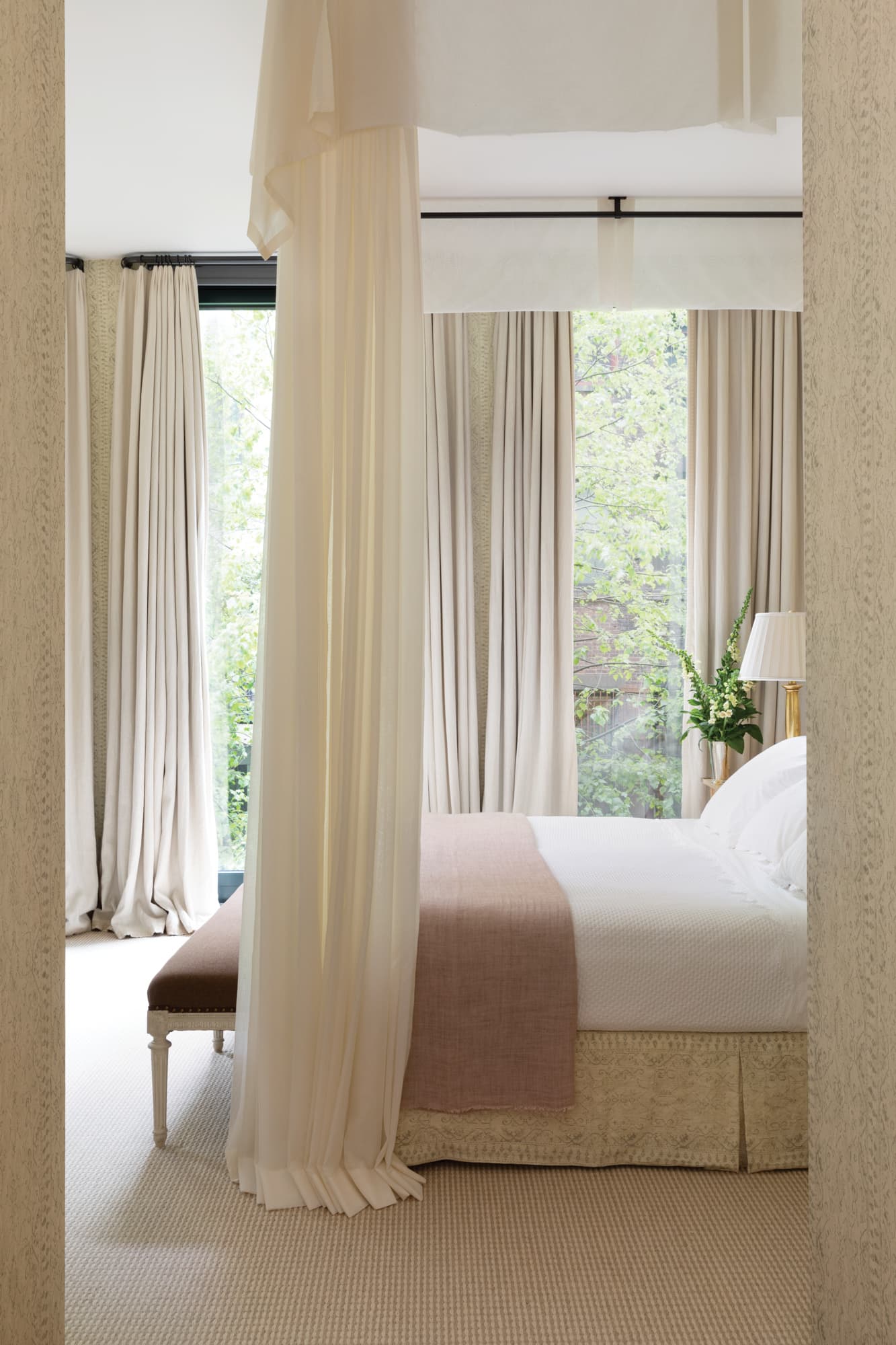
The angularity of the primary bedroom’s canopy—hung from the ceiling for the extra drama of height—similarly echoes the architecture for a sense of cohesion even amid a cocoon of textural softness. Bed skirt and wallpaper, Soane Britain. Bedding, Julia B.
Lesley Unruh -

To distinguish the otherwise plainspoken Namay Samay linen curtains in the living room, Thompson commissioned custom-embroidered edging from Indian artisans in a tonal pattern that quietly elevates a strict scheme and softens the room’s contemporary architecture.
Lesley Unruh
Which is not to say that Thompson steered completely clear of patterns. In the boys’ room, an Indiennes-inflected stripe amps up ceiling heights in a pretty bird pattern that’s still amenable to teenagers—and provides a lilting counterpoint to Jean Royère-inspired fretwork headboards. In the entry hall, a Mughal-inspired mural is an electrifying backdrop to a dapper Biedermeier console, a tug-of-war that’s a joyful testament to Thompson’s knack for creating enchantment even while keeping things serene. “Decorating is like painting,” she proclaims. “You want a composition that keeps your eyes dancing around the canvas.”

To squeeze two twin beds into the teenage sons’ room without overpowering the space, Thompson designed a pair of Jean Royère–inspired headboards with a light-as-air lattice pattern in masculine burled wood. Walls in Lisa Fine fabric; sconces, Vaughan; bedside table, KRB NYC.
Lesley UnruhTHIS ARTICLE ORIGINALLY APPEARED IN VOLUME 10 OF FREDERIC MAGAZINE. CLICK HERE TO SUBSCRIBE!