Too often relegated to the background, sheer textiles have a delicacy that deserves our full attention. Whether fluttering romantically or enveloping a room in soft minimalism, the myriad takes in the pages that follow prove that sheers are capable of much more than simply filtering the sun’s rays.
-
 Simon Upton / Interior Archive
STARRING ROLE
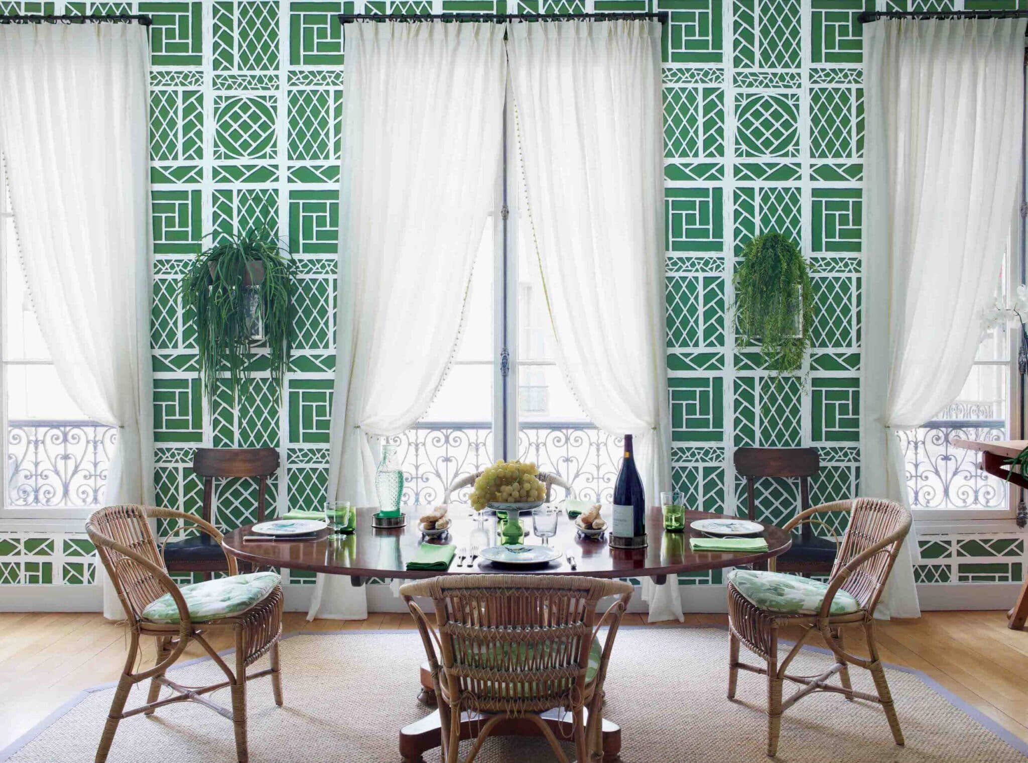
In his Paris apartment, Tom Scheerer created sheer curtains with all the proper hallmarks—decorative drapery rods, tiebacks, jaunty trim—for a whimsical window dressing that’s “done” enough for a dining room yet lets the drama of the view show through.
-
 Adrien Dirand
MODERN TAKE
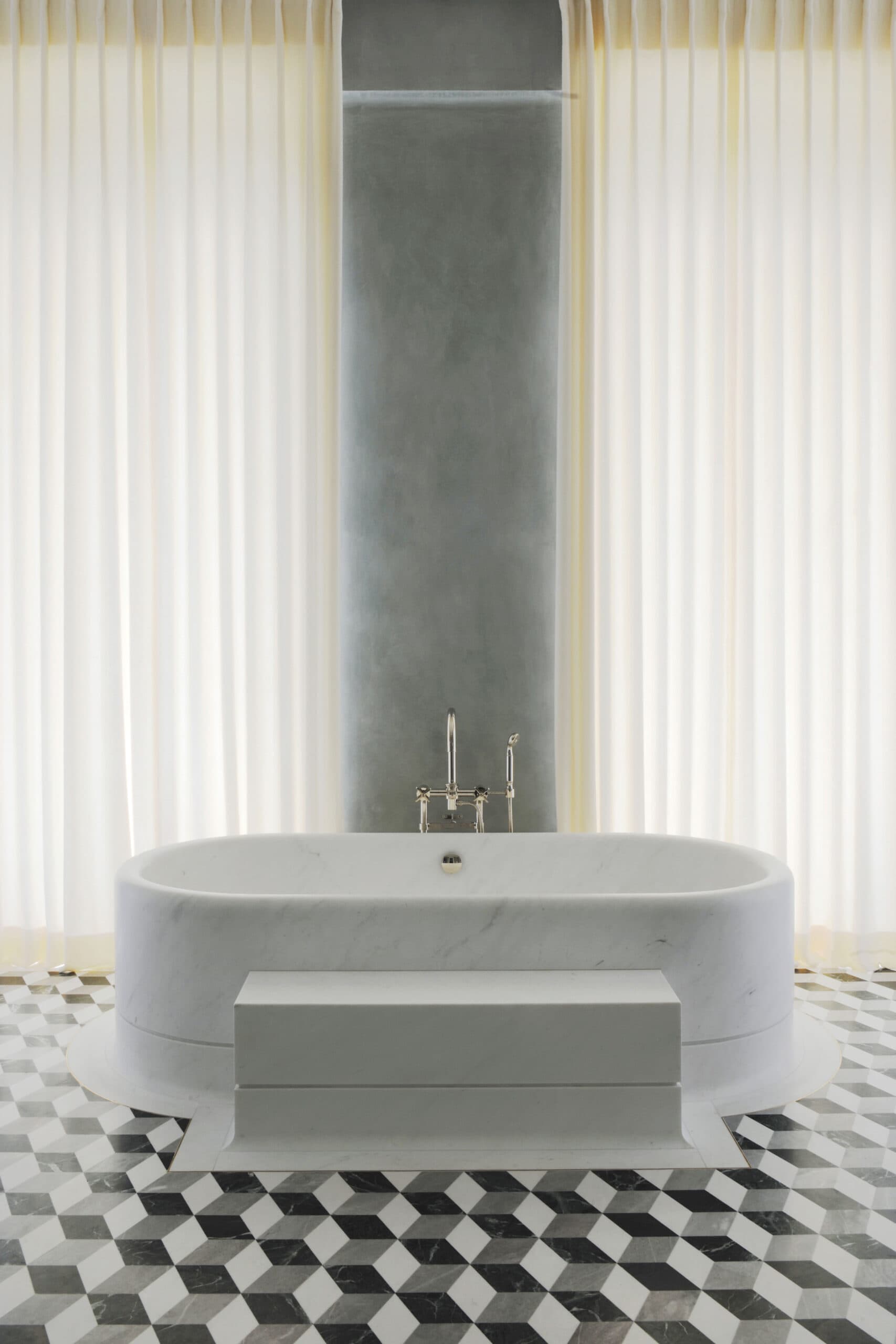
In this concrete-walled bathroom, architect Joseph Dirand used simple light-filtering curtains to add a surprising dose of romanticism and warmth to an otherwise austere space.
-
 David Oliver
PATTERN OF BEHAVIOR
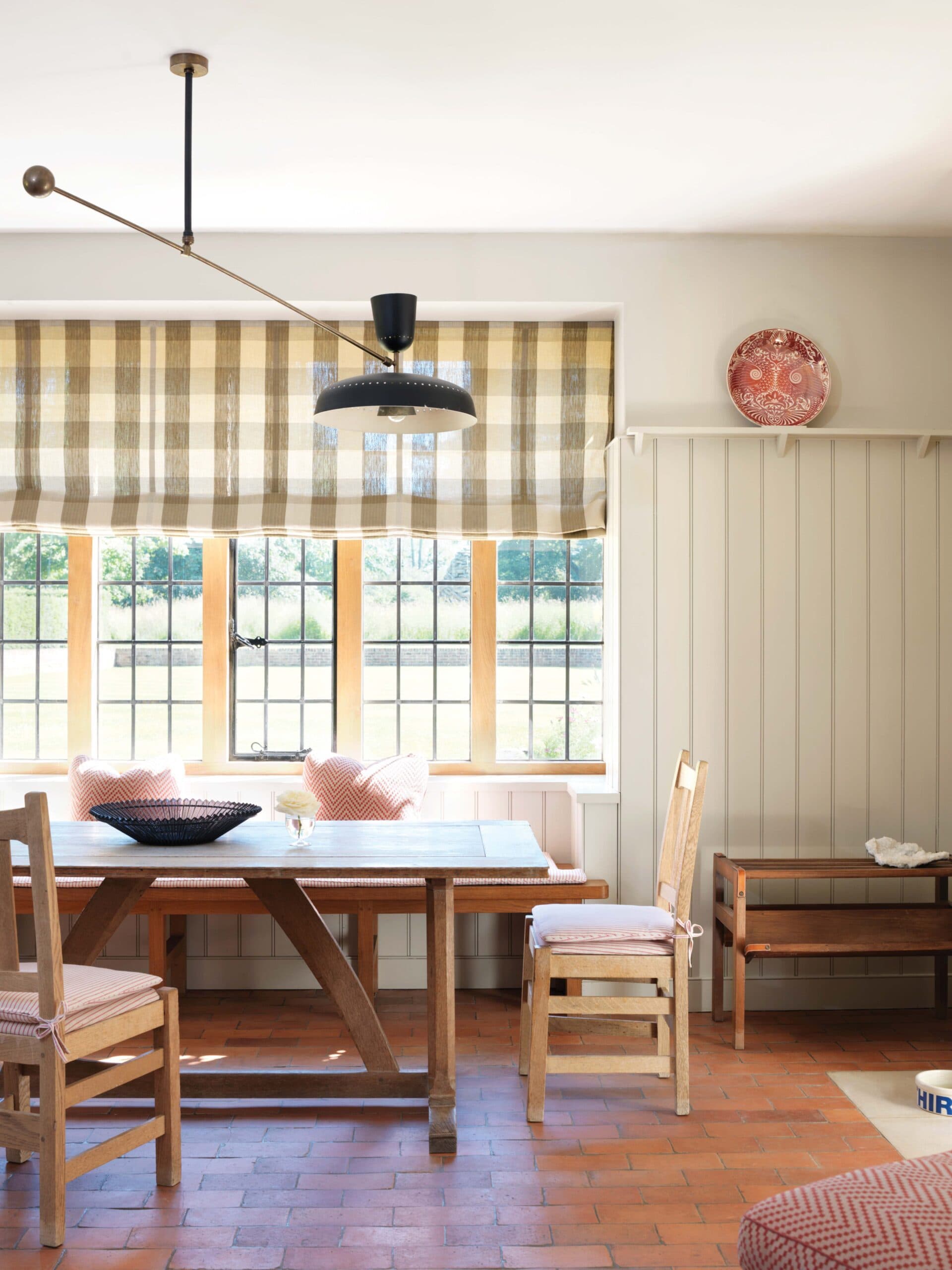
Proof that sheers don’t have to be plain: this paled-out check in a bright dining nook by Veere Grenney. A brick floor, beadboard walls, and trestle table complete the modern-country mood.
-
 Francesco Lagnese
SHORT AND SWEET
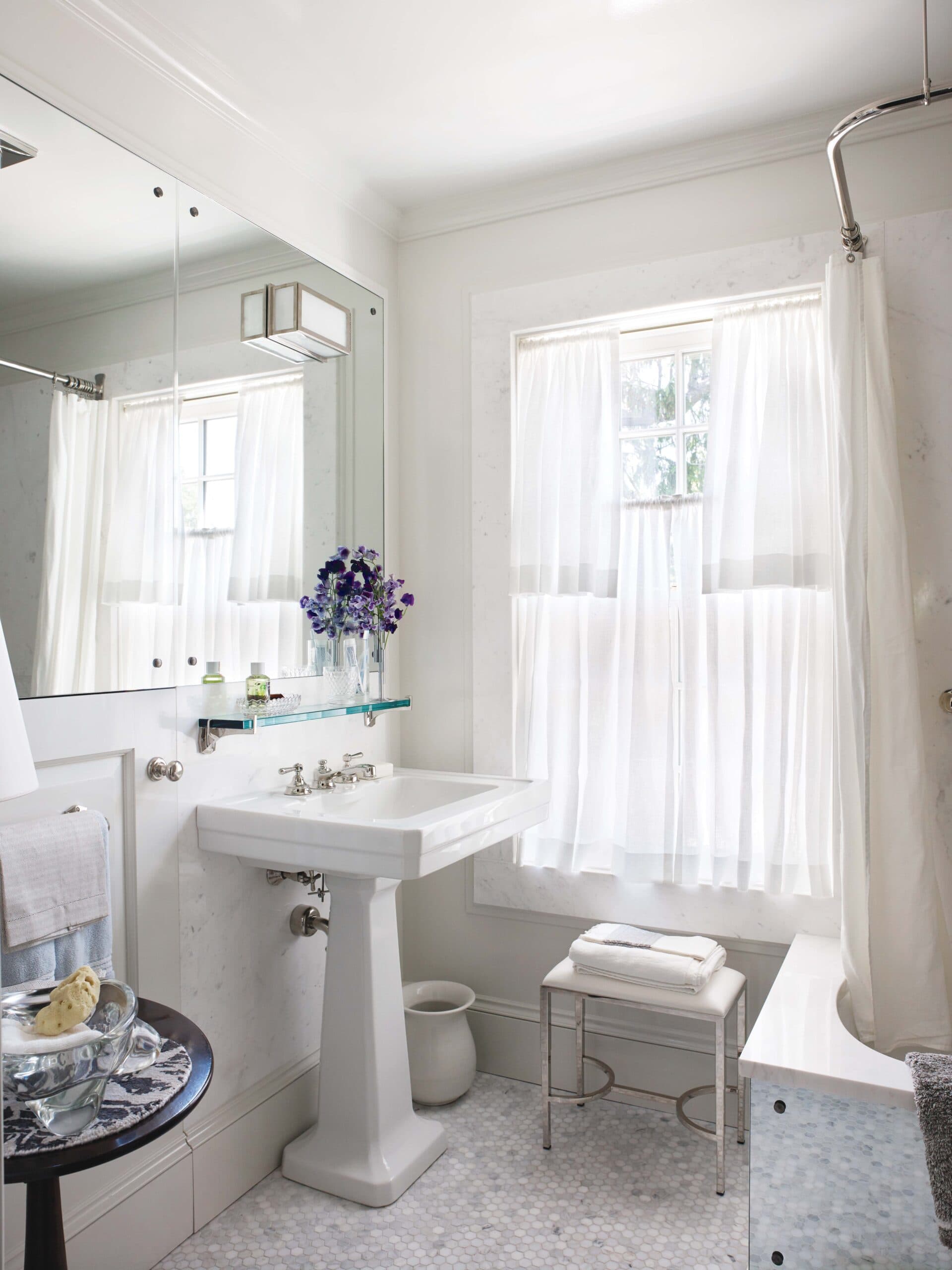
Fashioned from light-as-air fabric, double café curtains are a Thomas O’Brien signature: “The top can open for light and the bottom can stay closed for privacy,” says the designer. “The trick is finding a linen with a handkerchief-like quality.”
-
 Paul Costello
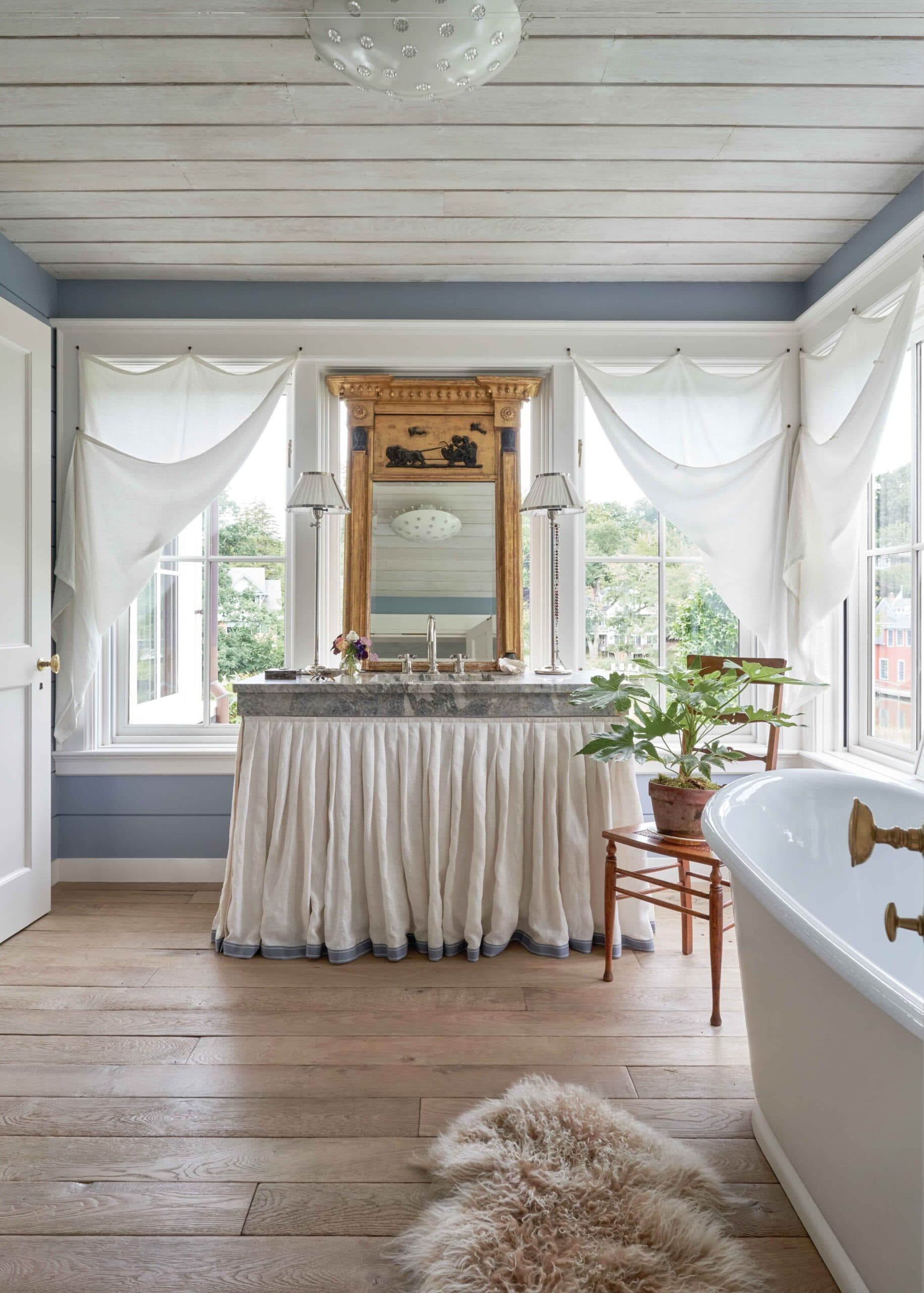
EASY DOES IT
A fetching triangulation of charm, insouciance, and ornament, these sail-shaped sheers—designed by Brockschmidt & Coleman—are hung 19th-century-style with fabric loops that attach to window surrounds, allowing them to be easily pulled aside.
-
 Laura Resen
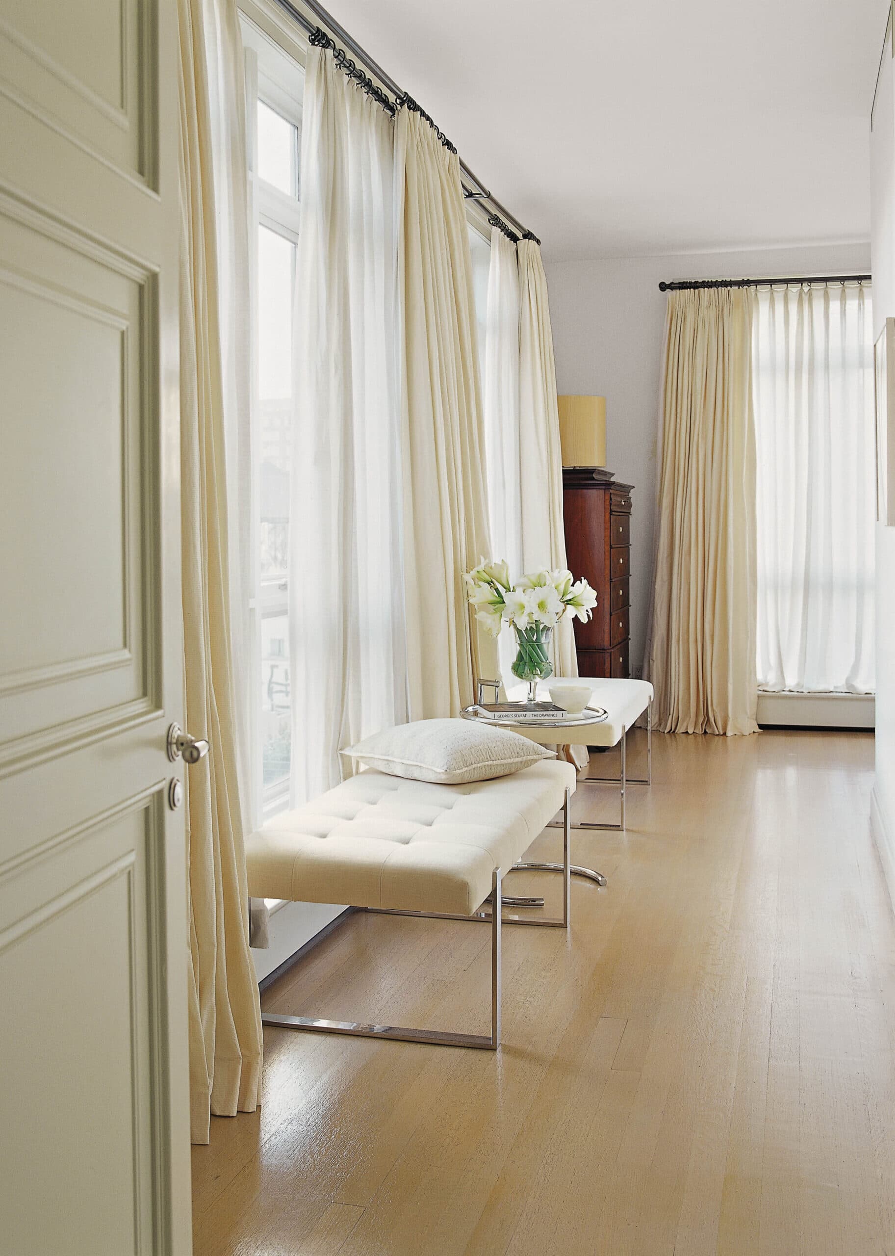
PRACTICAL MATTERS
In rooms where privacy and light are both prized, flannel-lined taffeta drapes layered over sheers are the answer. By giving them the repeating rhythm of architectural columns, Thomas O’Brien turned these curtains into a classical design element.
-
 Francesco Lagnese / Otto
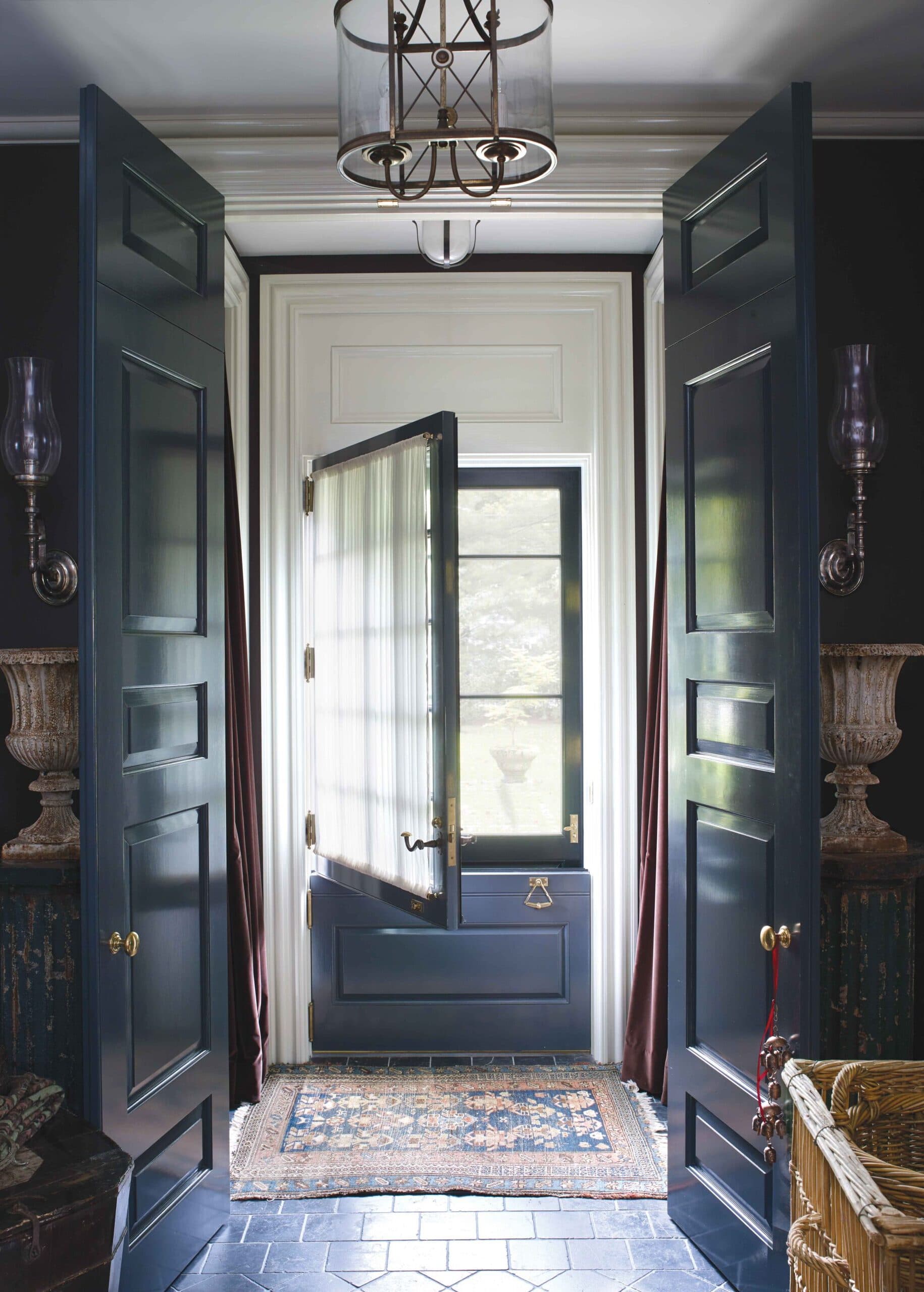
RELATIVE OBSCURITY
A gathered panel on the front door of Thomas O’Brien’s house is just revealing enough to feel welcoming without turning an entrance hall into a tell-all.
-
 François Halard / Trunk Archive
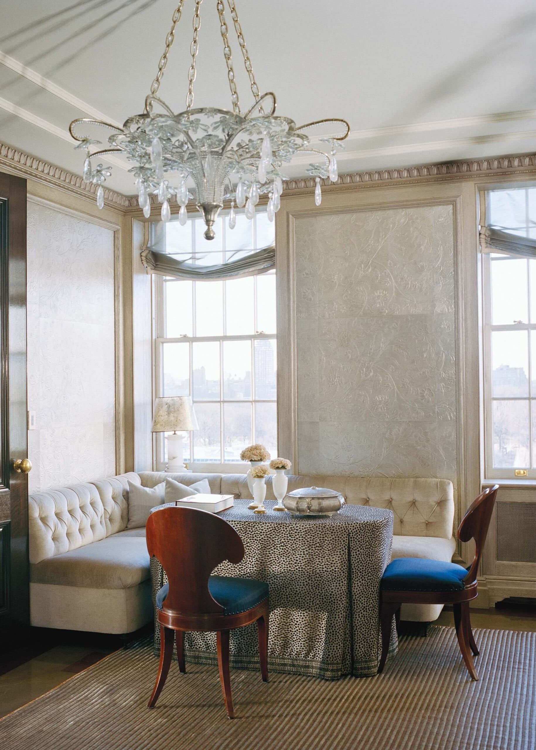
FABRIC SOFTENER
Silken and diaphanous, these Roman-style shades are the sheerest of sheers, adding softness without overpowering architecture. Stephen Sills edged them in gold trim to give them a decided air of formality without feeling overdone.
THIS ARTICLE ORIGINALLY APPEARED IN VOLUME 9 OF FREDERIC MAGAZINE. CLICK HERE TO SUBSCRIBE!

