F
or the Swedish-British designer Beata Heuman, designing Touriste Hotel Group’s new Hôtel de la Boétie in Paris’s fashionable 8th arrondissement and steps from the Grand Palais presented a unique opportunity to indulge in a whimsical and vibrant scheme. “I am drawn to theatrical expressions, but that’s not always appropriate for residential design,” says Heuman. “A hotel is an experience for a few nights so you can exaggerate and commit to a ‘look.'”
Her team was given a blank canvas to start with: “The building didn’t have any original features left and has been re-configured over the years,” she explains of the 40-room hotel. “We spun off the simplicity of the bones that were there, working with strong, straightforward ideas,” from quirky trimmings to unconventional hues. The finished result feels more like a (very stylish) friend’s Parisian pied-à-terre than a standard hotel, filled with reinterpretations of historic motifs and no shortage of vibrant, contemporary flair.
Read on to find out more about how Heuman transformed the hotel into Paris’s newest must-visit destination—and the ingenious decorating tricks she employed along the way.
Fake a Headboard
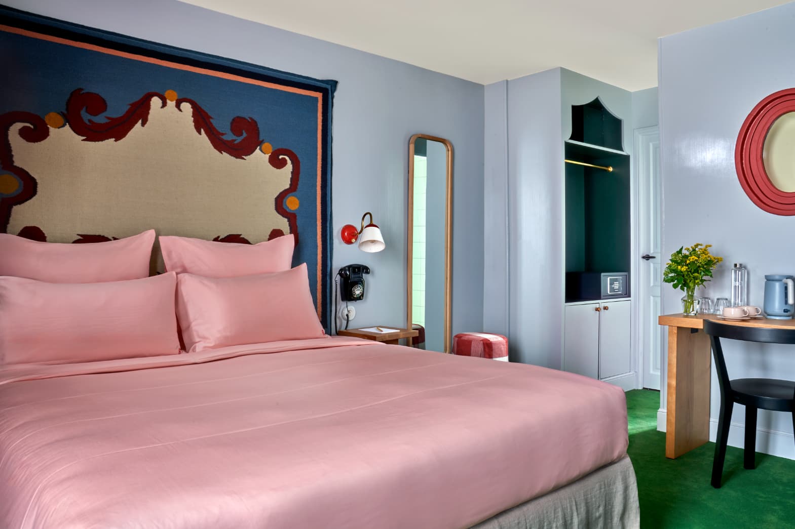
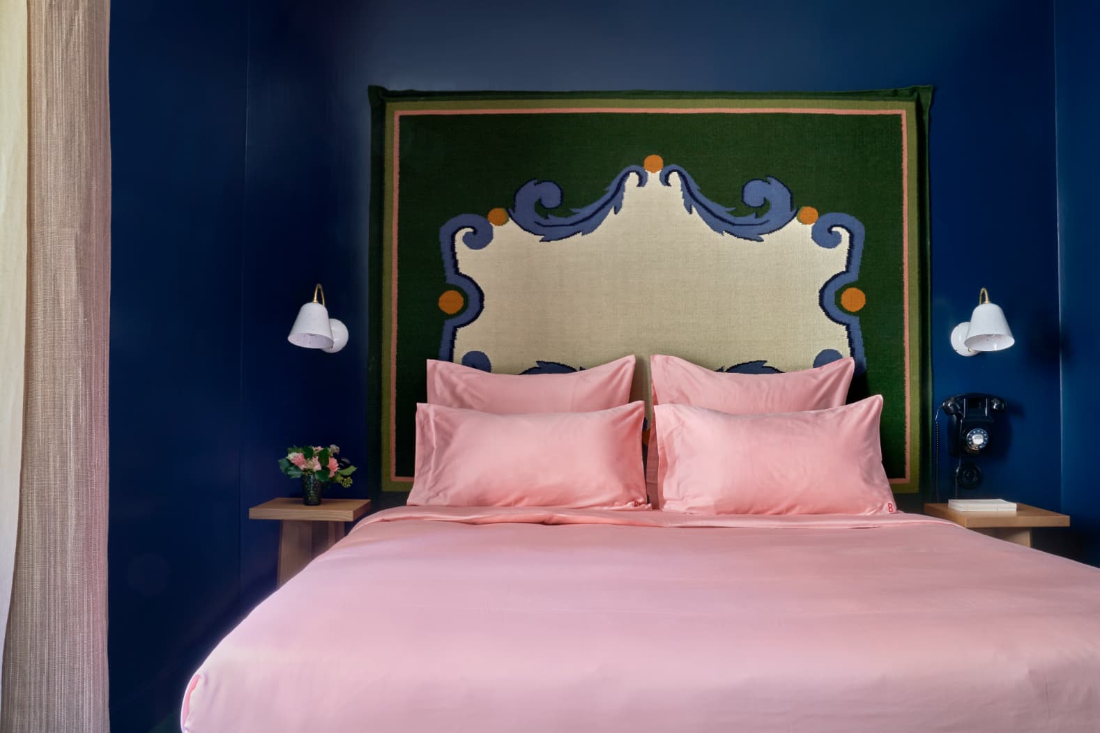
Rather than use standard headboards, Heuman designed custom woven wool rugs—inspired by medieval coat of arms and the marble floors of Capelle Medici in Florence—and installed them on the wall above each bed for a similar effect minus the square footage. Their two-dimensional scrolling motifs became the focal point of each room.
Embrace Solids
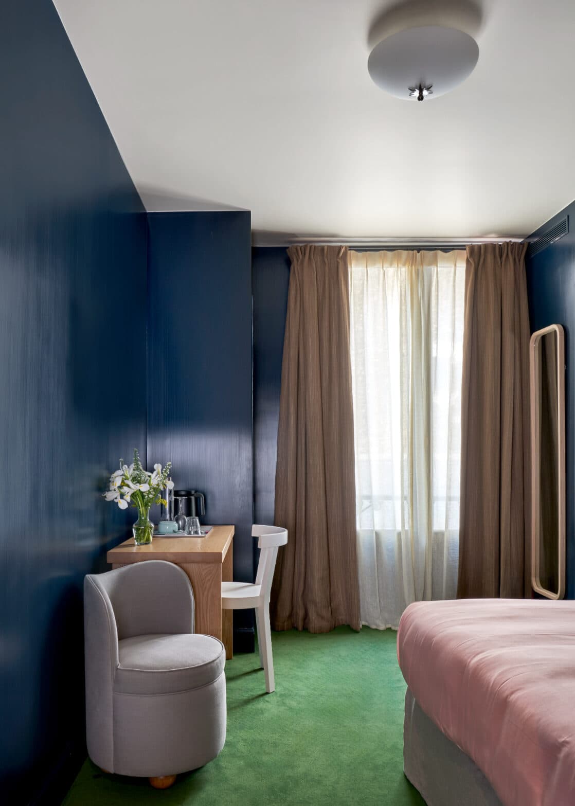
While Heuman’s work is often filled with prints and patterns, the designer went in a decidedly different direction for the Hôtel de la Boétie. “We wanted to create a space that was really quiet, calming, and peaceful, so we used block colors, simple lines, and carefully chosen textures,” including stainless steel, natural wood, and unlacquered brass. “There is a certain humbleness to it, but at the same time, it’s stylized and graphic,” she explains.
Bring On the Brights
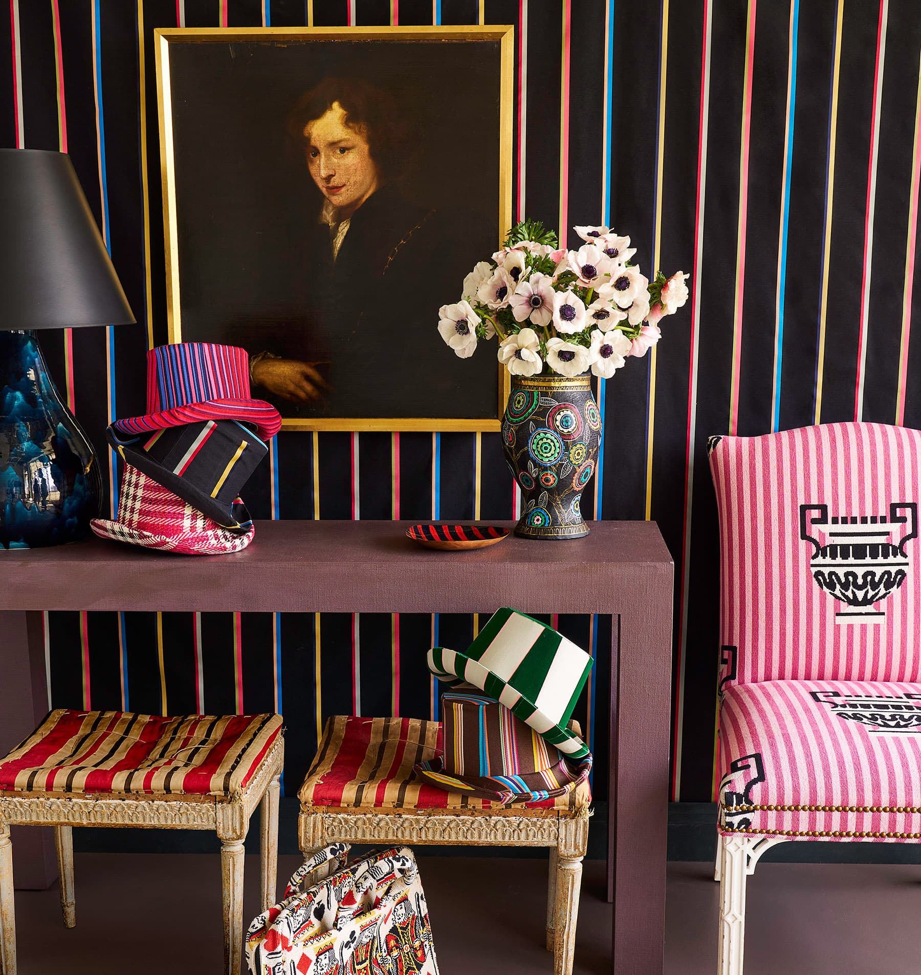
That’s not to say the rooms are plain: A saturated palette of reds, greens, pinks, and blues makes visitors feel as if they’ve wandered into a work of modern art. “It’s about contrast and balance,” says Heuman. “When I work with rich colors, my instinct is to offset that using simpler materials around it to complement and enhance.”
Go Beyond Basic White
While crisp, white sheets are always a safe bet, experimenting with more colorful bed linens can make a room feel extra fresh. Pink bedding was one of Heuman’s “non-negotiables” from the start of the project, so when she couldn’t find the just-right hue, she got creative. “They had to be made bespoke,” she says. “I’m so happy that we got the perfect shade!”
Tile Outside the Box
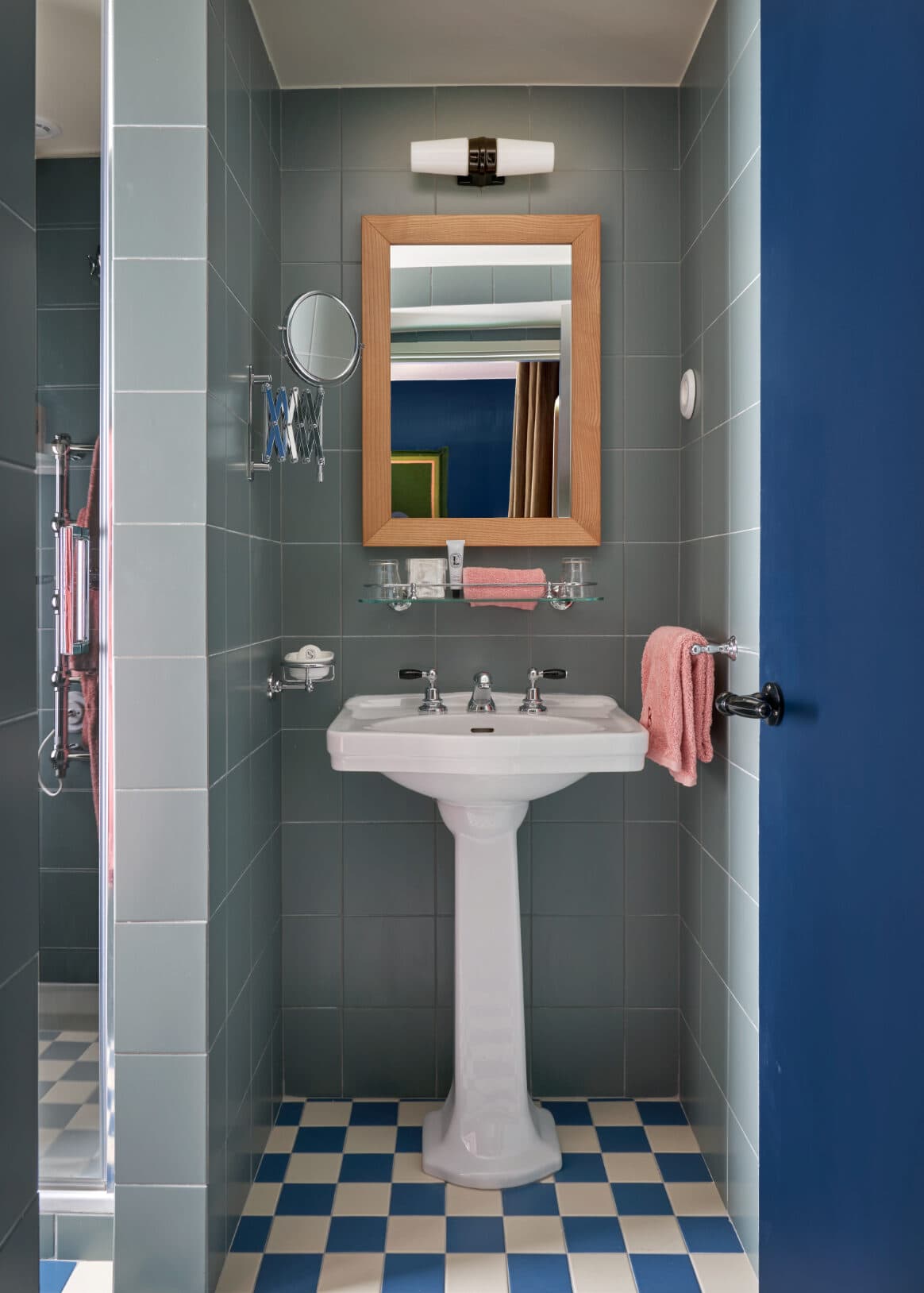
Heuman carried the color-blocking theme into the bathrooms, where walls tiled in serene aqua contrast with punchy checkerboard floors. She also varied the tiles’ size, using larger squares on the walls and smaller ones underfoot.
Illuminate with Pizzaz
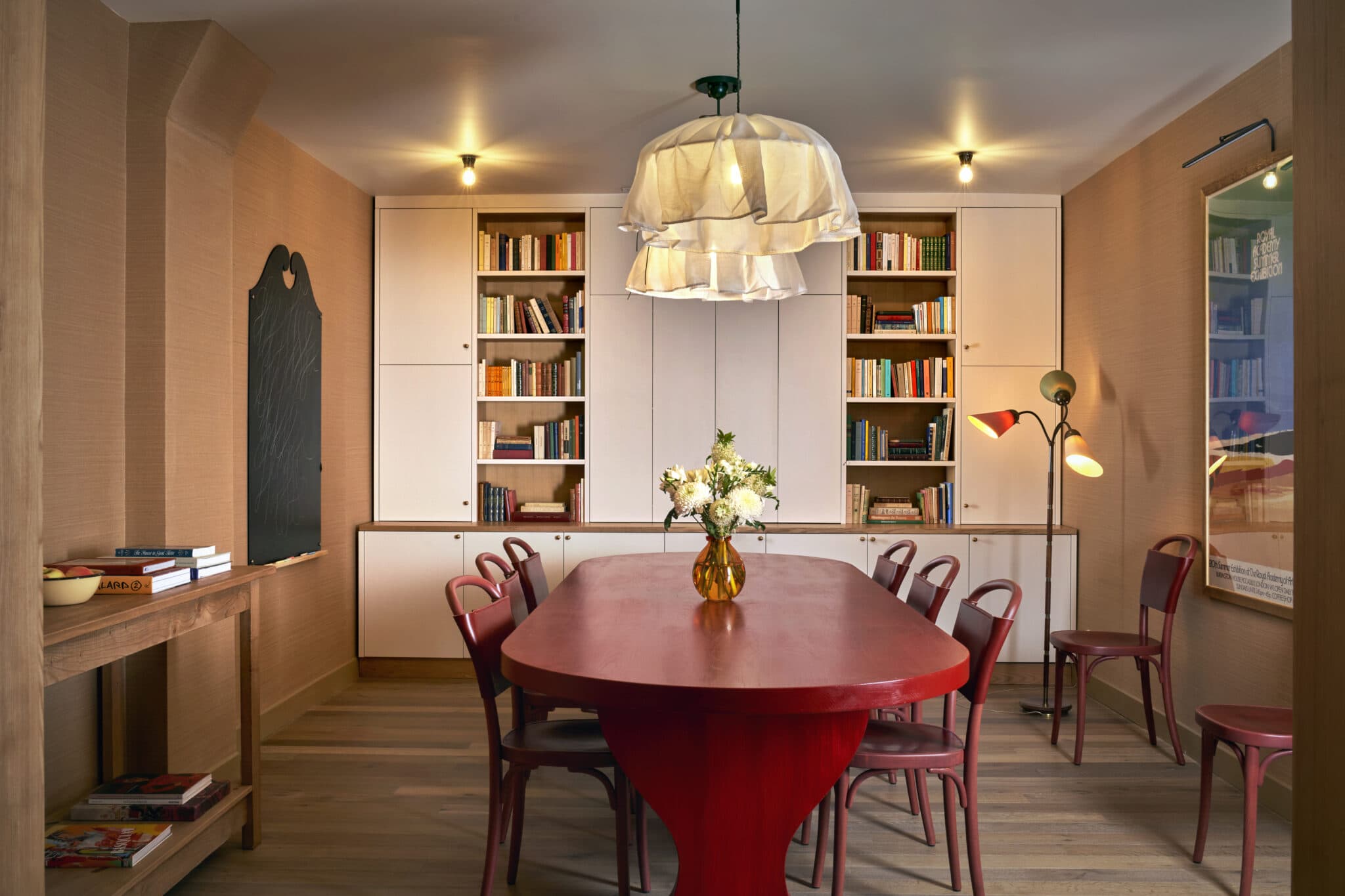
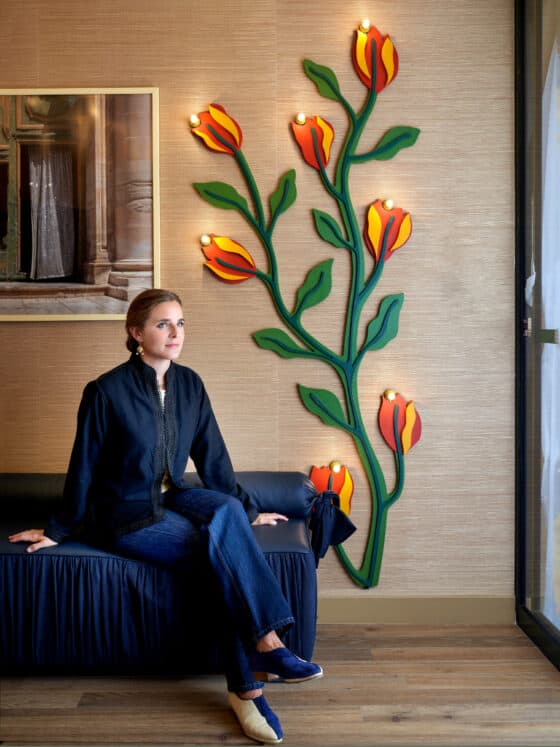
Statement lighting is one of Heuman’s go-to strategies for creating high-impact spaces. In the guest rooms, her Alma Wall Lights take the place of bedside table lamps for a perfect balance of utility and style. Instead of opting for outwardly formal lighting in the dining room, the designer installed flowing handkerchief pendants to add a little sanguinity to the otherwise decorous space.
