


Just as the flourish of an Hermès scarf can hide all manner of sartorial sins, patterns can do magic tricks for architecture. Just ask designer Andrew Howard, who turned to their transformative power when he was enlisted to revamp a family’s circa-1890 home in Summit, New Jersey. “It’s common in old houses like this one for the walls to follow the roofline,” says the Jacksonville, Florida-based designer. “Because so many of the walls were pitched, we couldn’t really hang out, so we needed something that stood on its own.”
Enter a bevy of statement-making wall treatments: In the attic-turned-playroom, Ottoline wallcovering with French ticking-esque vertical stripes lends the knee-wall space “the illusion of height,” Howard says. A child’s slant-walled bedroom, swaddled in Beata Heuman’s Florentine Flowers wallpaper, is as transportive as any Roald Dahl book. In a tiny powder room, a vibrant Soane Britain floral creates a cozy cocoon.
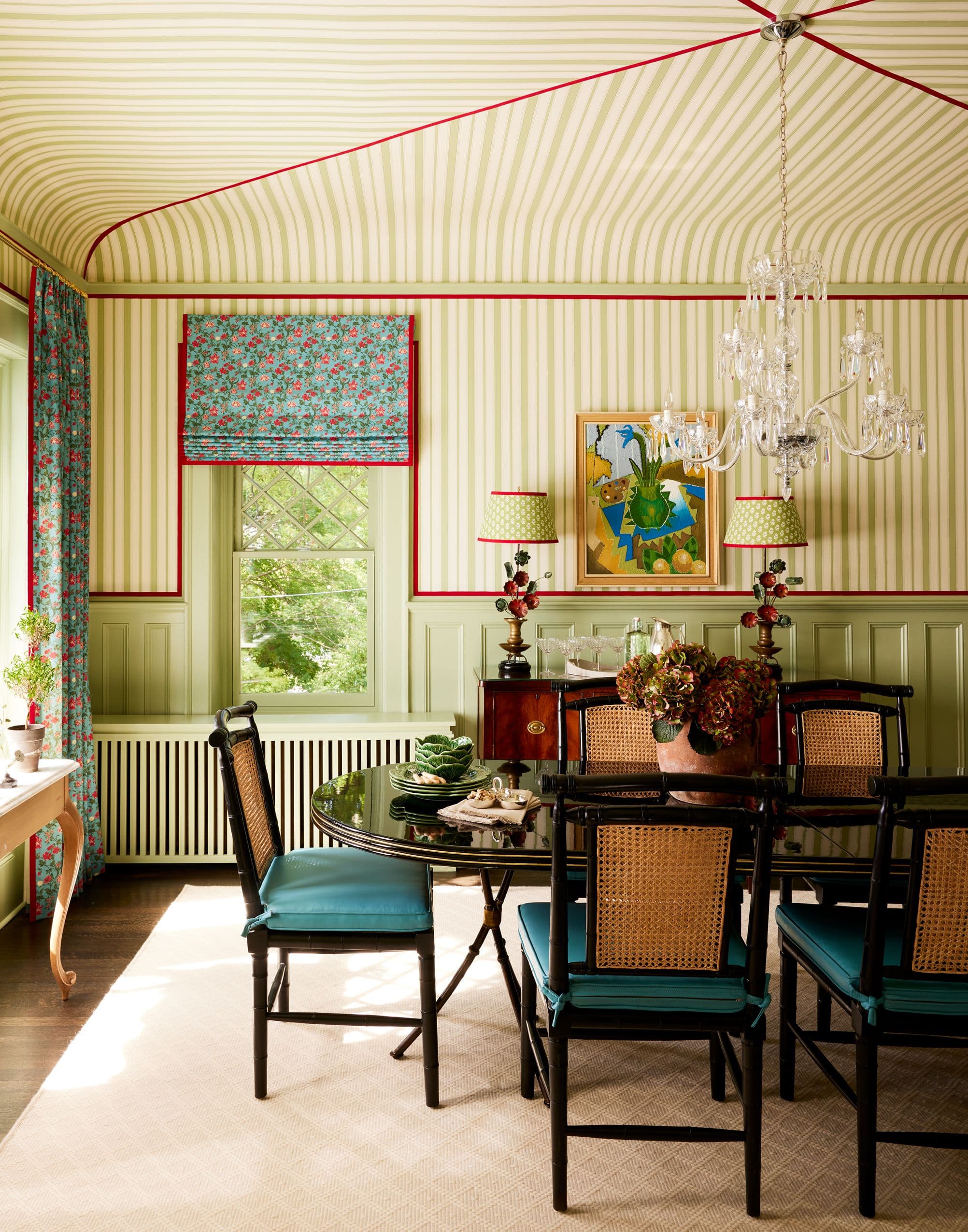
“The cool thing about an old house is you’ll inherit some quirky details that you’re not even expecting,” says Howard. In the dining room, he and Waters highlighted the existing curved ceilings with stripes; red tape creates a tented effect. “It’s nearly impossible to make the stripes line up, so this tape gives you a nice relief between them,” he says. Millwork is painted in Sherwood Green HC-118 by Benjamin Moore; the window treatments are in Harrison Floral fabric by Scot Meacham Wood.
David Land-

The house had charm to spare, including this etched glass mirror, which the owners unearthed in the garage.
David Land -

Howard stacked two tapes on the leading edge of the family room curtains (in a Marika Mayer fabric) to create a wider trim. “That’s always fun for me—when you can take the tools you have at your disposal and make them feel custom.”
David Land
The project’s primary approach was to respect “what it was trying to be, the all-American house on the street,” says Howard, who worked on the house with designer Lindsey Gerlock Waters, a project manager at his firm. Throughout, the palette of largely reds, whites and blues has a distinct lineage. The client “wanted an old 1920s, 1930s Hamptons, shingle-style, Kennedy-style house.”
One of the first questions—a common one in old houses—was “what to paint and what not to paint,” Howard says. “This house had a lot of dark stained wood, and we were thinking, ‘Do we paint this—and if we do, where do we stop?’” If you, too, have that same sleepless worry, Howard’s advice is to go with what you actually want instead of buckling to some imagined guilt trip of previous generations. “I think people get it in their head that they’re destroying this wood that has been around forever and it really wasn’t all that valuable to begin with. Unless it’s really fine, like a zebra wood or something similar, wood is meant to take a finish, and paint is just as much of a finish as a stain.” After much back and forth, Howard and Waters ended up swathing almost all the woodwork in unexpected colors, such as Benjamin Moore’s Geranium (a soft vermillion) and Weeping Willow (a sage-y grass green).

Vaughan pendant lights and Crate & Barrel stools supply a note of classic cool to the kitchen island. The window treatments are custom, in a Fanny Shorter fabric. Walls are in Benjamin Moore’s First Snowfall 1618, an icy pale blue.
David Land-

A custom-painted ceiling fixture by Shades of Light adds a fanciful touch to this children’s bedroom. “We’re in a world now where designers are painting lampshades and adding trims to as many things as we can,” Howard says. “Why not do the light fixture?” Wallcovering, Beata Heuman. Bedding, Les Indiennes. Beds, The Beautiful Bed Company.
David Land -

“The client loves stripes in all different scales,” says Howard, who punched up the office’s Cole & Son wallpaper with roman shades in a Svenskt Tenn print. The blue paint color is Sherwin-Williams’ Windy Blue 6240.
David Land
Their biggest challenge—making it all feel authentic—is one that arises frequently in historic home projects, Howard says. “The worst thing you could do to an old house is put a bunch of new stuff in there,” he notes. “So typically, when I take on projects like this, I have a conversation with the clients where I tell them that we have to commit to getting new upholstery and old things, because these old houses that you fill full of new stuff just seem disjointed to me. To make the furnishings feel like they’ve been in the house for a hundred years is always a balancing act.”
They whipped up an entirely new kitchen with that same directive: the feeling that it had always been there. “You don’t want to walk into an old house and see a kitchen that feels brand new, especially when the rest of the house feels like it’s in the 1800s,” Howard says. Key to the look was the Tabarka Maghreb handmade terracotta tile backsplash, Vaughan pendant lights with box-pleat shades, and the leaded-glass cabinet inserts Howard designed “which might be something you would’ve seen around the turn of the century,” he says. In short: pattern makes perfect.
-

Painted in Benjamin Moore’s Geranium 1307, the unlikely inspiration for the playroom’s custom-made bunks was the 1995 Adam Sandler comedy Billy Madison. “In the film, he draws a blue duck and [the teacher asks] ‘Why’d you draw a blue duck?’ He says: ‘I’d never seen a blue duck before and I wanted to see one.’ I kind of felt like that about this: I’d never done a red bunk before and wanted to see what it looked like.” Wallcovering, Ottoline.
David Land -

Howard’s colleague Waters had an unusual proposition for the bath: “‘Why don’t we get a tub that we can paint?’ I thought it was a crazy idea,” he recalls. But the concept turned out to be a winner—they were even able to find a soft spa blue in the plumbing supply company’s finish options. “This was a small bathroom and it needed something to really be the star of the show,” he adds.
David Land