


Midway through earning his architecture degree at Harvard, New Yorker David Netto defected to interior design—hardly surprising given that his father owned fabric company, Cowtan & Tout. Now living and working in Silver Lake, California (in a mid-century home originally designed by pioneering starchitect Richard Neutra, no less), Netto is known for his intelligent, eclectic interiors that feature subtle modernist nods, as well as a second career moonlighting as a sought-after writer and editor, most recently completing a monograph of French designer Francois Catroux.
Never one to shy away from offering his invaluable know-how, Netto shared some pithy design edicts everyone should keep in mind when embarking on a new project.

DO browse Pinterest, but…
DON’T pin. It’s addictive, unrealistic and constraining. Think of it instead as background inspiration rather than a mood board to direct your décor—and decorator.
DO snap up small sculptures, which instantly transform any space. “You can make a traditional room full of hip, young energy in one shot” with an abstract piece inspired by Tony Smith or Jean Arp, Netto says.
DON’T let upstairs dictate downstairs. Our fondness for spacious bedrooms and en suite baths has boosted the square footage of the second floor in many contemporary homes—and forced the first floor to grow in response, often making it hard to evoke intimacy in common areas. Consider asking an architect to add a third floor to keep the footprint compact instead.
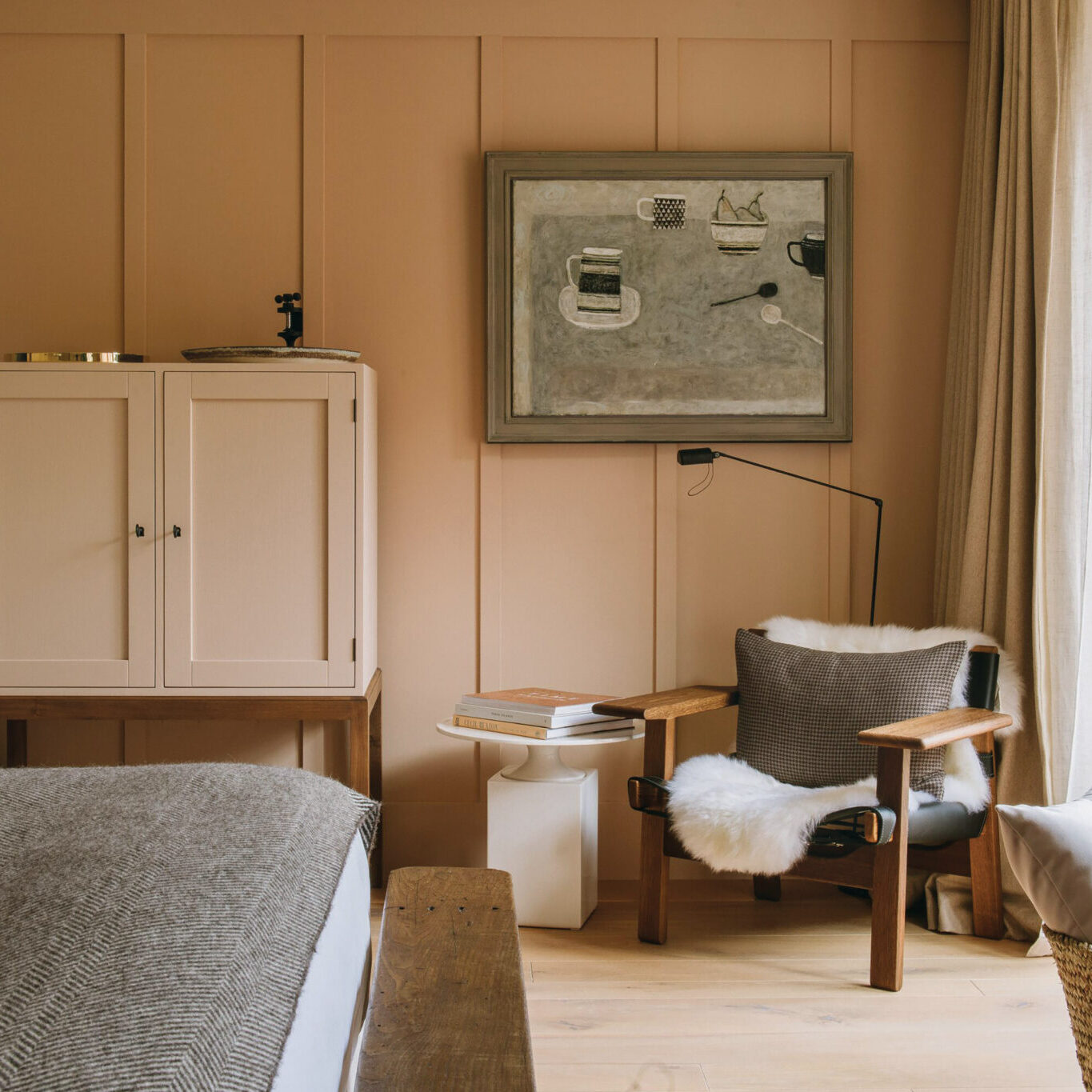
DO embrace the unexpected. “Every room needs one thing that doesn’t belong in there,” says Netto – in the bathroom, perhaps a fireplace or an upholstered chair for folded linens instead of a towel rack.
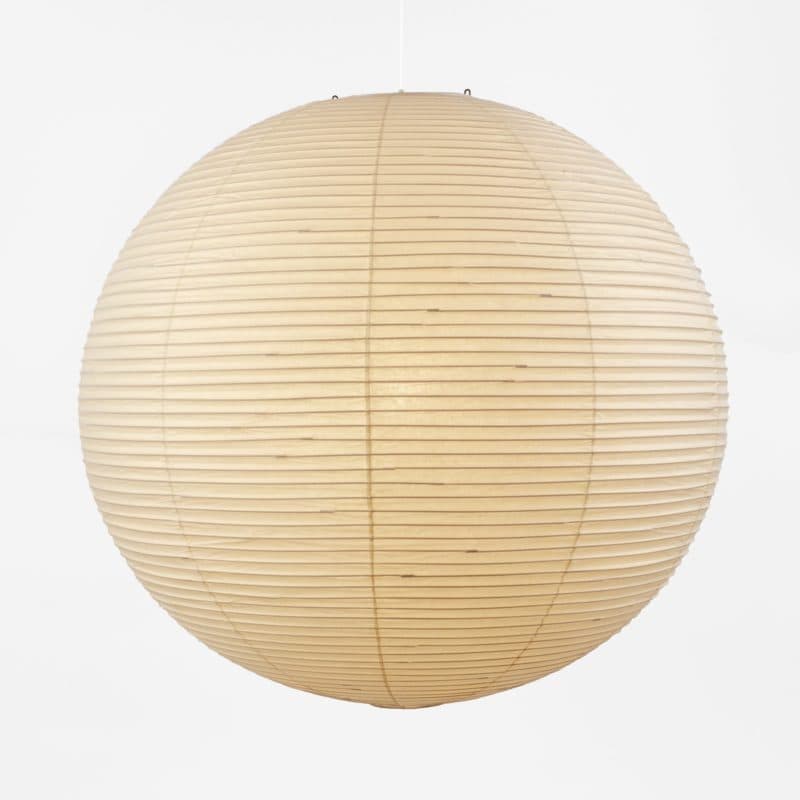
Akari paper lantern by Noguchi
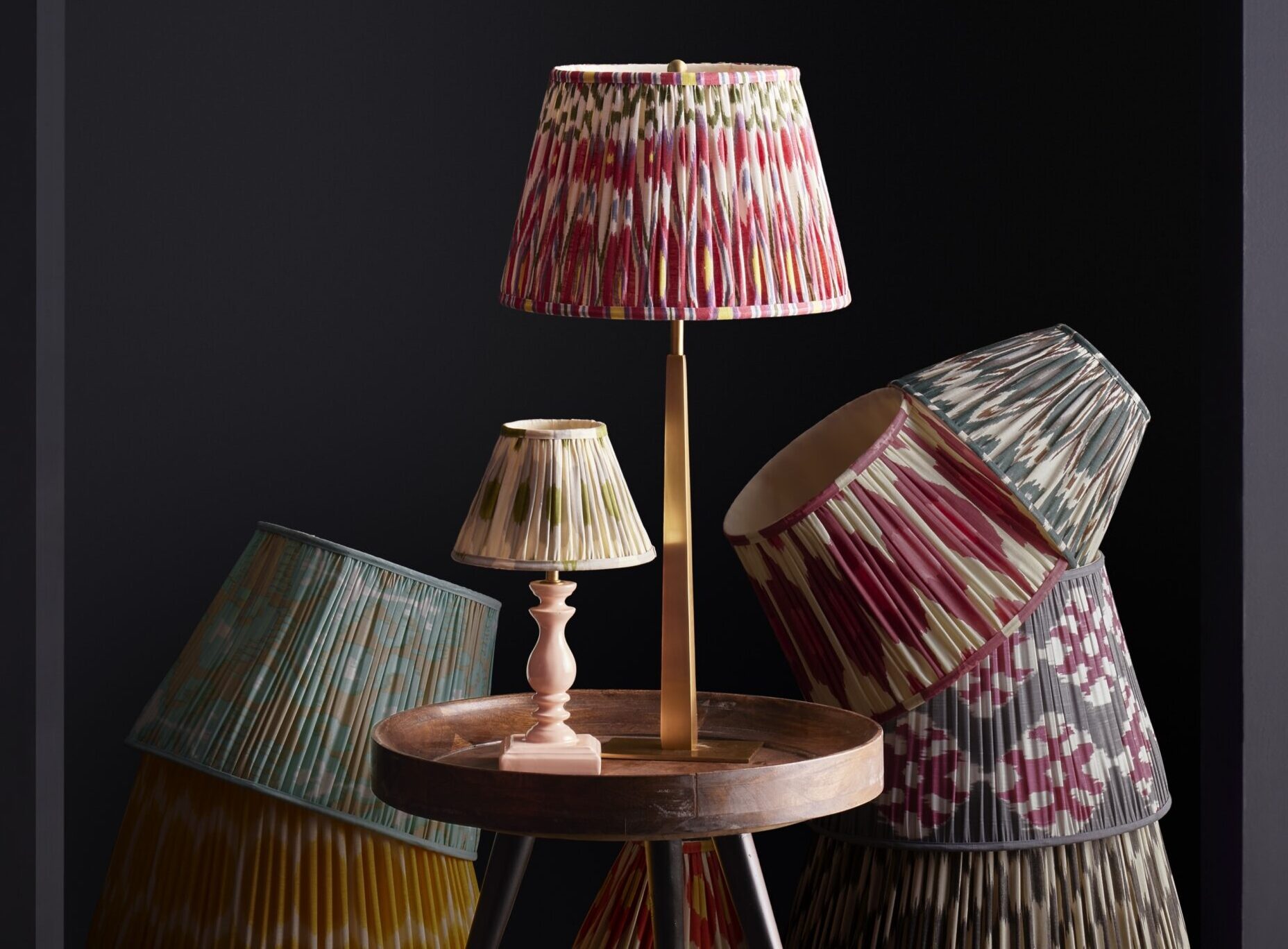
DON’T scrimp when it comes to chandeliers. “The worst thing is a cop-out—it’s better if it’s giant than too small. This is when you need to go for it.” A failsafe fallback in any room, per Netto: a Noguchi paper shade, in the largest size.
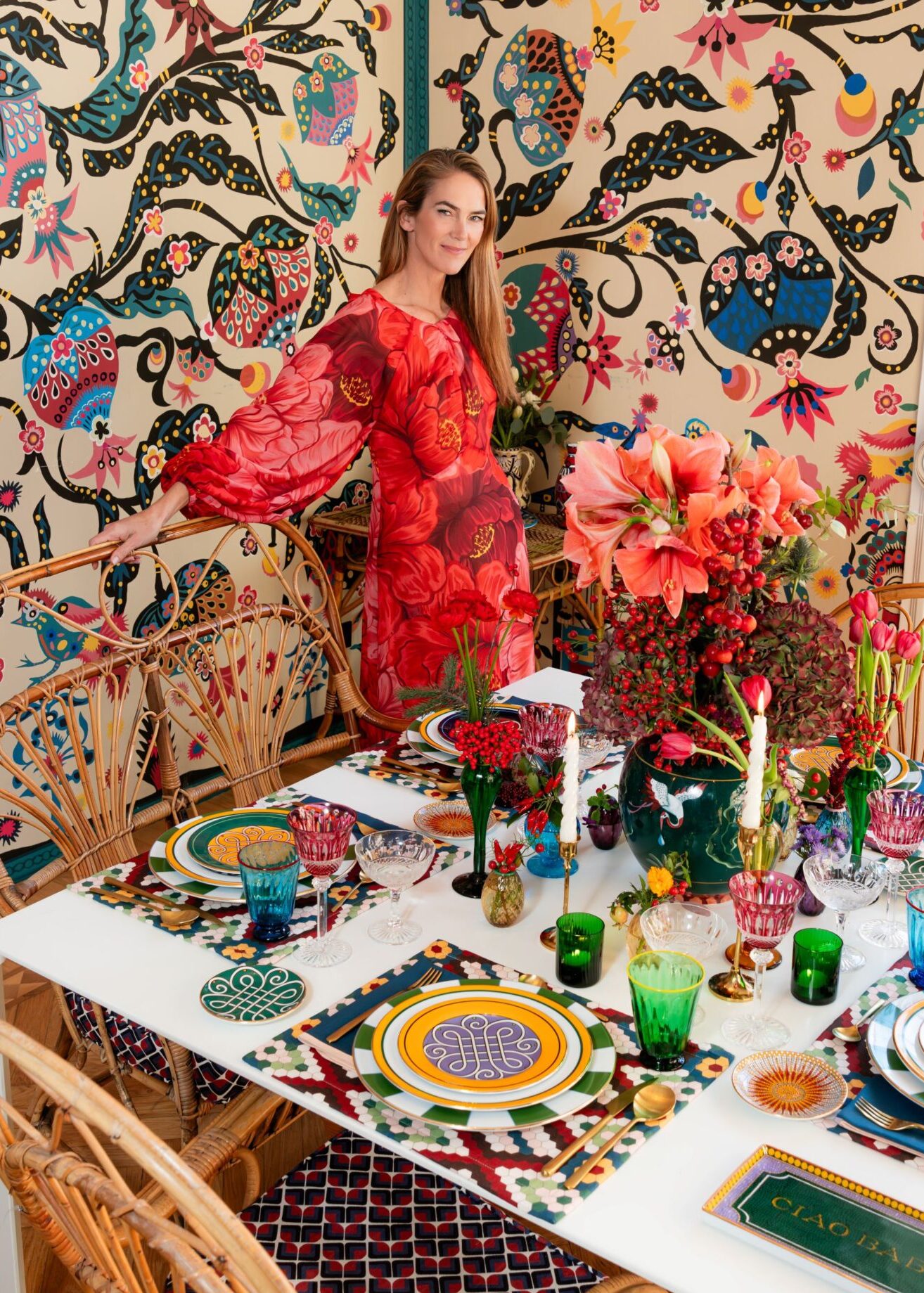
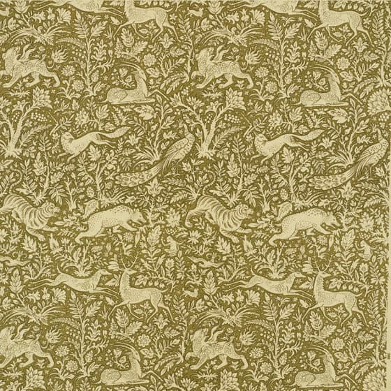
DO embrace the Swiss Army knife of colors: olive green. Often dismissed as ugly, Netto says it’s the ultimate utility player, a supporting shade that allows splashier colors or designs to shine.
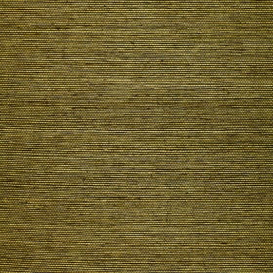
Ningbo Sisal
Khan's Park

Rocky Performance Velvet
DON’T be a slave to pretty. “People think they want their houses to be pretty, but there are lots of different ways to deliver that.”
DO install stainless steel countertops in utility spaces, even if they’re not considered “familiar or cozy”, he says. Practical and stylish, steel counters transform tiny spaces. For the same reason and the same effect, swap out linoleum for cork flooring.
DON’T second guess your decorator. If you hire a lawyer or a dentist, you’d act on their advice unquestioning and defer to their expertise—so treat your decorator the same way. “I’m like a dentist, and I don’t want to debate a problem beyond a reasonable level,” Netto laughs, “The more yeses I get, the better it ends up looking.”
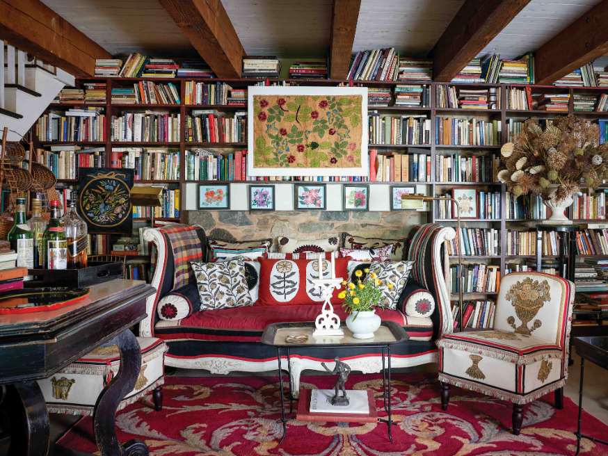
DO think internationally in a period room. “One trick is to take something cool from the same period as your house but from across the ocean. There’s a relationship between things that were happening at the same moment but on different continents,” Netto notes. A 1910 shingle house in Long Island, for example, is an ideal backdrop for a statement piece by Charles Rennie Mackintosh.
DON’T put a TV in the bedroom. “Without one, you’ll have more sex in there—it’s a sign of a good marriage.”
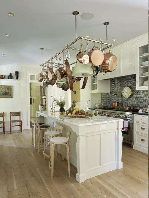
DO halve your number of kitchen stools. Smaller groups encourage better conversations while you cook.
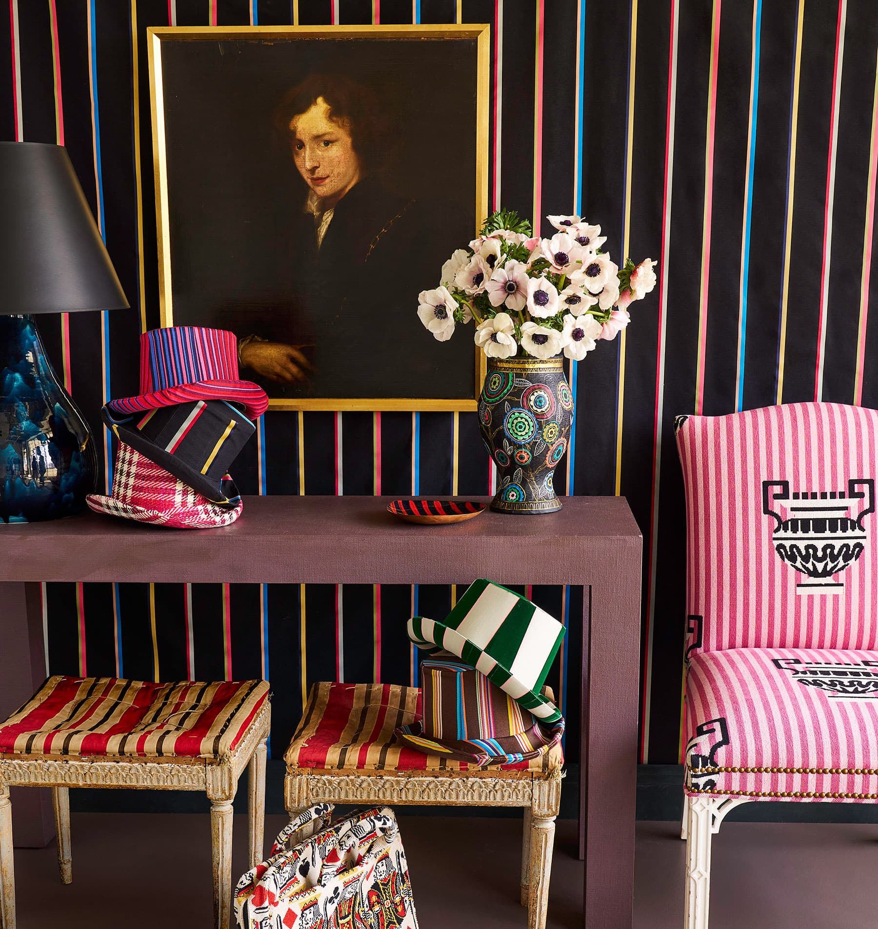
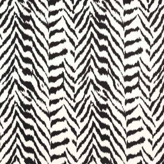
DON’T be afraid of patterns. Often the minimalist impact of a space is heightened rather than diminished with an artfully placed patterned piece—think a zebra print chair in a stark, Axel Verwoordt-style interior.
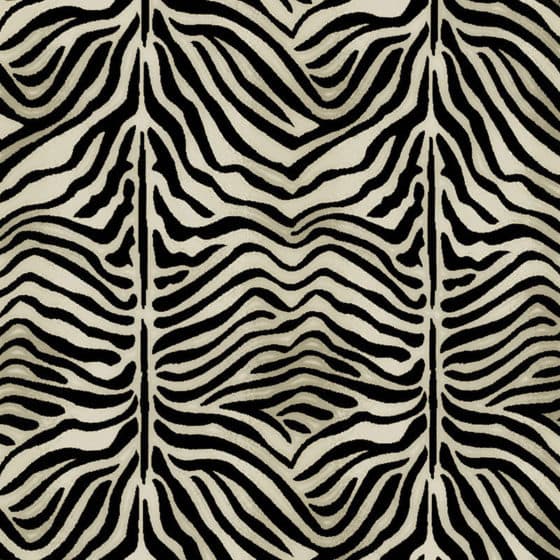
Zebra Epingle

Ionic Zebra
Quincy Hand Print
DO recognize cost and elegance aren’t always aligned. “To have a great house, you don’t necessarily need to spend a lot of money—in fact, it’s almost the opposite, especially with an old house,” Netto warns, “If you spend too much money on that, tricking it out and upgrading it, you’ll diminish all its charm.”
DON’T buy rugs online. It’s impossible to truly gauge the patina and pile on a screen, both of which are crucial in how a piece will frame a room. The only exception: dealers you trust, who can describe those details well.
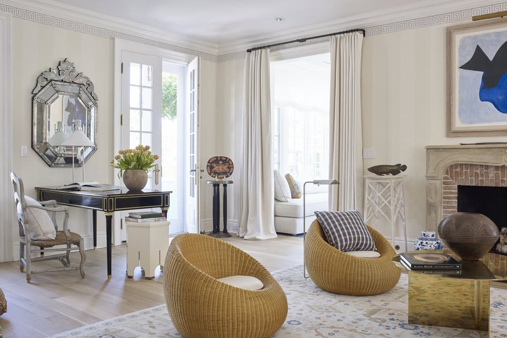
DO follow the 80/20 rule. 80 percent of the room should coordinate or match, while 20 percent should clash in some way—what Netto calls “dropping a bomb on it.” Think a Polar Bear Chair smack bang at the heart of a chintzy parlor—“a violently modern object in the middle of all that patrician elegance.”