


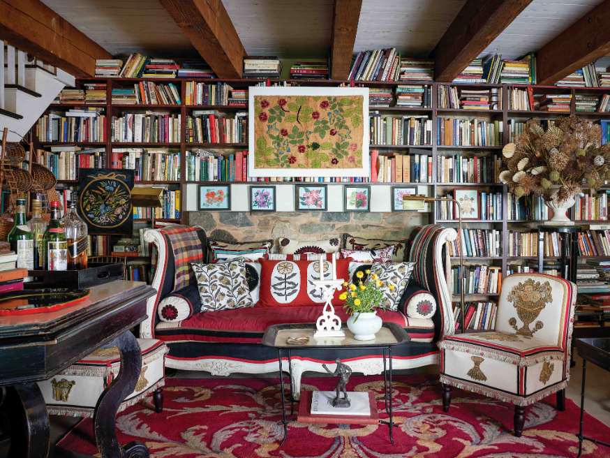
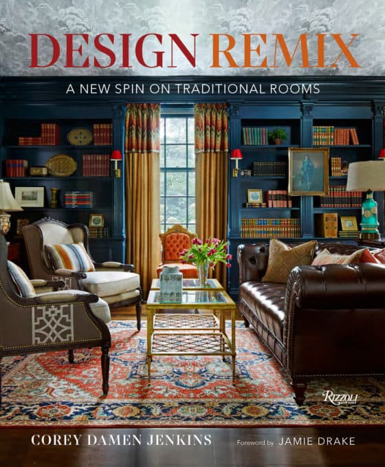
A-list designer Corey Damen Jenkins has won industry-wide accolades for his ability to put an exuberant twist on traditional interiors. Now, in his debut book, Design Remix, the Detroit-born, New York-based decorator is revealing some of his most valuable tricks of the trade. Brimming with pages of playful motifs and vivid, jewel-toned palettes, the tome showcases the various inspirations that he looks to when whipping up his designs, from the runways of New York Fashion Week to the Florentine maestros of the Italian Renaissance and the late Prince of Chintz, Mario Buatta. Read on to find out how Jenkins fearlessly puts his own bold stamp on centuries-old style in an excerpt from the book.
. . .
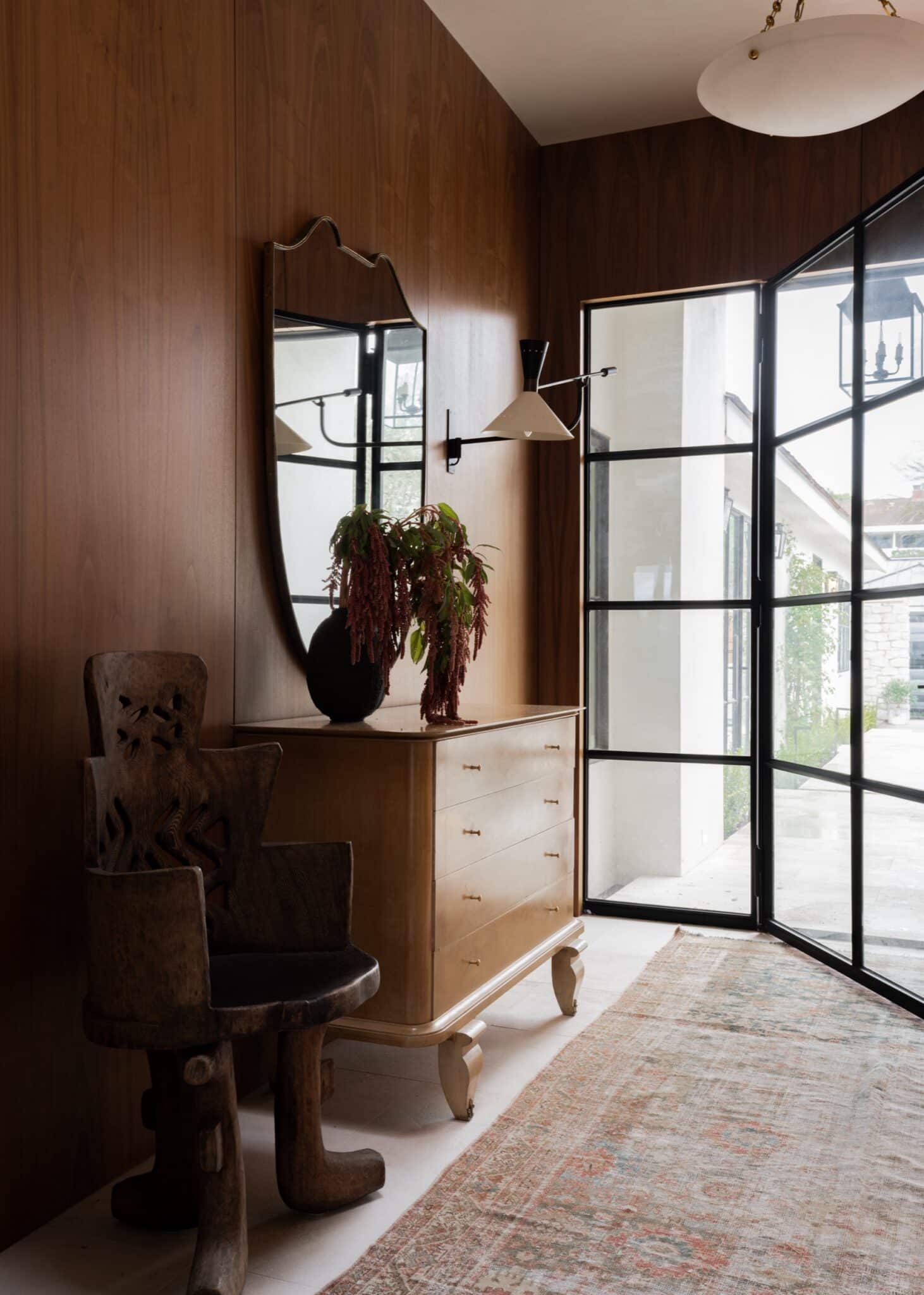
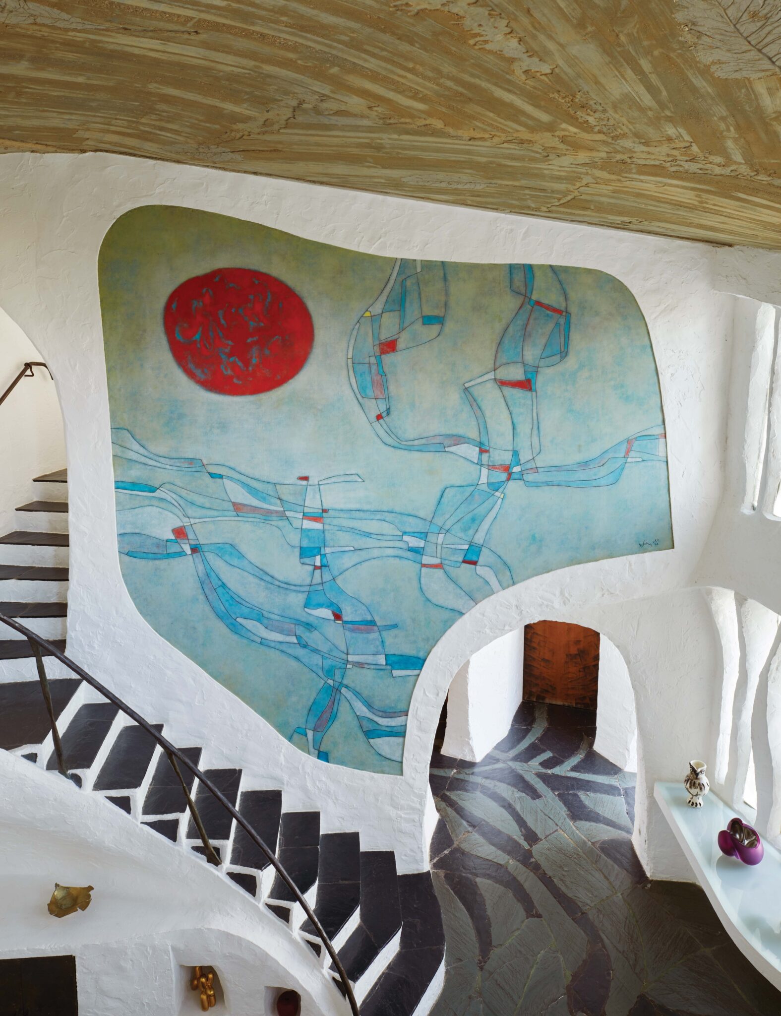
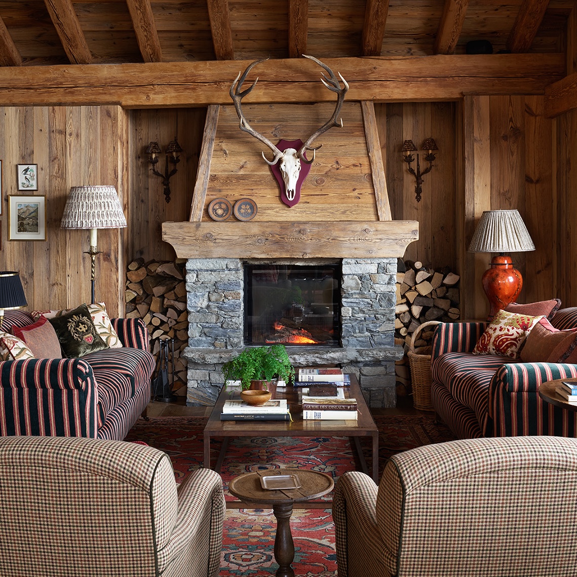
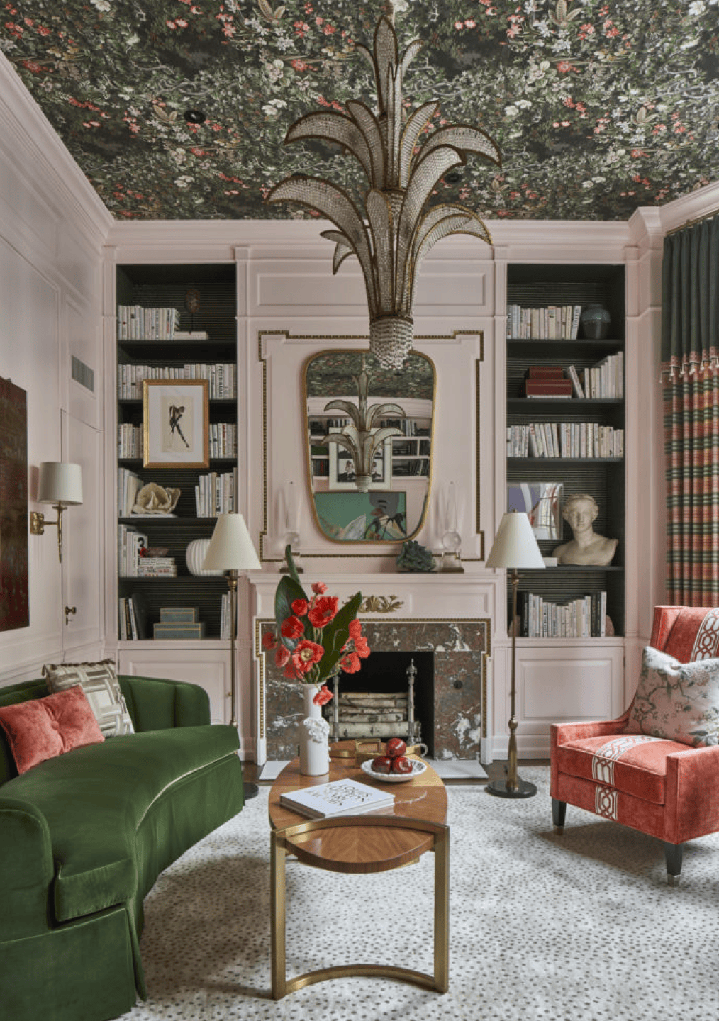
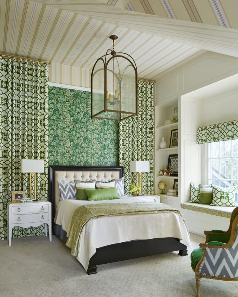
Where I come from, being bold has a bit of a reputation. In Michigan, being toned down and making safe choices in fashion and design are the norm; a bit of flair is not really part of the lingua franca. I don’t entirely disagree—bold simply for the sake of being bold comes off as hollow and ungrounded. But throughout the history of design—think classical Florentine, Rococo, and the chintz-loving work of one of my heroes, the great maximalist Mario Buatta—artists and designers have created enticing, memorable, and meaningful visual stories through bold palettes and ornate inspirations.
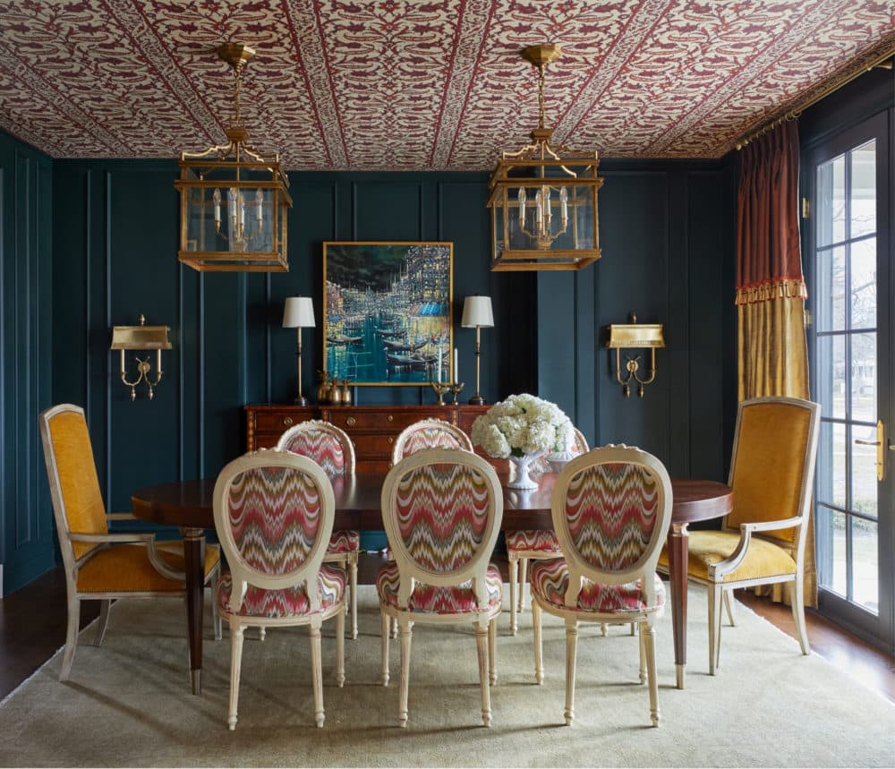
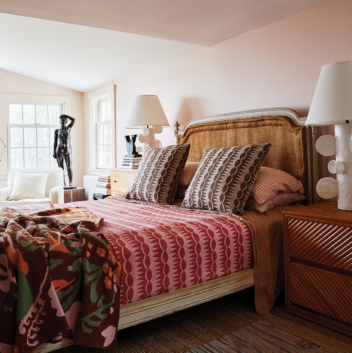
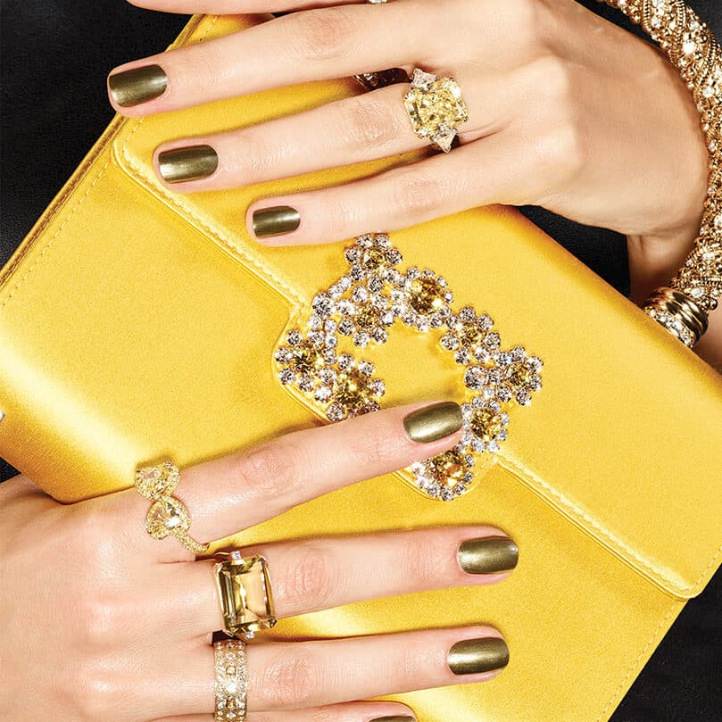
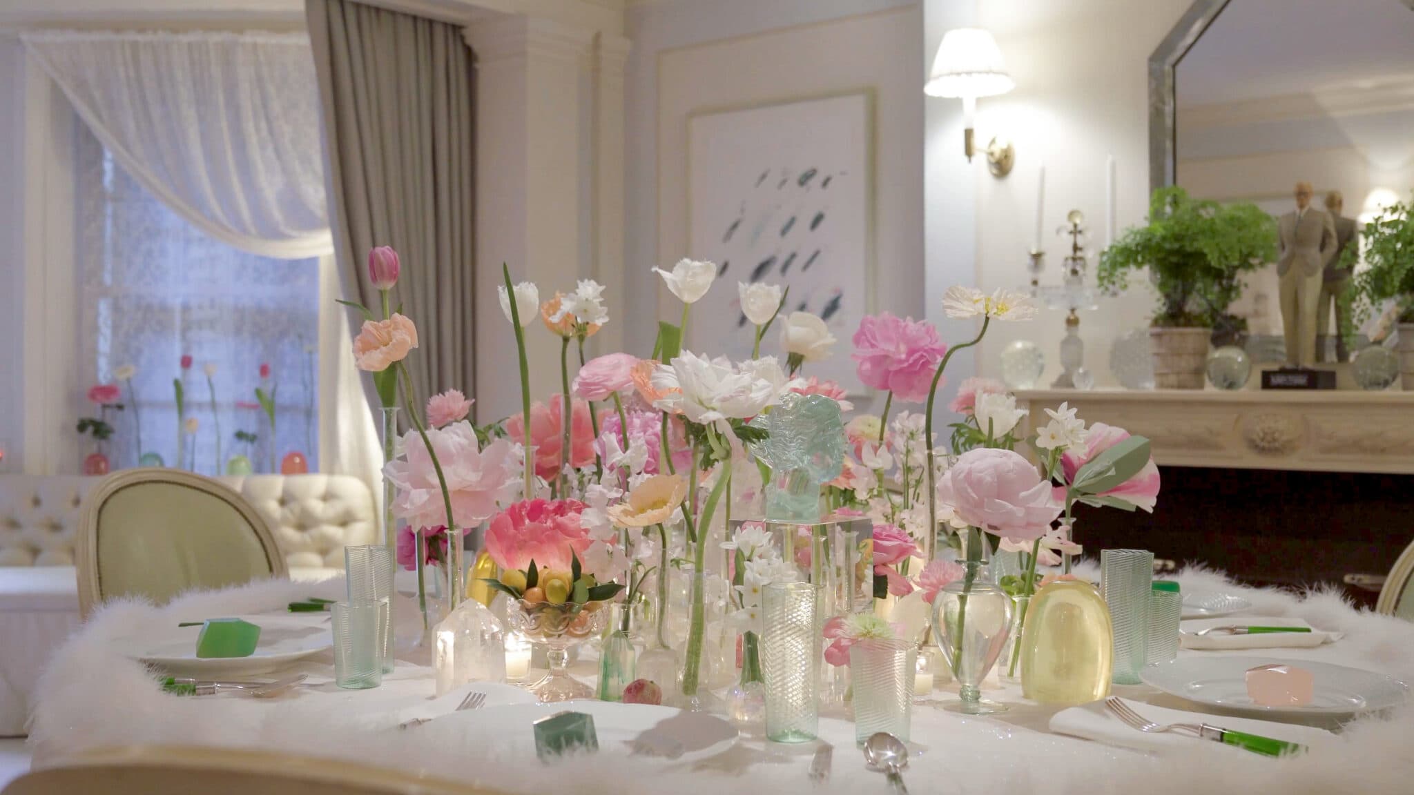
The boldness I love has a backbone of tradition, in which tried-and-true, unassailable architectural elements and decor—“the standards”—are enlivened with striking color, vibrant pattern, and unexpected combinations. It is a point of view that, if done right, is the opposite of trendy. Boldness keeps an older style looking fresh and modern. The first step to beautiful boldifying is color. Finding bright and unorthodox shades, using them to create unexpected palettes, and then applying those colors and palettes to decor elements in surprising ways is a great approach to any room.
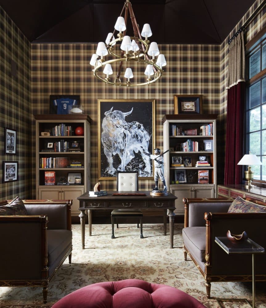
For inspiration, I frequently look to fashion magazines and runways, as you can find daring color stories in the fashion world that can be translated to interiors for a fresh but sophisticated look. Once I’ve selected the colors I want to work with, I think about what architectural elements or pieces of furniture I can apply these colors to that will be pleasing to the eye. I particularly love taking a great architectural detail—a column, molding, or built-in bookcase—that is usually very neutral and painting it a rich color—turquoise, avocado green— to draw attention to it and give the room as a whole an unexpected jolt.
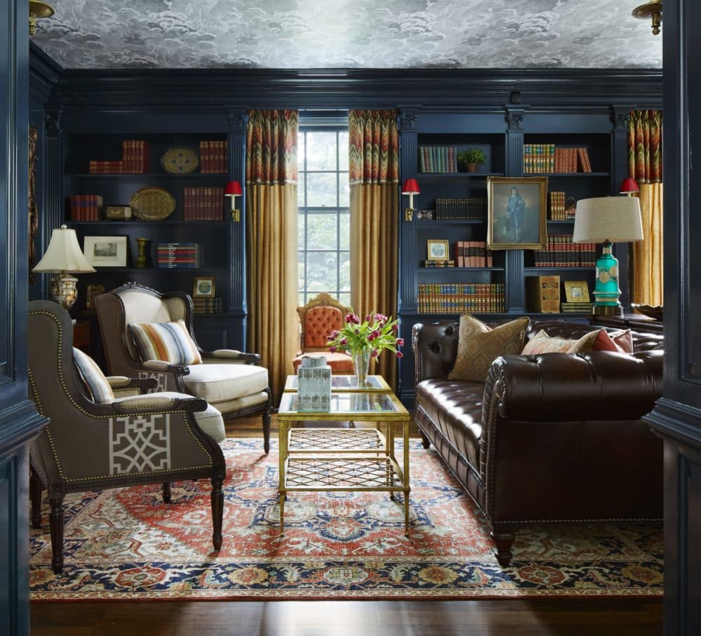
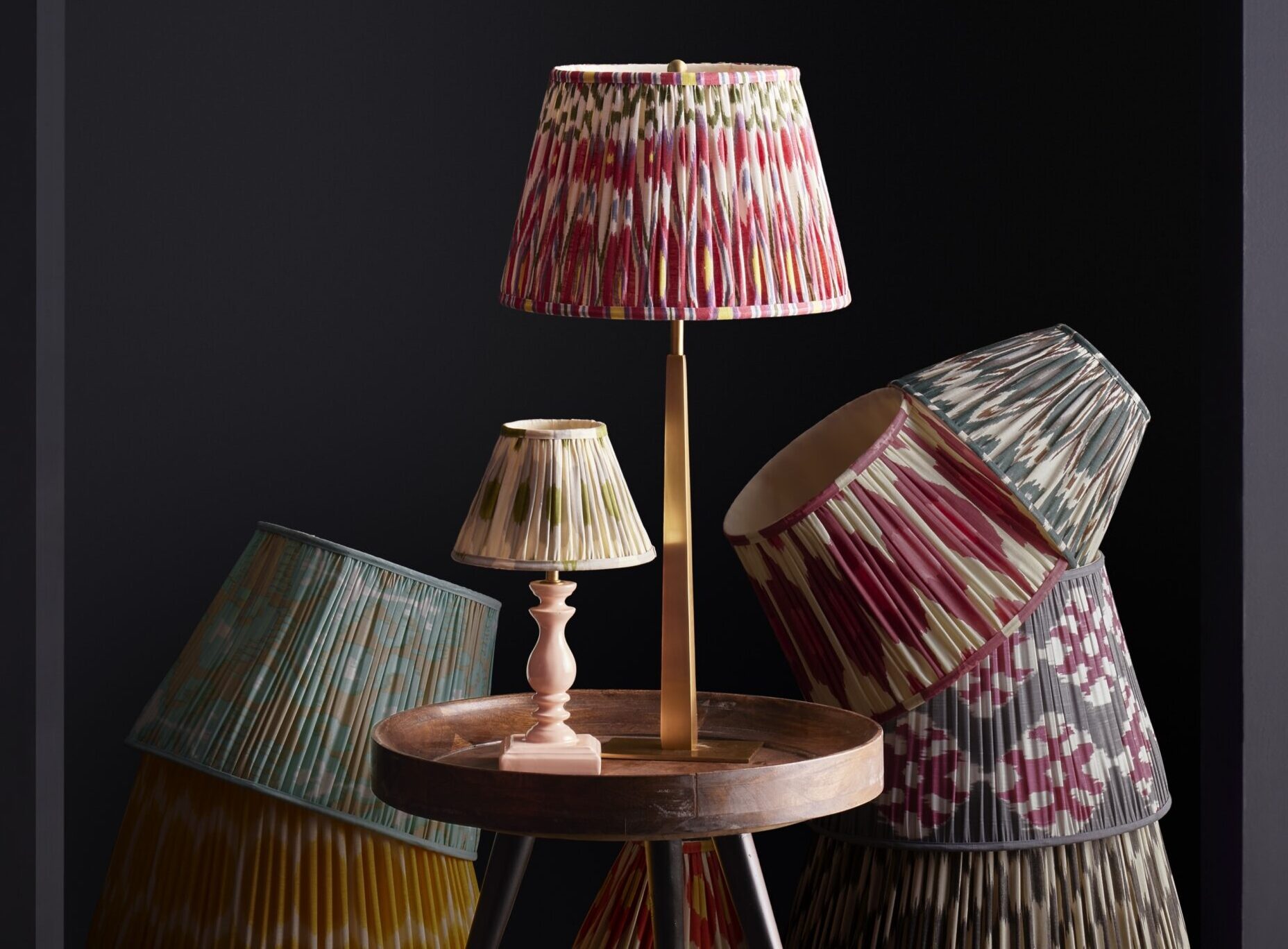
Materials are another way to go bold. Similar to color, I also take inspiration from fashion and try to apply ideas I’ve seen on runways for fabrics and details and bring them into the home. I’ve upholstered furniture in patent leather, which (in addition to providing a nice, slick sheen) is easy to clean; I’ve used vibrant wallpapers on the ceilings; and I’ve added metal trim around a traditional wood floor as an unconventional border. While a striking material may be more subtle than a wall in a saturated color, it can still contribute to a bold look overall by adding depth and texture.
Being bold is about playing with what is expected and what has been done before. As a designer, I always want to push my clients exactly to the edge (remember that patent leather?), but not so far that they feel as if they’ve gone over the cliff of crazy. I take my designs to the limit of where clients feel the exhilaration of the unexpected, while still being grounded in timeless (if dramatically employed) elements. And interestingly, as I’ve worked bold into my MO, I’ve discovered that even the most traditional Midwesterners warm quickly to this unconventional approach—they see that winters go faster when you are surrounded with great, bold design!
Adapted from Design Remix by Corey Damen Jenkins.