


It takes two, as they say, and that’s never more apparent than when selecting colors for a space. So we polled a few of our designer friends for the best pairings they’ve used lately—and when to break those old-school design rules (yes, green and red can co-exist beautifully!).

Ashley Whittaker of Ashley Whittaker Design
“I’ve been spending too much time in Millbrook, New York but there is something about a color we call ‘camouflage green.’ It’s basically green with enough yellow in it to keep it from feeling too fresh—murky is the best description,” notes the New York-based decorator. “We mix it with almost everything! I especially love it in this Florida living room with the taupe-y grey in the rug and sofa. They create an unexpected combination that brings a youthful energy to this classic room.”
Get the look:


Thomas Jayne and William Cullum of Jayne Design Studio
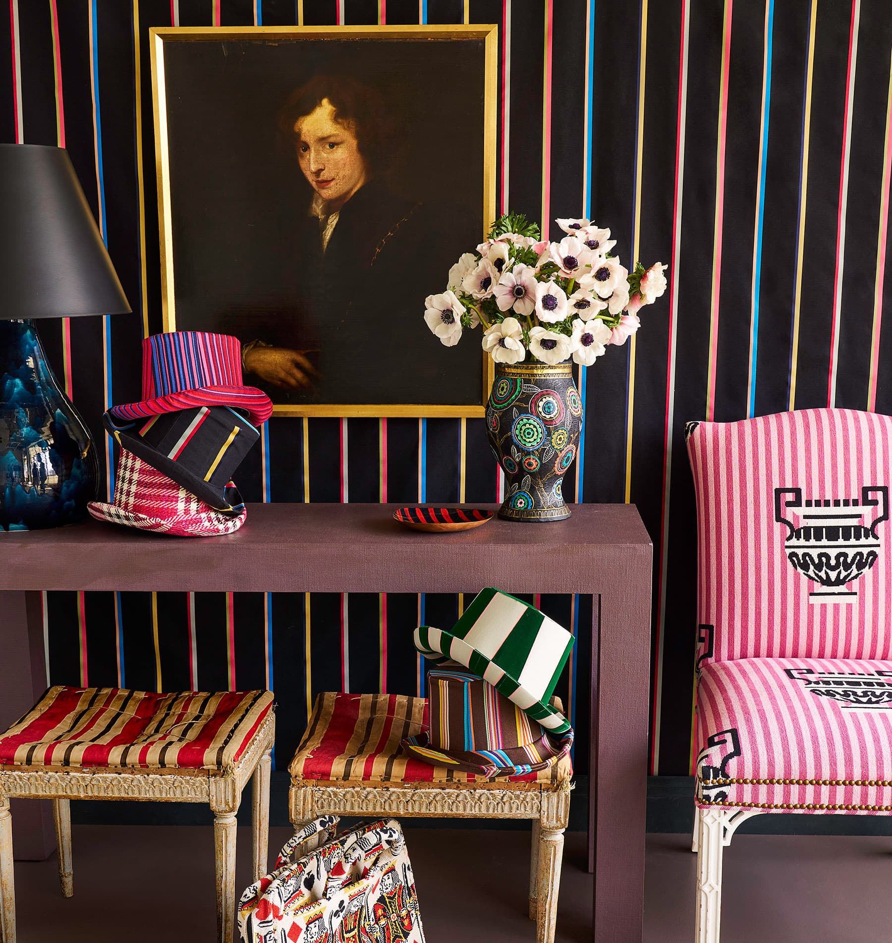
For the great room of a client’s Suffern, New York home, the New York-based design duo used an often feared pairing, but with a twist. “Red and green can be difficult to use because of the association with Christmas, but if you are careful to temper it by using associated shades, it can work well,” says Jayne. “In this case, the green tips towards blue and the red is more of a brick color, so it makes for a successful palette in a classic combination (they are complementary colors after all).”
And, as Cullum is quick to note, these two hues have been used together for centuries. “The color palette for the room took its cue from an 18th-century fragment of Indian chintz—a blue background with red and pink flowers, and green leaves—which we enlarged for the carpet by the fireplace. Coupled with the terra cotta floors (red in tonality), the room begged for a heavy dose of something cool, which brought us to Farrow & Ball’s Green Blue for the walls.”
Get the look:


Alice Engel of Peter Pennoyer Architects
When in doubt, Alice Engel suggests going back to primary colors. “The citron yellow is a cheerful and bracing antidote to the more grounding elegant slate blue of the trim and fanciful archive fabric on the walls,” she says about the classically-inspired bedroom she and Peter Pennoyer designed for the 2019 Kips Bay Show House.
Get the Look:


Celerie Kemble of Kemble Interiors
Forget about traditional navy and crisp white because there’s a new couple in town. “I’ve always loved this shade of cornflower blue, which pairs well with cream as a twist on the classic blue-and-white combination,” Kemble says of the playful saturated hue that coats the millwork of a stylish family’s Manhattan dining room.
Get the look:


Nick Olsen of Nick Olsen Inc.
For the master bedroom of his client’s high-rise apartment, Olsen went global for his color inspiration. “I love royal blue paired with shocking pink,” says the New York-based designer. “It’s very exotic and reinforces my serious need to visit India for the first time. It also reminds me of Yves Saint Laurent’s collections from the early 1980s, which are my personal favorites.”
Get the look:


RELATED:
Colors, Decoded: Quick Facts About 4 Humble Hues